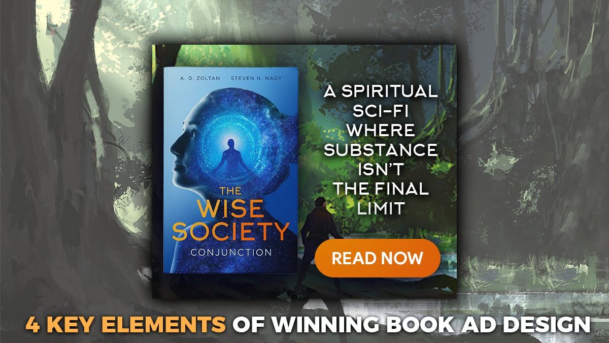
Bookbub Ads is nearly a must have for every self-published authors.
Bookbub has 6.5 million visitors per month it’s the second biggest referral site of Amazon’s book section after Goodreads. The site have been founded in 2012 where the initial business idea was to share discounted or free Kindle books for 5-7 days.
The company was founded in 2012 by Josh Schanker and Nick Cochrane, who saw the potential in the Kindle book market. The site has since grown into a multi-million dollar business. Bookbub now offers discounts on Kindle books, audiobooks (Chirp), and several book discovery services like Bookbub Ads.
As a self-publisher Bookbub should be an almost essential part of your book marketing mix.
In this article I want help self-published authors how to create an effective Bookbub Ad creative that grabs the attention of site visitors.
Some Important Good To Knows About Bookbub Ads
A. Bookbub Ad size is 300×250 (2022) which badly limits our space
As an advertiser on BookBub, you’re limited to a 300×250 ad size, which can be frustrating when trying to deliver a message.
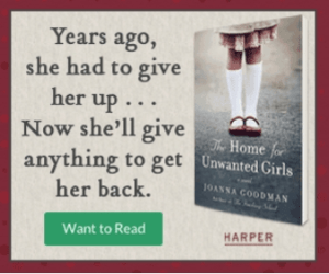
While it may seem like a small space to work with, there are still ways to be creative and make your ad stand out.
If you’ve ever had to deal with the blurry loss that comes from downsizing an image, you know how frustrating it can be. Don’t forget if you upload your ad creative to Bookbub let’s say in 600×500, the site will simply downsize it back to 300×250. To avoid this issue entirely simply use the exact resolution (300×250). You can keep your images sharp and clear, no matter how small you need to make them.
B. We should use PNG image since picture quality matters
We should use PNG image instead of JPG or JPEG.
PNG images are better for text and web graphics because they have no blurry feeling and don’t lose quality when they’re compressed.
JPG/JPEGs are best for only photos because they can be compressed more without losing significant quality, which will result smaller file size, but in case of an ad file size won’t be issue, because we have small creative resolution (300×250 px) anyway.
For Bookbub Ad creatives, we recommend using PNG files so you can create stunning visuals easily with readable sharp text messages and vivid colors.
C. Bookbub’s Ad Targeting Capabilities are Limited
You can target authors and categories, which is still very good.
If you’re looking to reach a specific audience with your book, BookBub is a great option.
4 Essential Elements of Bookbub Ads To Stand Out
1. Simple Book Mockup and Strong Contrast with the Background
A book mockup is a digital representation of your book that can be used for marketing and advertising purposes. They are usually created with mockup templates. In case of Bookbub ads most people simply don’t use mockups only the flat Kindle book cover creative, and that’s completely ok!
I personally prefer to see it’s a book with binding, but this effect fades because of small resolution, so we can skip it.
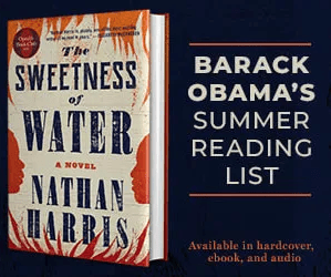
What is more important to keep strong contrast between the background, the text and call to action button. You may use simple one color background or visually detailed background, but in both cases the background shouldn’t influence the readability from the key elements of the design (cover, text, and call to action).
Where the book comes? On the left or right side? Since “lefties” make up about 10 percent of the world. I would argue that call to action button should come to the right side, to be more clickable so the cover should come to left side.
2. Strong Call To Action Button “Read Now” or “Read Today”
The call to action button is the most important part of the design. That’s because it’s the only thing that tells the reader what to do next.
If you’re designing a bookbub ad, for example, your call to action button should be designed to stand out from the rest of the ad. It should be a different color, a different size and different font type.
Make sure your call to action button is big enough to be easily seen, and make sure it’s easy to understand what it says. Also avoid adding text shades or text effects on the call to action button, but you may give shadow to the button itself to stand out from the background.
The call to action button’s text should be actionable, which means “Available Now” or “$2.99 Sale” aren’t really actionable buttons. “Buy Now” is a little bit pushy, but
From design point of view it’s very important to align the call to action text to middle. It’s unprofessional and annoying when the text isn’t vertically aligned. Also forget 3Dish buttons, in modern design we use flat buttons with high contrast!
I would advise to never skip the call to action button from creatives, since without it, it will feel only another “image” on the site.
3. In Case of Textual Content, Keep It Short and Emotional
There is not enough place on the creative. There is no way to tell any selling point of the book, and it isn’t the role of the creative. What we really want is to raise emotions in the visitors!
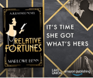
Ignite readers’ emotions by incorporating emotional elements in your worlds. Also keep the text extremely easy to read, use big font size.
From visual point of view it could work if we put a text caption background behind the text, as in case of Tiktok or movie captions.
4. Keep the Bookbub Ad Design Clear and Tidy! Avoid Information Stuffing!
The following creative’s biggest problem that it puts to many things on the creative. Skip the repetitive elements! Use only one mockup, and one visual element. Also putting your website address on the creative won’t help to get more visitors, since people won’t enter it into the search field of their browser.
Less is more!
5. Further Considerations
Shall I use an Ad Frame?
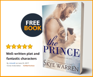
It could be a great idea to use one if your background is light (close to white). Frames help to make something stand out in design and wrap the package.
Shall I use an Stars?
No, I wouldn’t recommend that. Nobody cares about stars at this point.
Shall I use Discount Notes? Like Free between Jun 12-16.
Depends. It’s generally a good idea, but you have to accurate and change the creative once the free book promo period is over.
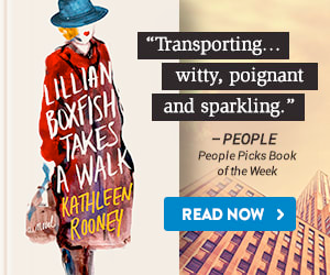
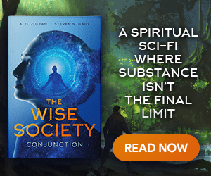
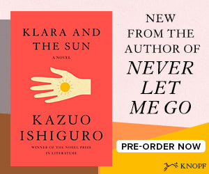
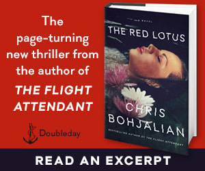
4 Great, Professional Ad Creatives that I liked
