Photo: Matthew Donaldson
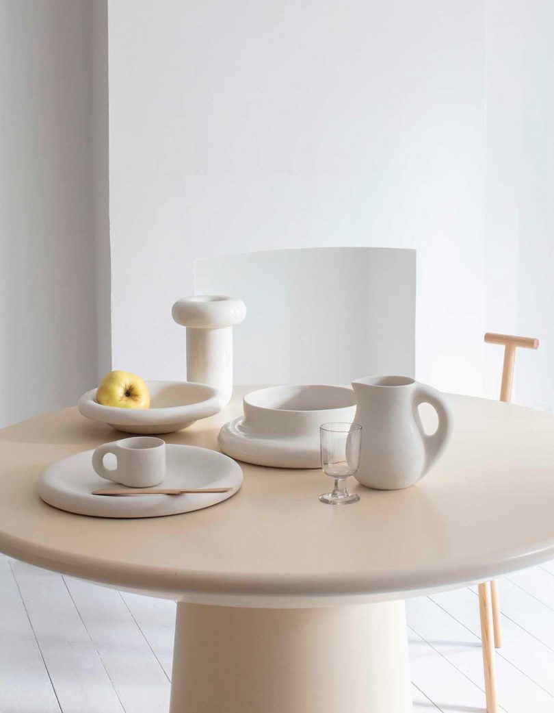
1. Dough Homeware by Toogood
London-based studio Toogood, founded by designer Faye Toogood, launches their first ever collection of homeware designs today and they’re delightful. Dough is a collection of ceramic designs, including a mug, jug, platter, bowl, vase, and centerpiece, that feature a rounded swollen look, almost as if they were made of freshly risen dough. Available in two matte glazes, cream and charcoal, the pieces are minimalist and chunky and I’m dying to own them.
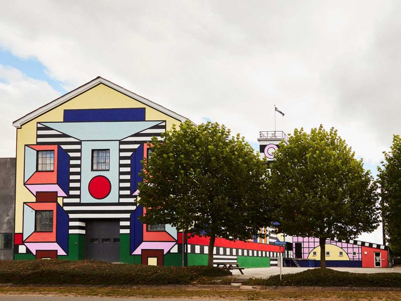
2. Walala x Montana Factory Mural in Denmark
London-based French artist and designer Camille Walala has added her signature touch to the exterior of Danish furniture brand Montana’s factory located in a small village in southern Funen. To mark the brand’s 40th anniversary, they enlisted Walala to help make the outside of their factory match the playful and colorful designs they’re creating inside. How could you not be inspired to go to work every day when this is the first thing you’d see in the morning?!
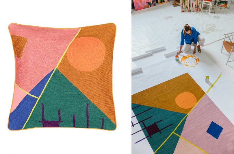
3. Zeniitti Pillow and Rug by Minni Havas for Finarte
Love this pair of matching designs by Minni Havas that was just launched by Finnish rug company Finarte. They’re part of a collaboration between Finarte and young Finnish designers, including Havas, who were asked to bring their modern aesthetic to life using the rug brand’s traditional methods.
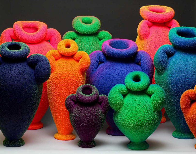
4. Ceramics by Maxwell Mustardo
After a deep dive on Instagram, I recently came across artist Maxwell Mustardo’s colorful and bulbous ceramics. From the textured surfaces to the bright colors, the pots are intriguing and instantly make me think they look like some sort of being with their hands on their hips.
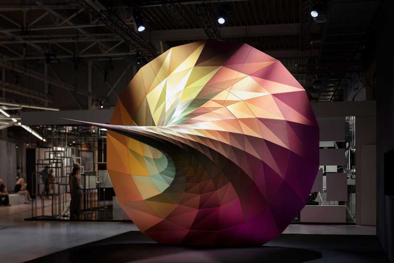
5. “RESONANCE: VORTEX to DIVERSITY” by we+ inc.
This large scale, vortex-shaped installation is 100% visually pleasing at first glance. The more you explore it and the metallic pigment on each triangular plane, the more your eyes become entranced. While the images are stunning, I’m sure seeing it in person from different angles would take it to a whole other level.

Caroline Williamson is Editorial Director of Design Milk. She has a BFA in photography from SCAD and can usually be found searching for vintage wares, doing New York Times crossword puzzles in pen, or reworking playlists on Spotify.
You can follow Caroline Williamson on Twitter, Facebook, Pinterest, Instagram, and Linkedin. Read all of Caroline Williamson’s posts.
