Architect Koray Duman – born in Turkey and based in New York City – knows about creating spaces for art – both appreciating it and creating it. As the founder and principal of Buro Koray Duman, he converted an 11,000-square-foot manufacturing space into a gallery and studio space for artist Richard Prince in Harlem. That experience and others have taught him how to negotiate our expectations of spaces dedicated “to art” and the actual elements of a rewarding architectural experience. “There’s a common thread in designing art spaces – people always want the space to be ‘natural,’” he says. “It is important that space doesn’t compete with the artwork – but it’s very important for the space to elevate you. To get you ready [for the fact] that you are going to be faced with a great work of art. I always see the space for artwork as a threshold [between] everyday life and the special moment where you are faced with the artwork.”
In this week’s Milkshake, Duman talks to us about the special demands of designing these spaces, as well as the most inspirational experience he’s had recently – that would be Simone Leigh’s work within the American pavilion at the Venice Biennale, which he says was “just unbelievable, very inspiring and very moving” – and “decentralizing” brick-and-mortar buildings within the context of the institution – a topic he recently explored as part of a series of social justice-minded panel discussions for the American Institute of Architects New York Cultural Facilities Committee, at the Center for Architecture. “One thing that was really inspiring none of these organizations wants to call themselves institutions anymore,” he says. “They call them programs, community projects, happenings – but this idea of being an institution is something they reject, which I thought was very interesting,” he says.
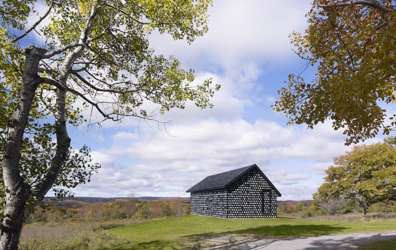
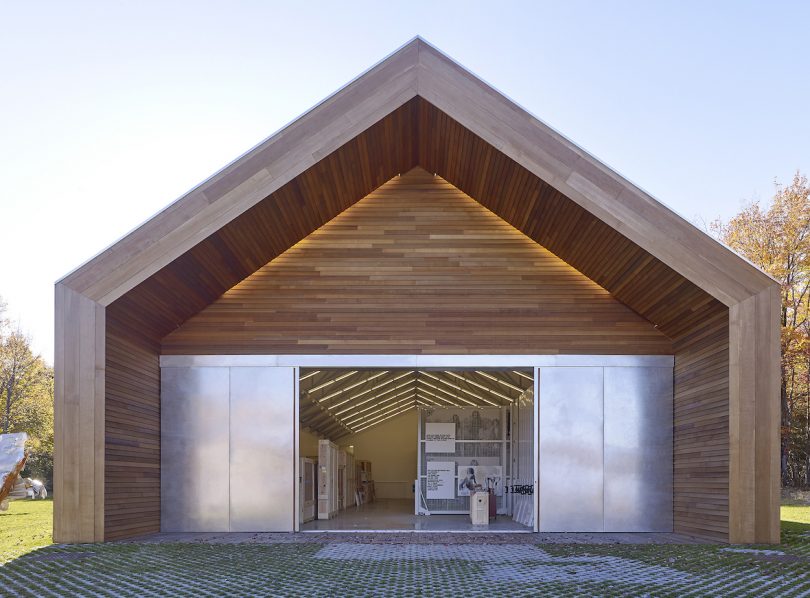
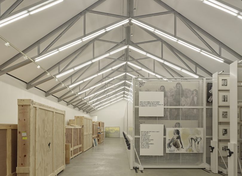
Also in this week’s Milkshake: Duman shares the thing (read: person) who’s making him hopeful these days, and also, his favorite architect cliché: “We tend to always dress black and white,” he says. “And if it’s another color it’s only in blue.” (Tune in to see how well he aligns with this cliché – pretty well, we’d say.)
Diana Ostrom, who has written for Wallpaper, Interior Design, ID, The Wall Street Journal, and other outlets, is also the author of Faraway Places, a newsletter about travel.
Milkshake, DMTV (Design Milk TV)’s first regular series, shakes up the traditional interview format by asking designers, creatives, educators and industry professionals to select interview questions at random from their favorite bowl or vessel. During their candid discussions, you’ll not only gain a peek into their personal homeware collections, but also valuable insights into their work, life and passions.
