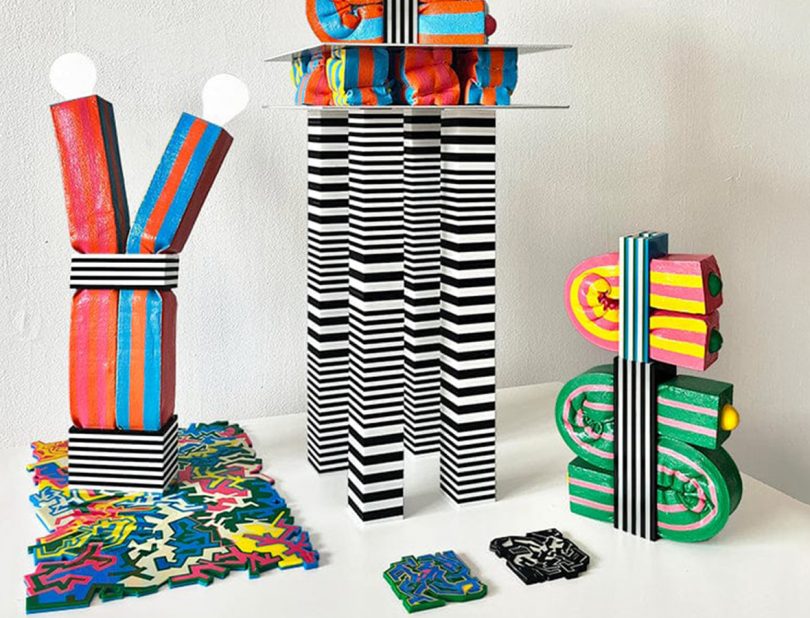
As a formally trained architect, Greek designer Kiki Goti has a unique connection to form and materiality – particularly, the special way in which the two influence our experiences in a space. In the Brooklyn-based designer’s latest collection of bold and tactile homewares, she takes her exploration to new, fantastical places. Featuring striking patterns, bright and playful hues, and an endlessly satisfying combination of rigid and malleable materials, Kiki Goti’s homeware collection is a multi-sensory delight that’s eye candy in the truest sense of the word. The collection includes coasters, vases, a table lamp, and a side table – all defined by their bold colors, contrasting textures, and sculptural shapes that’ll give any room a burst of modern, maximalist energy. To learn more about the collection, we caught up with Kiki to ask her a few questions. Find Kiki’s collection in the Design Milk Shop!

Can you tell us about your inspiration for this collection?
I wanted to develop a series of very tangible sensorial objects. During the pandemic I felt like there was not enough sensory stimulation at home. Living in NYC I was used to a constant input of information and when I had to stay at home my environment felt very bare and sterile. That is how I came up with the idea of “visually tangible” objects. I wanted to create a hyper-sensorial domestic state through an intense use of colors, patterns, and textures.
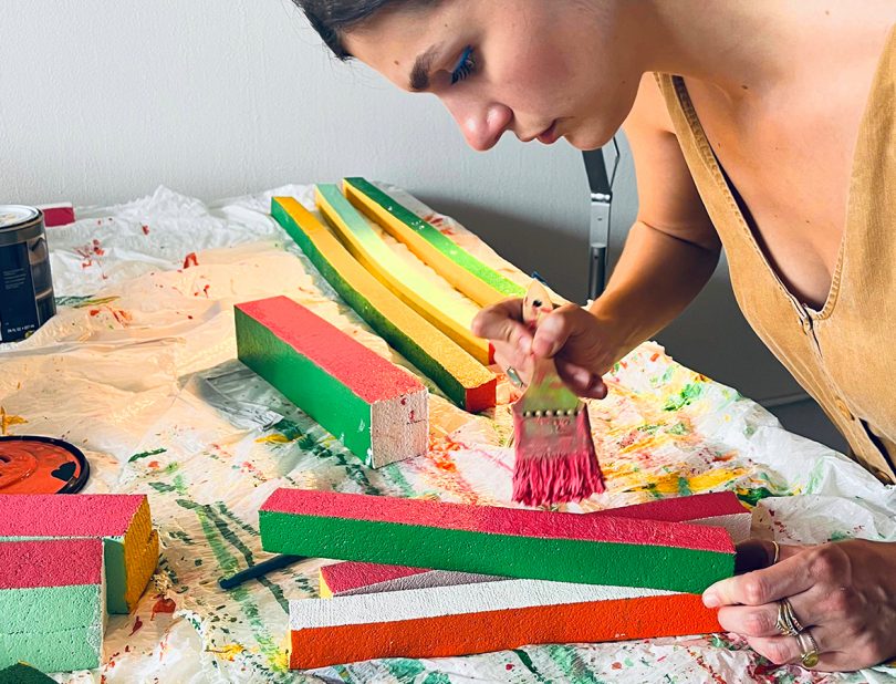
We love the unique combination of materials you used for this collection – what drew you to work with acrylic and foam?
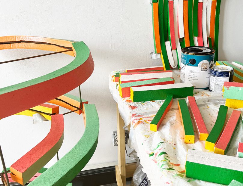
I was looking for materials with contrasting properties. Something soft and malleable and something stiff and rigid. This is how the tectonic system of these objects works. The rigid acrylic becomes the structure that hosts the malleable exuberant foam. It’s a codependent relationship. The stripes help unify the objects and highlight their coexisting state.
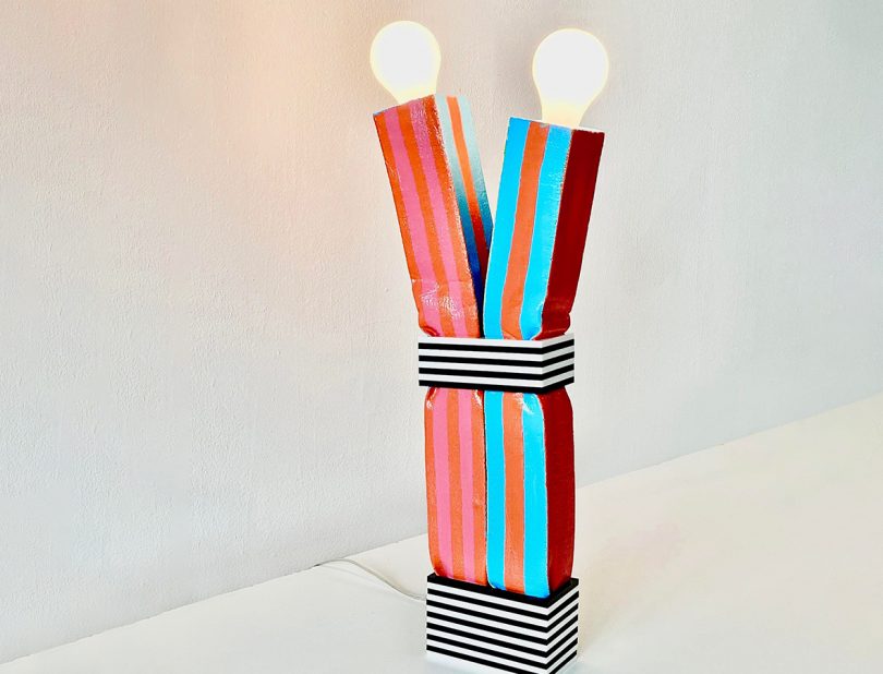
U+II Lamp ($1,000)
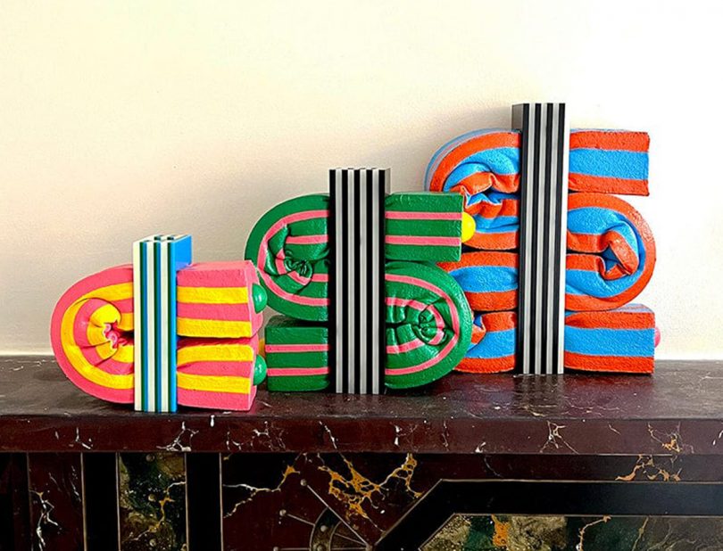
Squishy Vases ($200 – $400)
How do you approach balancing the architectural forms in your work with your maximalist patterns and playful colors?
The material is the one that guides the process. Both forms and patterns emerge from an inherent understanding of the material. Each material I use has its own properties which means that it tends to form specific shapes – I just need to embrace and follow that. I guess that’s something that you learn early on in architecture schools…
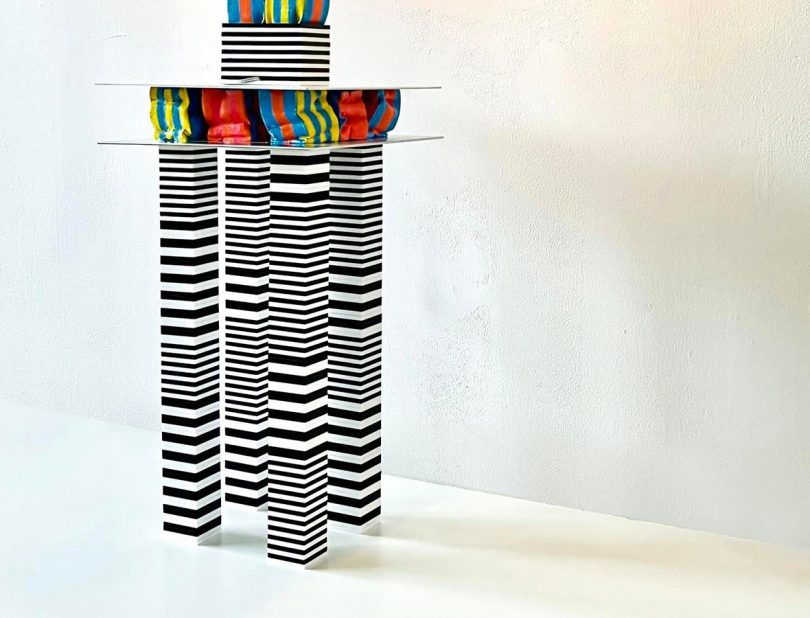
The U+II Side Table ($1,500)
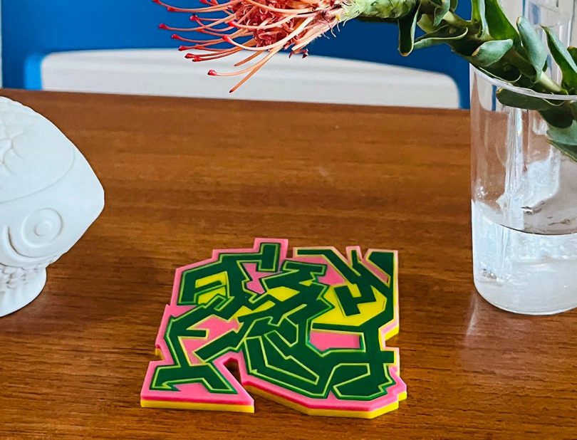
Messed-Up Coasters ($120)
How have your experiences and learnings as an architect influenced your creative process in designing homewares?
As an architect I have learned to read systems, proportions, and tectonics. It’s all about how things (materials and forms) come together to assemble large structures that humans inhabit. In the case of homeware design my process is very similar. I design objects that play with proportions, symmetries, and rhythm. I try to come up with bespoke ways of assembling different materials together. And I’m doing it in order to change the spaces that humans inhabit.
What’s your favorite piece in your Design Milk collection? How do you envision it being styled in people’s homes?
The large Squishy Vase. I love its shape and size. It works both as a sculpture and as a vase. I can see it as the main piece on a dining table, a fun addition to a working desk or an explosion of color on your living room coffee table.
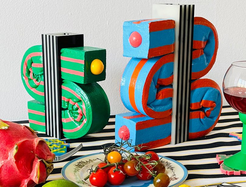
From left: Green Squishy Vase ($300), Blue Squishy Vase ($400).
>>> For more from Kiki Goti, visit the Design Milk Shop here! <<<

Alexa is commerce editor at Design Milk. She lives in Miami, Florida with her fiancé Alex and retired greyhound, Phoebe. A longtime art and design enthusiast, Alexa’s first stops in any new city are the art museums. When she’s not writing about her favorite DM shop picks, she might be buried in a book, binging reality tv or adventuring around her city with her partner and pup.
You can follow Alexa Morales on Instagram. Read all of Alexa Morales’s posts.
