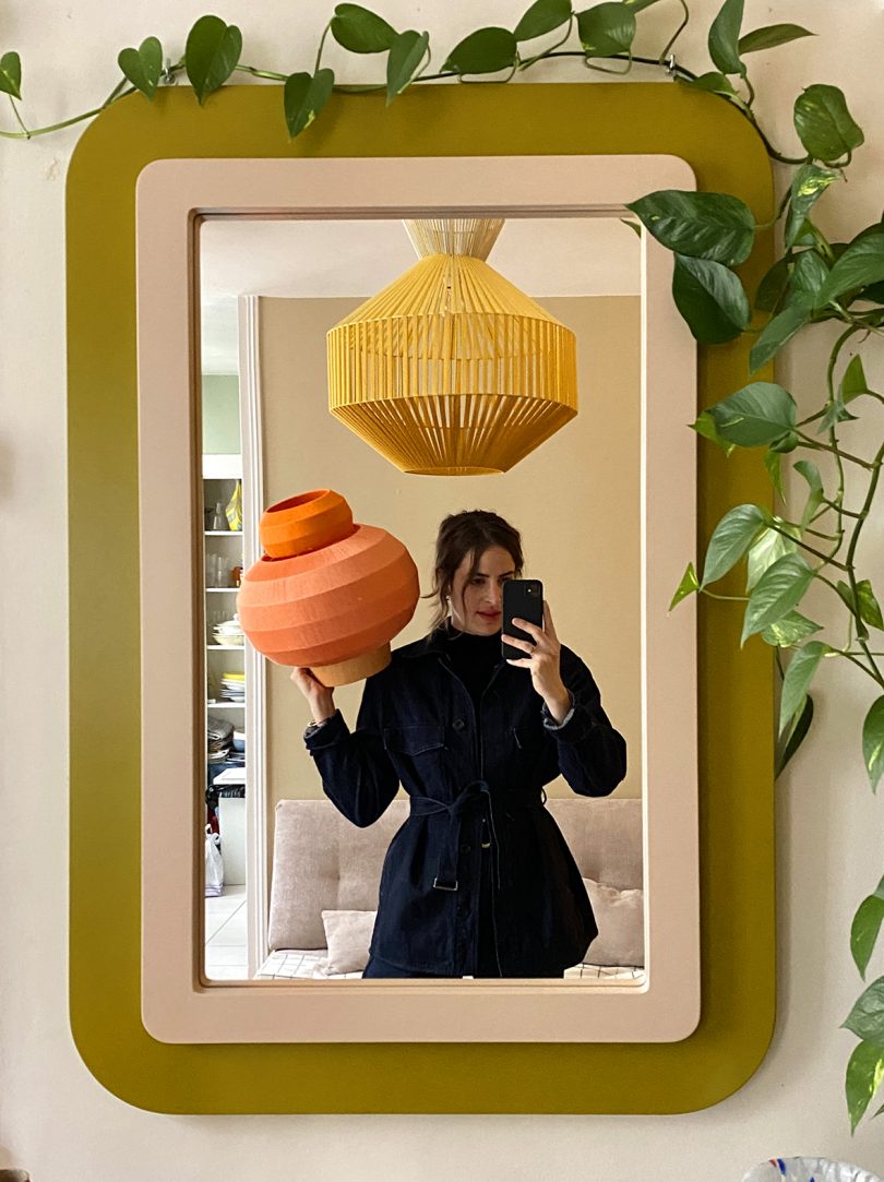
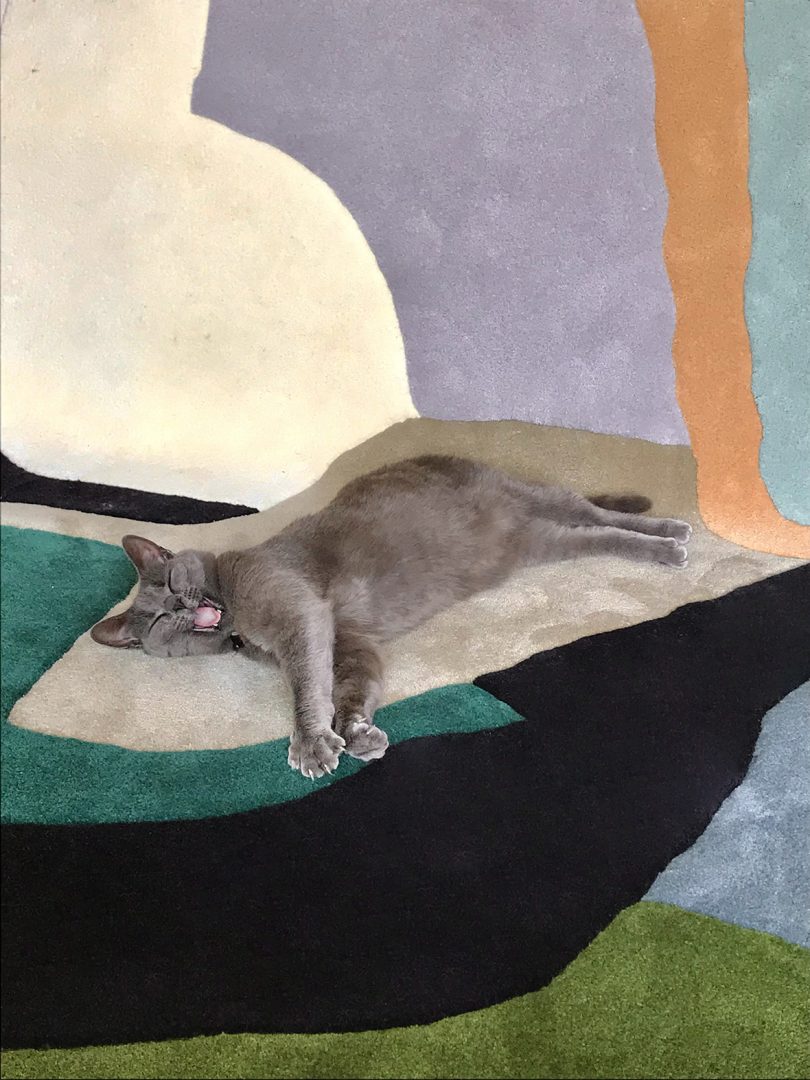
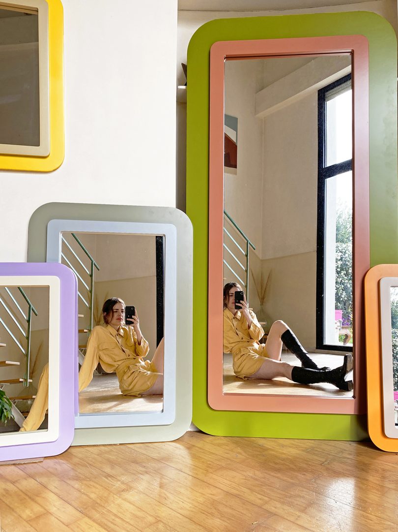
Julie Lansom’s Paris studio is a wonderland of color: Her vibrant paintings sit cheek-by-jowl with her woven Sputnik lamps, made from a rainbow of thread. She’s created gorgeous mirrors in laminated wood with dynamic color combinations, like lavender and white, or moss gray and sky blue, or a soft pomegranate and coral pink. Elsewhere, you’ll find Lansom’s photographs of often bare collaborators, as captured against rich red earth or gray sand. Lanson also works with artisans to produce three tufted rugs, an extension of her painted pieces, in three “coloramas”: L’Ocean in warm California colors, the cool blues of Les Salines, and the striking greens of Le Fôret (the Ocean, the Salt Marshes, and the Forest).
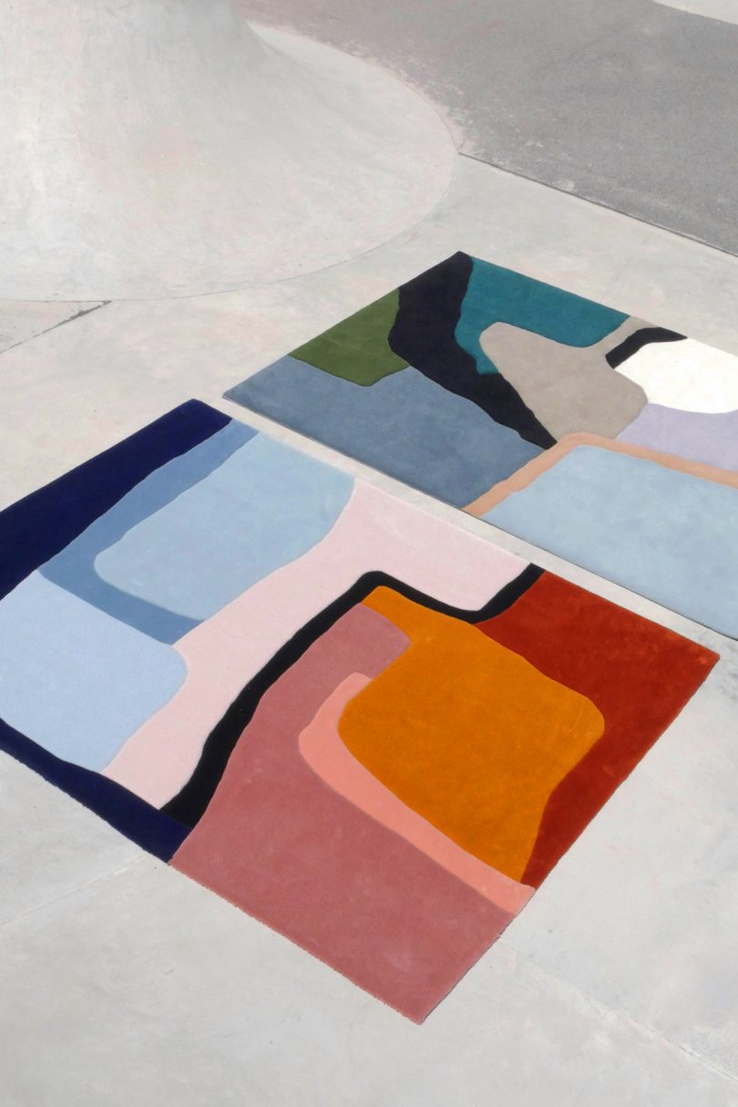
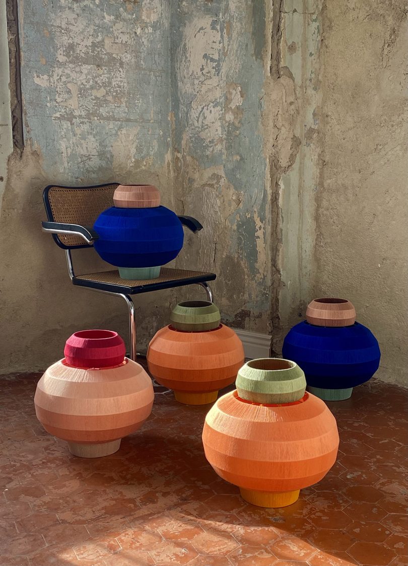
Indeed, color is the thread that ties Lansom’s work together. “I think the link has always been colors,” she says. “I am obsessed with them and how to associate them, I always have been. This is something that can be found in every aspect of my work, in all the different media.”
Lansom didn’t set out to be an artist – rather than studying fine arts in her native France, she pursued an education in journalism. Her career in media was ultimately short-lived, though: “I had always been painting, taking photos, buildings things – but I went for a master’s degree in journalism, in terms of my studies,” she says. “I only worked for a year as a journalist, and then art pulled me back.” She now directs her attention to whichever calls most loudly. “I never know what I am gonna work on next,” she says. “It very often comes from a very egoist need or a craving for something. I do it for myself, and if it works out and I am happy about it; I put it out there for everyone.”
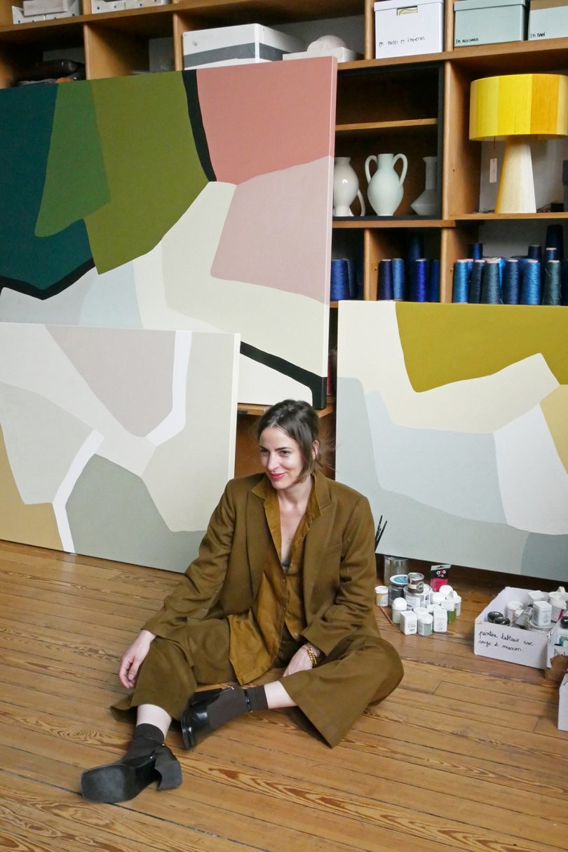
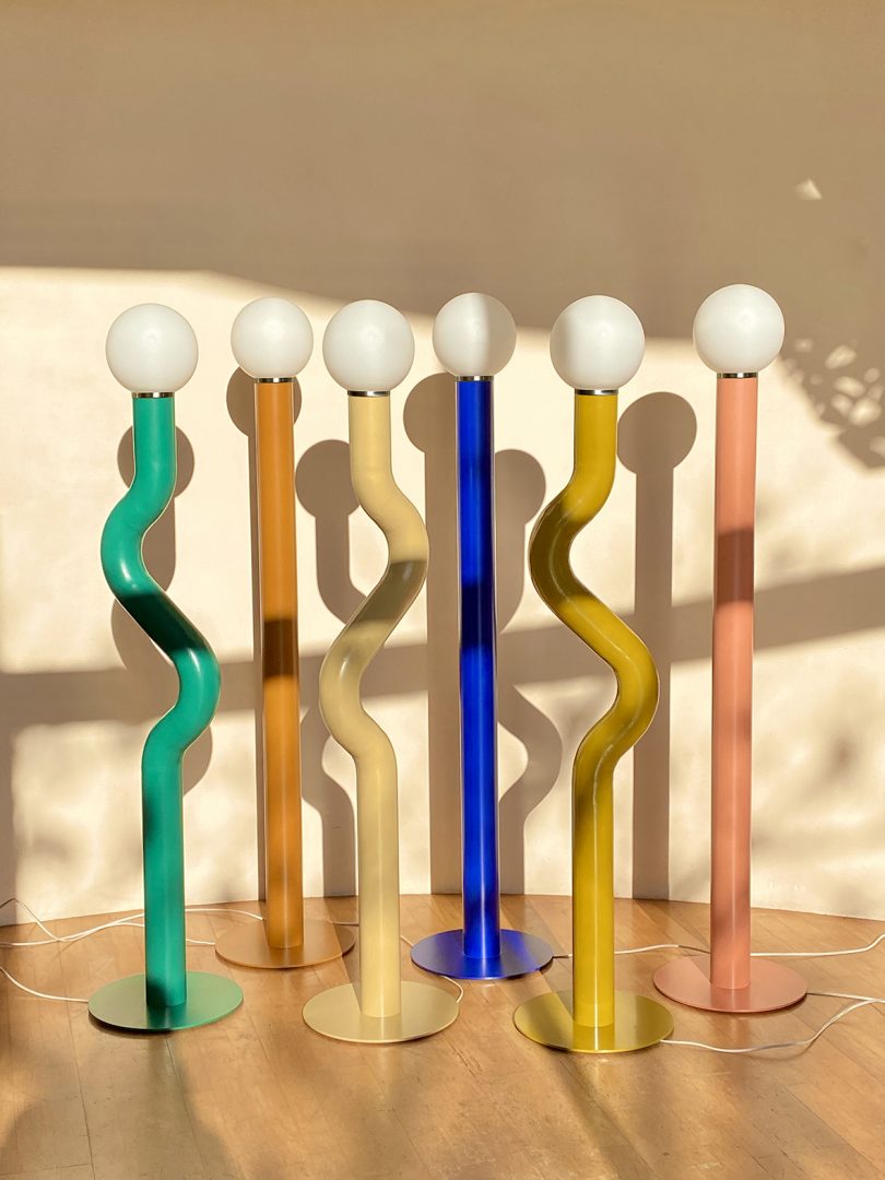
As organic as her approach to materials has been, her use of color is deeply considered, and her palette is expanding as she takes on more projects. “I am working on brighter colors than I used to at the moment,” Lanson says. “I have been quite inspired by the Memphis movement, and I am working on colorful and playful designs, almost naive. My objective in life is to approach and create as a kid would. I have always heard and read that it was really hard to deconstruct something you have learned, so I am trying not to construct too much.”
This belief is perhaps nowhere as visible as in Lansom’s Sputnik lighting collection, with hand-woven threads encircling the object’s frame. The interplay between colors is vibrant and alive, with dynamic pairings like peach and green, more subtle matches like cream and yellow, or a full-on rainbow. The effect is full of motion and dynamism; they change with both natural and artificial light.
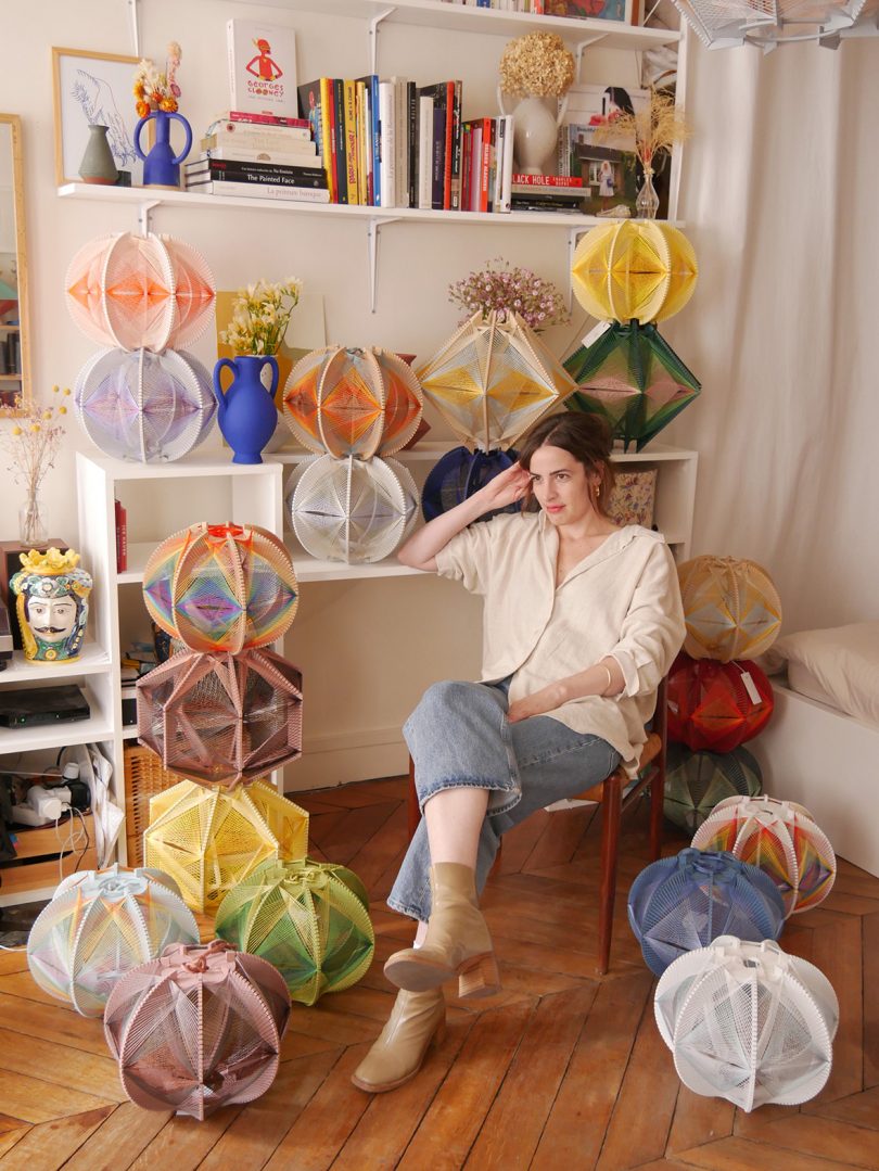
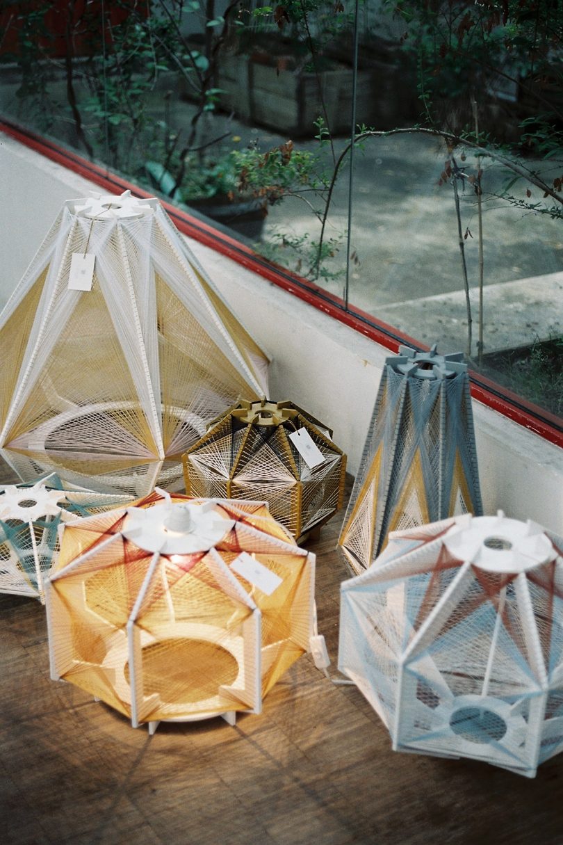
The Sputniks were her first design and are still central to her design philosophy. “I’ve been doing this for eight years now and I wouldn’t change it for anything,” Lansom says. “I love the artisanal side of it too, weaving myself. It takes hours and even days and it’s my form of meditation. I need it in my life.”
Squarespace has proven to be crucial to sharing Lansom’s wide array of work with the world – especially as a designer who wants to devote herself to her art practice rather than learning the ins and outs of web design with tools she’ll never need to use again. “Squarespace just made it so easy for me to have a website – it’s so organic to use for someone who doesn’t know anything about web design,” she says. “I think it’s still very important to have a website today as an international ‘vitrine,’ or showcase, of your work.”
Another key part of the equation: Squarespace allowed her to have the streamlined, beautiful site that her work required – on a budget. It’s a common problem: A ceramicist or product designer or multi-hyphenated artist like Lansom will need a website as elegant as their own work – but elegant websites can be very, very expensive. Squarespace offered her another path. “It’s very affordable for little businesses or people starting their projects,” she says. “That’s an important point when you start. You can’t pay for developers or web designers to work on your website and it’s so nice to have this option of nice designs that you can do by yourself.”
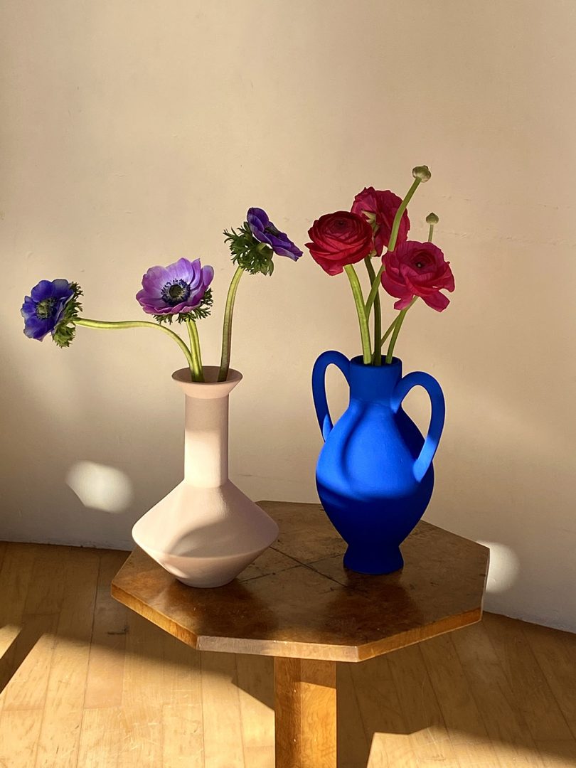
For Lansom, the experience is seamless: “I don’t think it’s obvious when you look at the website that it was created from a template, rather than with a web developer,” she says, noting that another big advantage of mastering Squarespace has been the ability to update her website frequently, without needing to pay for additional web design services. “The most important thing for me is being able to shape my website all the time, as I have new projects popping out quite often. This is just very easy to do with Squarespace. Even though we use social media daily, having a proper website is essential,” she says.
If you’re ready to share your own vision with the world, or build a new brand, take the first step today with Squarespace. Start your free two week trial and use coupon code DESIGNMILK when you’re ready to get 10% off your first purchase.*
*OFFER ONLY APPLIES TO FIRST PAYMENT OF SUBSCRIPTION ON SQUARESPACE, DOES NOT APPLY TO FUTURE RECURRING PAYMENTS OR MONTHLY PLANS, AND MAY NOT BE COMBINED WITH ANY OTHER OFFER CODES OR DISCOUNTS.
Diana Ostrom, who has written for Wallpaper, Interior Design, ID, The Wall Street Journal, and other outlets, is also the author of Faraway Places, a newsletter about travel.
