
Amazon enabled adding A+ Content (formerly Enhanced Product Description) for self-published books on Amazon KDP. Why is it important? You can highly improve your book’s Amazon page visual part with images and infographic like content, which is much more eye catchy than any written material in your description.
Let Us Help Creating an A+ Design For Your Book
Why is it important at all?
- It increases your book’s sales potential, when the visitor is already on your book’s Amazon page
- It adds further visual content to your book above the book cover
- It may include further information about your book or author
- It’s simply cool 🙂
Big publishing houses utilize this for years on Amazon, which makes their published books look more professional. This section is what we call From the Publisher section.
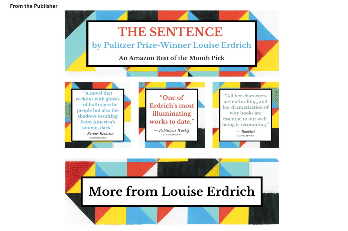
How to create A+ Content for your book?
You can ask your book cover designer or an A+ content designer to help creating the necessary pictures.
Who can add such a section to my book?
Basically the publisher, which is in case of an Amazon KDP account: the author.
How to upload A+ sections to KDP?
1. Login to KDP

2. Go to “Promote and Advertise” section
3. Scroll down to A+ Content section and select the marketplace (e.g. amazon.com)
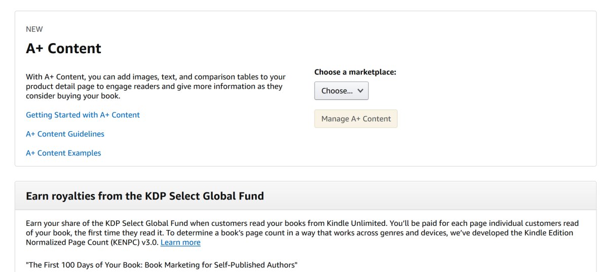
4. Click “Manage A+ Content” (this will redirect you to A+ Content Manager page)

5. Click “Start creating A+ content”
6. Enter a “content name” for your A+ content (typically your book’s name)
7. Add Modules to you A+ content. See the typical elements we use below. The elements represent a certain sized box, where the background of the box should match with the design we created. Modules offer the option to add text on the creative, but we usually leave this empty. We use only the background part of the modules for the A+ design. This part of the process is like a LEGO puzzle.
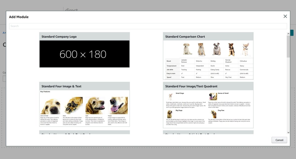
8. Once you uploaded the images to these modules enter the ASIN (Kindle, Paperback or Hardcover) where you would like to apply the A+ section
9. Once you are ready, click on “Next: Review & submit”
That’s it, your From the Publisher section will be live in 4-7 days (the reviewing process on Amazon side requires time).
What are the typical image sizes for these image boxes?
- Wide background creative 970×300
- Image header background creative 970×600
- Box creative 300×300
- Header brand creative 600×180
- Four Image/Text Quadrant 135×135
- Standard chart products 150×300
What are the typical elements you should use in KDP A+ Content Manager?
- “Standard Image Header With Text” for 970×600 images
- “Standard Image & Light Text Overlay” for 970×300 images
- “Standard Three Images & Text” for 300×300 images
- “Standard Comparison Chart” for 150×300 images
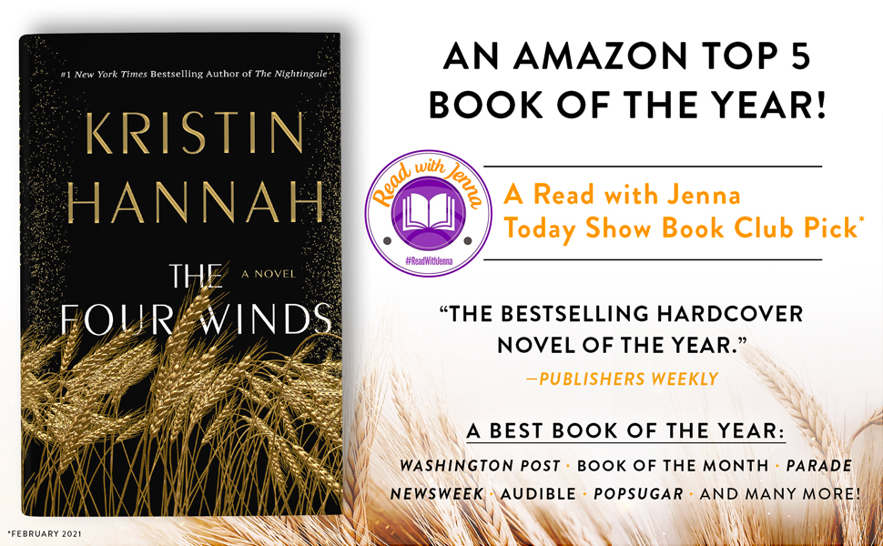
(970×600 design)

(970×300 design)
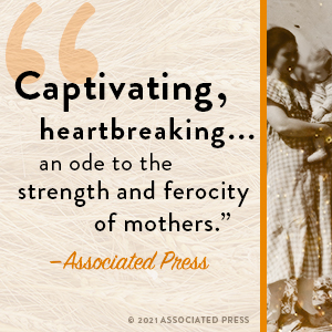
(300×300 design usually 3 similar boxes in a row)
What to watch out and don’t put on images
- No price tag, “bonus”, “free” text on images
- You can share reviews only from well-known sources or public figures
- No time sensitive text like “buy now”
- No links on the images that my encourage visitors to visit a website outside of Amazon
- Awards logos won by the book should be proven
- You should have the rights for images and logos present on the creatives
- You cannot make false claims on images (#1 in certain category, that might change over time, or any health related statement, like the method cures certain diseases)
Find all the A+ content guidelines on the following Amazon KDP Help page.
Our favorite A+ designs for 2022

The Last Thing He Told Me
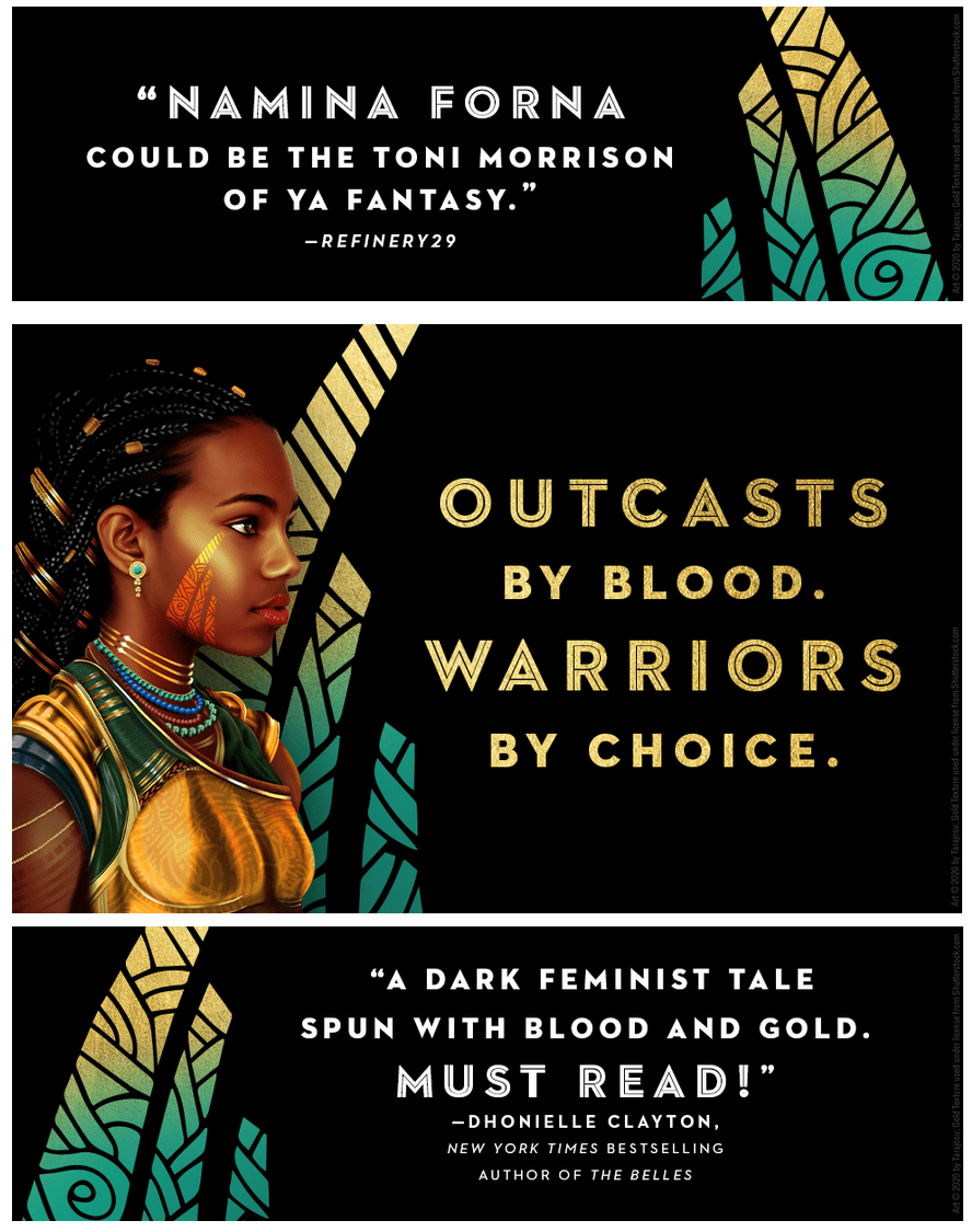
The Gilded Ones
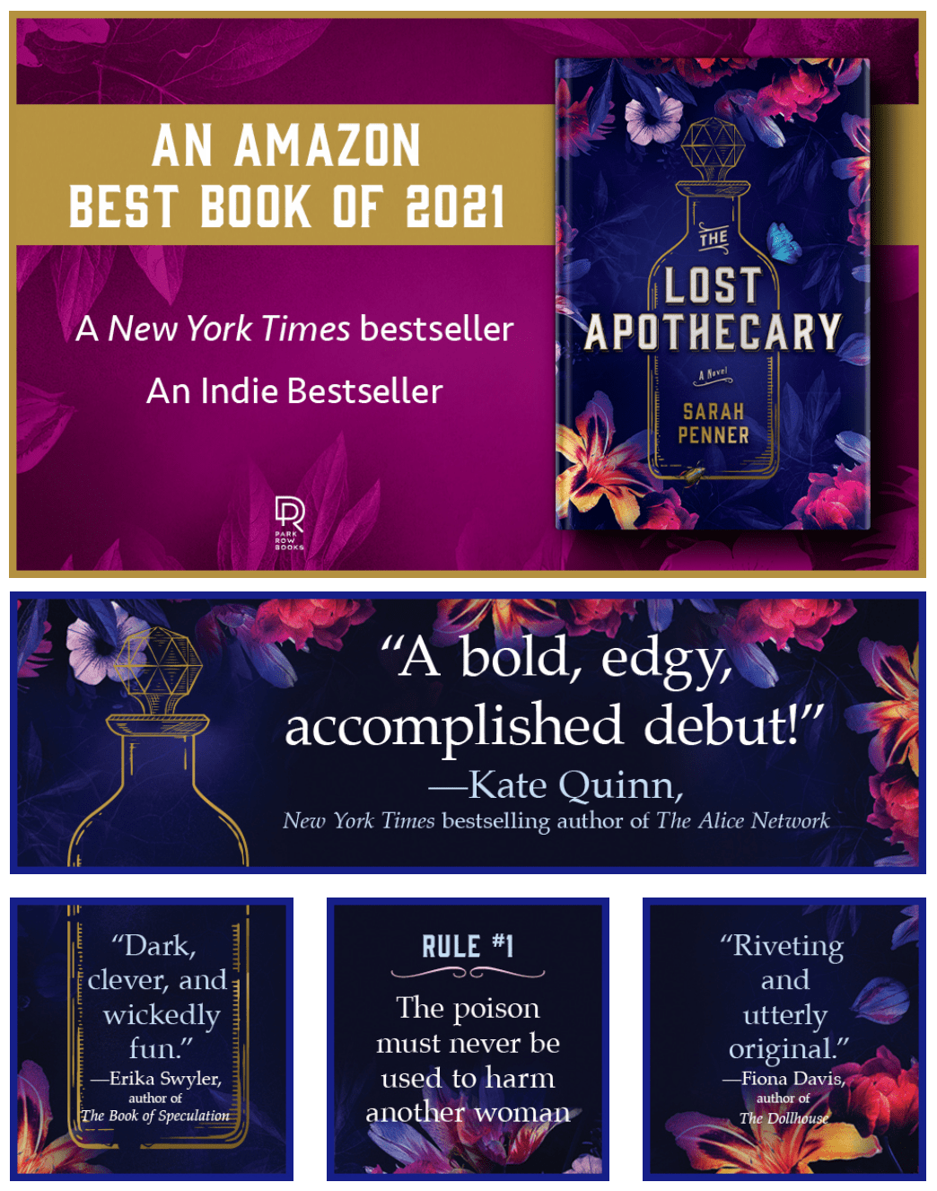
The Lost Apothecary

Big Feelings
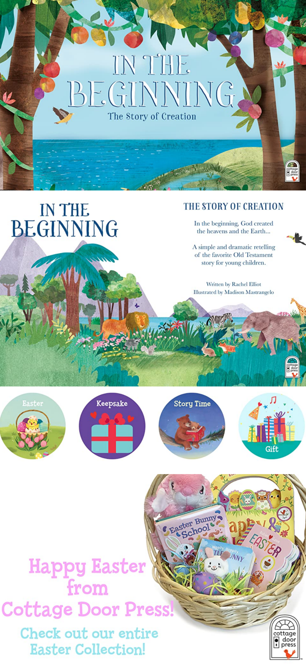
In The Beginning
Conclusion
A professional A+ design is key to a successful book in 2022. Keep your audience in mind when creating your content, and reflect the book’s theme and typography to enhance your message. A well-designed A+ content will not only look great, but it will keep your visitors on your book’s Amazon page.
So don’t wait any longer, get started on your A+ content today! I hope the above summary about Amazon’s A+ Content was informative.
