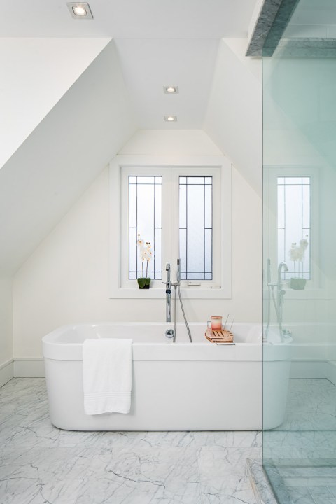
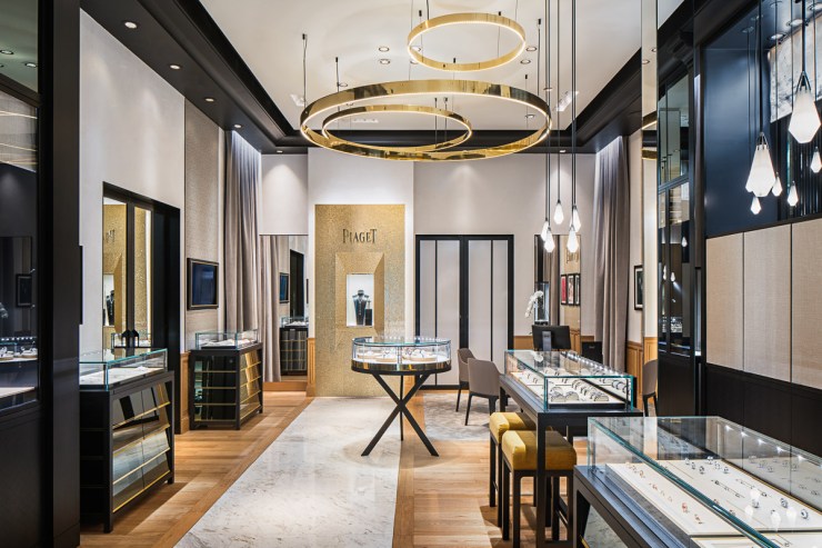
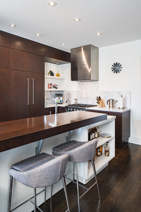
After exploring architectural abstracts, let’s dive into the world of architectural interiors! It can be a pretty wide category, with clients ranging from real estate agents to high-end interior designers. It’s also a lot of different types of spaces: Houses, hotels, restaurants, offices, retail, university buildings, libraries, community centers and more.
Interior images have a few goals: Showcase a room, feature interesting furniture/details, show a space in use — it depends on who your client is and what their needs are. For example, the real estate agent and the interior designer usually need different images of the same house.
Let’s dive into five tips to improve your interior images:
Straighten your verticals
First, any architectural image needs to have straight vertical lines. The easiest way to achieve that is to use a tilt-shift. If you don’t have one, don’t worry, no need to open the B&H website! You can use the Transform tool in Lightroom or Camera Raw.

Don’t go too wide
If you’re shooting for a real estate agent, then, by all means, go wide. It’s usually what they want, to make the rooms look bigger than they are. However, if you’re shooting for clients such as architects and interior designers, they usually want images without distortion.
As a rule of thumb, try not to shoot wider than 24mm (on a full-frame camera). The vast majority of my images are shot with a 24mm tilt-shift lens. Sometimes I need to crop or use a longer lens. But unless the room is very large, I don’t go wider than 24mm.

Stage the room
Staging is one of the most important steps of interior photography! It’s not rare that it takes more time to stage than to actually take the photos. Some clients help me with staging, but other times, I have to do it.
First, set up your camera and frame your shot. Depending on the point of view, elements in the room can appear very differently, so you have to stage for a specific angle. Once your shot is set up, make sure there’s nothing distracting, the room isn’t too busy, etc.

Use lighting
While lighting is not mandatory in any way (I often shoot without it), it can make a big impact on some spaces. Residential and hospitality spaces, where furniture and atmosphere are key, can definitely benefit from some additional lighting. It’s also great to balance interior light with the outside light, so you can see the view outside the window.
You can use speed lights or some strobes, depending on how big the space is. The key is to balance ambient lighting and flash, so it doesn’t look completely sterile and white. Using gels for your flashes will also help avoid blue casts.

Include people
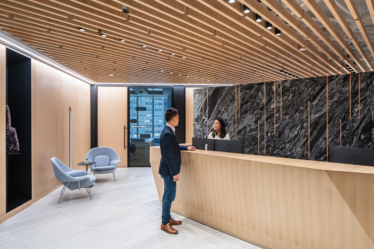
Including people in your images is a great way to show the space in use. It’s rarely used in residential/hospitality images, but it’s definitely becoming a must-have in images for commercial and institutional spaces.
You can use people that are actually using the space. It’s usually better with a longer exposure, in which people are blurry. Having someone walk into the space with a slight blur makes the shot more dynamic. Some clients bring their staff to actually model for the photoshoot (like in the image above). It’s great because you can direct them exactly how you want.
Tell your story with the second annual Visual Storytelling Conference!
Experience four days of interactive, online training sessions featuring a range of educational content with experienced photographers and content creators. This free event kicks off with a series of technical boot camps to build essential skills, followed by live, online sessions on photography, video, business and social media. Join live from March 10-13, 2022!
