
If you are looking for an idea about how a modern author’s website should look to make a big impression on the visitors to make them loyal buyers, you have come to the right place. Here are the best author websites to look at! Each one has a distinct element or elements so that you can easily, effectively, and personally market your books via your website. This will help you to either revamp your existing website or make a new, lucrative one. So, let’s get started!
Rachel Ivan
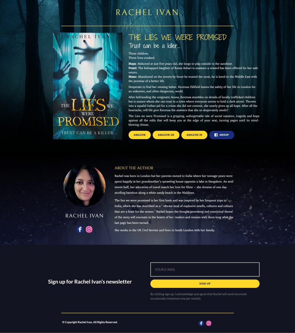
Do you like the contrast of black and mysterious backgrounds even on a digital platform? Well, it is time to try that for your website. On a black background, the magic of white words and simple font can never fail, even if there are only one or two visuals to explore. This is exactly what the website of the author, Rachel Ivan, shows.
Rachel has a one page website, but in most cases it is more than enough for an author if you don’t want to blog on daily basis. What we really like in this site is the simple but really effective structure: book on the top, a nice about author section and a call to action at the bottom. But the strongest point of this author page is the design. The carefully selected background perfectly matches with the book’s story and topic (kidnapping crime thriller).
The website also perfectly fitting to mobile, which is a must today since most of the visitors will be coming from mobile devices. Overall in simplicity this is one of the best author website of 2022.
Kellie Coates Gilbert
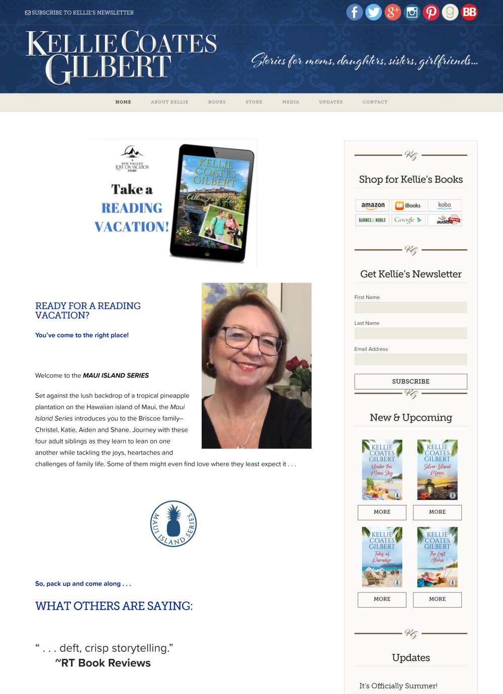
An author is always creative in some way or the other and at least up to some extent. This is exactly what the website of Kellie Coates Gilbert reflects. The landing page shows the gameplay of italic letters of the author’s writing style description and uppercase letters of the author’s name.
Its impact is captivating enough to come out of the belief that italic fonts do not influence well when used on a landing page. The overall organization of content on the landing page can inspire any author who wants to launch a website for its books and other publications.
While the top area of the landing page shows the author name and writing style description along with quick social media links on a blue background, the middle section can exhibit your ideal workpieces, and the remaining can be stuffed underneath. Frankly, the idea of using a single-colored background is good, as it allows focusing on the content.
Miriam Grace Monfredo
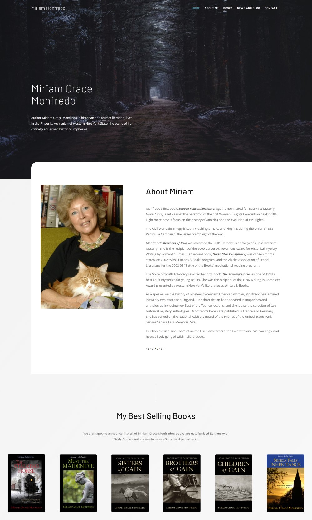
How about a landing webpage that directly tells about your style of writing? Sounds interesting, right? This is exactly what the landing page of the website of Miriam Monfredo does! At first glance, you see an image of a dark forest with the adjacent areas covered in mist. So, what does this tell you?
Well, it says that this area is mysterious, which means that the author prefers writing and solving mysteries. Why not set the website’s feel as per your writing style?
From this webpage, it is simple to conclude that the first image on your website’s landing page is quite important. Although it can be a slider showing a series of two or more visuals, a still image also does its job well.
Kevin Hearne
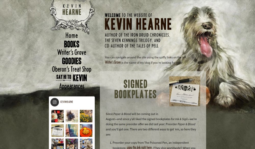
Are you planning to have a background image for the landing page of your website? Well, to know how important it is to have by realizing its impact, visit the website of Kevin Hearne. Its background image will tell you that having such an image matters the most, as it is the source of making the first impression on the mind of a visitor.
You can imagine what will happen if an unclear or distorted image is set at the top of your landing page. It will simply ruin the look and feel of all other components on the webpage. On the landing page of Kevin Hearne, there is a cute image pic of his dog on the contrasting background of white-grey and black.
The rest is simple but striking. What else you need to notice is the sidebar dedicated to Facebook posts on the left, which are nothing but Kevin’s recent activity on it. Isn’t this effectively creative?
Linda Tharp
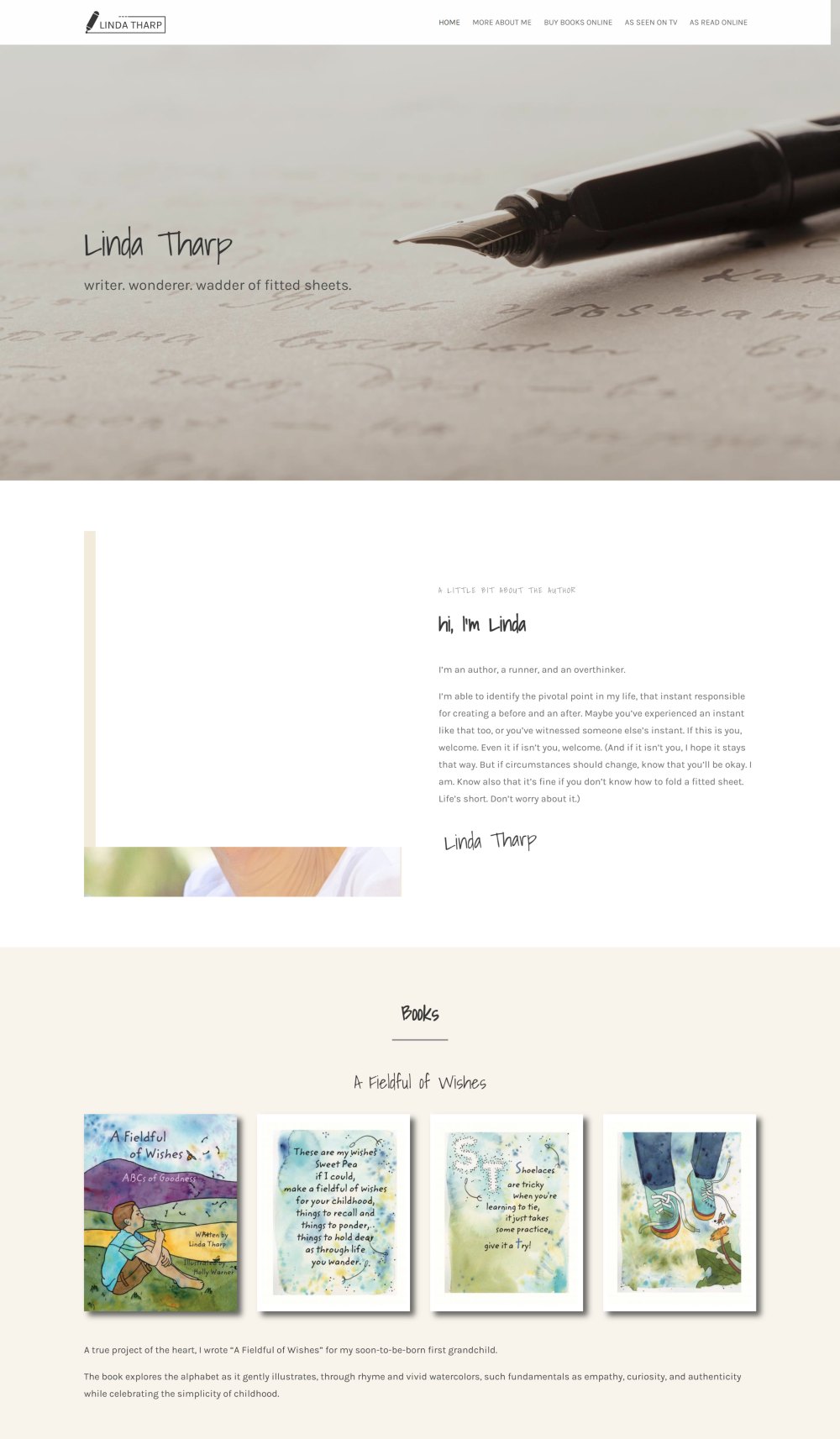
Would you like to make a simple website without extra bells and whistles? If yes, then the website of Linda Tharp can be a great source of inspiration for you. It is an ideal instance of a minimal website of an author.
Unlike the websites of other authors or writers, this one displays the bio of Linda and then reveals her book links. There is a simple image of pen and paper on the landing page with the name of the author, the author’s bio, and her works in the end. This kind of display is ideal for those who have released more than one book and now are in the pursuit of expanding their base of admirers.
Leigh Bardugo
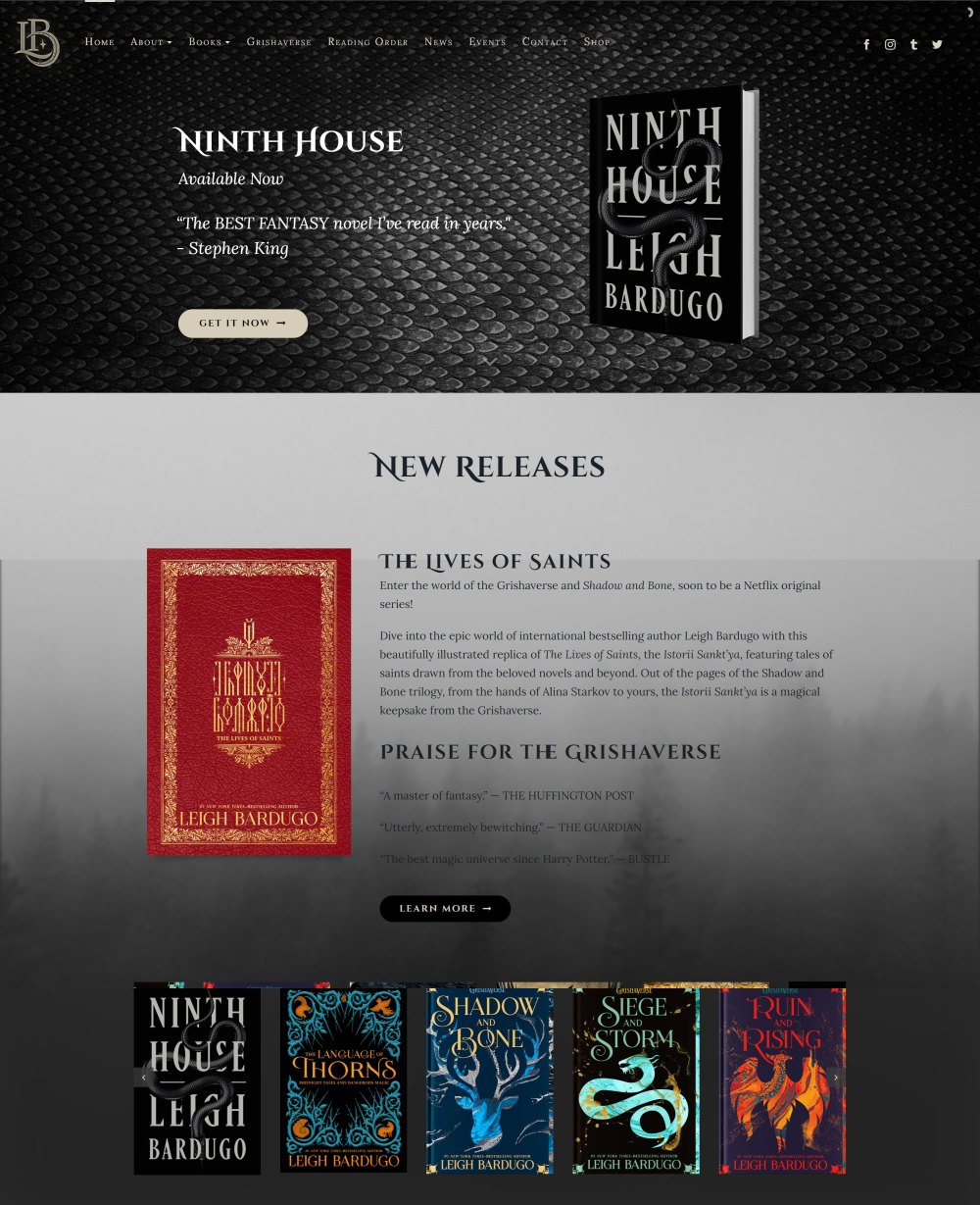
The author has a very beautiful website in terms of design. Great backgrounds and simple structure. We also love the custom font typeface, which works very well with the headlines.
Sometimes less is more, but in case of Leigh’s website everything is on the spot. We also loved the fact that she puts her latest works in the front, users don’t have to scroll, which is important when people are spending only 10-20 seconds on one page.
Chuck Wending
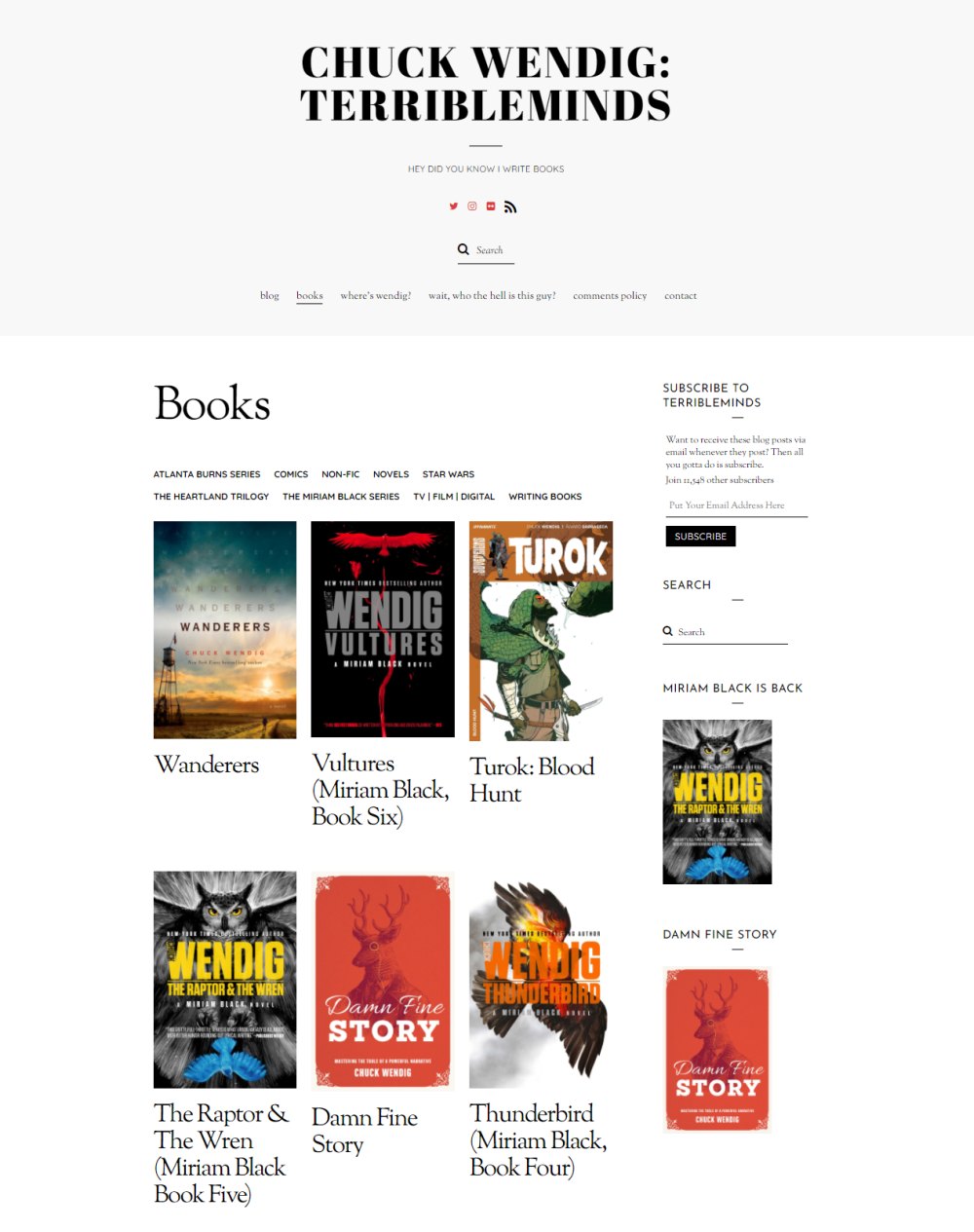
The website of Chuck Wending is quite different from the remaining ones in this list. Consider this design for your website too if you wish to reveal a lot of things; it is an instant inspirer. You will only believe it once you open it.
So, what is so striking about this website? Well, the landing page features a diverse portfolio of Chuck along with an array of his artwork. There is neither background image nor background color.
All his colorful artwork posters are on a white background. You will agree that this page has an ideal mix of black, white, and other colors. Despite no background visual, the look is impressive. Further, it is easy to design such a page, isn’t it?
Above all, the top part of the webpage is distinct due to its quick iconic links to connect with the author and his works via social media platforms. There are also quick links to know where Wending is and who Wending is.
Emma Davies
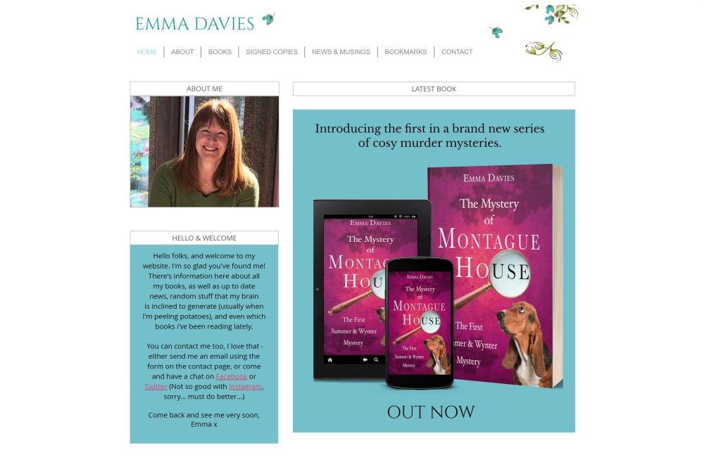
This author’s website is another minimalistic example coupled with artwork reflecting the author’s preferences. Whatever the author wants to reveal has been arranged as thumbnails, which gives a plain but engaging experience to the visitors. The website also looks clean and tidy without any jazzy elements.
Thumbnails provide links to different useful information, namely, about the author, welcome message, and the latest book. The latter is perhaps the first one to grab your attention on the right. This overview section gives you an idea of which book has just been released. You also get to see the cover page. Then, you can join the mailing list to get all updates via e-mails.
Below this exists a collection of cover pages of books written by the author. Clicking any of them takes you to its Amazon page, which is done from the marketing viewpoint. To conclude, this author’s website appeals to those female writers who love a clean and confident look.
Brenda Novak
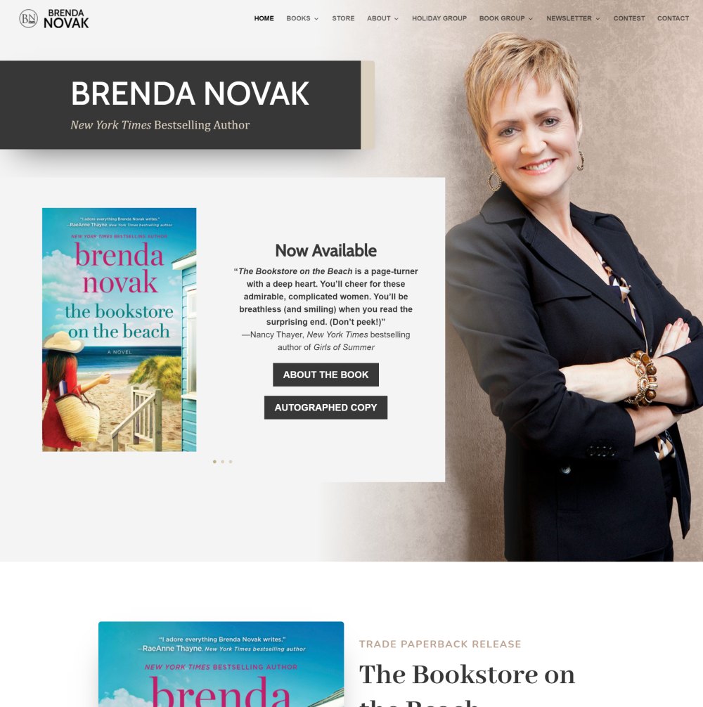
Do you feel that starting a webpage with your bio and work links is boring or is quite traditional? If YES, you are looking for something unique or more creative. Well, it is simply not mandatory to showcase your bio or your work before it. This is exactly what the website of the author, Brenda Novak, proves.
Upon opening it, your eyes first see the author’s picture on the right at the top preceded by the prestigious badge won of ‘New York Time’s bestselling author. Such an idea is for those authors who want to make their websites a collection of their works and sell them simultaneously. Good way of marketing, isn’t it?
One more striking section of the landing page is at the bottom, which reveals the upcoming release along with the time left for its release. Very useful for its fans, isn’t it?
Julie James
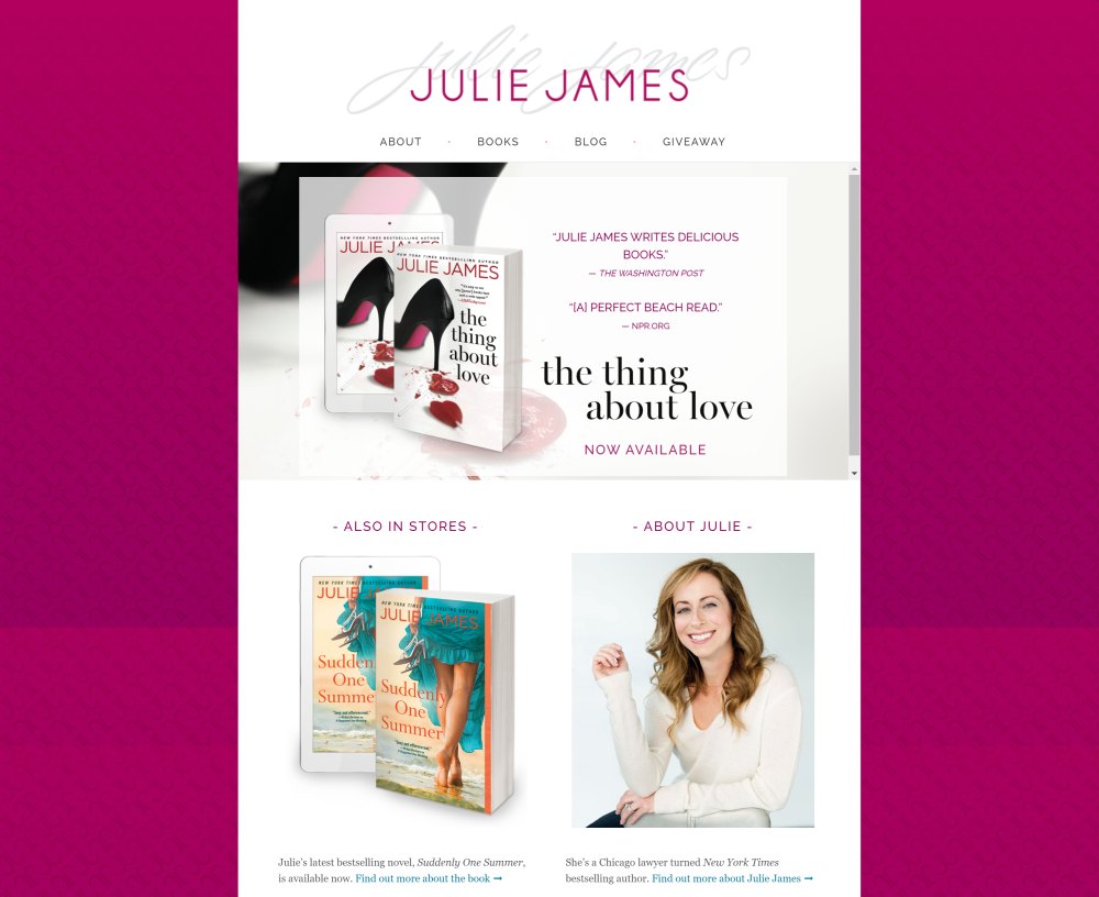
Open this website, and you will find it plainly captivating, as our eyes get diverted to the middle part. Although the page starts with the author’s name written in an attractive font, you are likely to first focus on the currently released or selling book. This makes it stand apart from the websites of other authors.
Just below it are two useful sections namely, coming soon and about the author. Using this landing page design, you can easily exhibit what you are working on at present. There is also a giveaway section to attract interested buyers and sell your stuff to them.
Kami Garcia
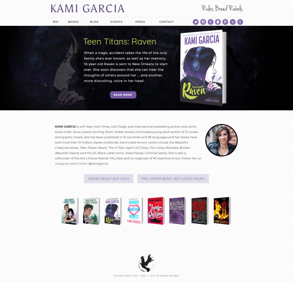
This is perhaps the unique one in the list. All the aforementioned websites are easy to build by using some free themes. However, this one is just different! Kami’s website, at the first glance, gives an impression of the author being creatively professional.
This is because the visuals coming in a slider form on the launch of the page are only possible with the help of a web developer. Additionally, it is responsive and clean. The landing page then introduces the author as a best seller and allows ordering her works by offering the Order Now and Pre-order buttons. This is essential to get more sales.
Austin Kleon
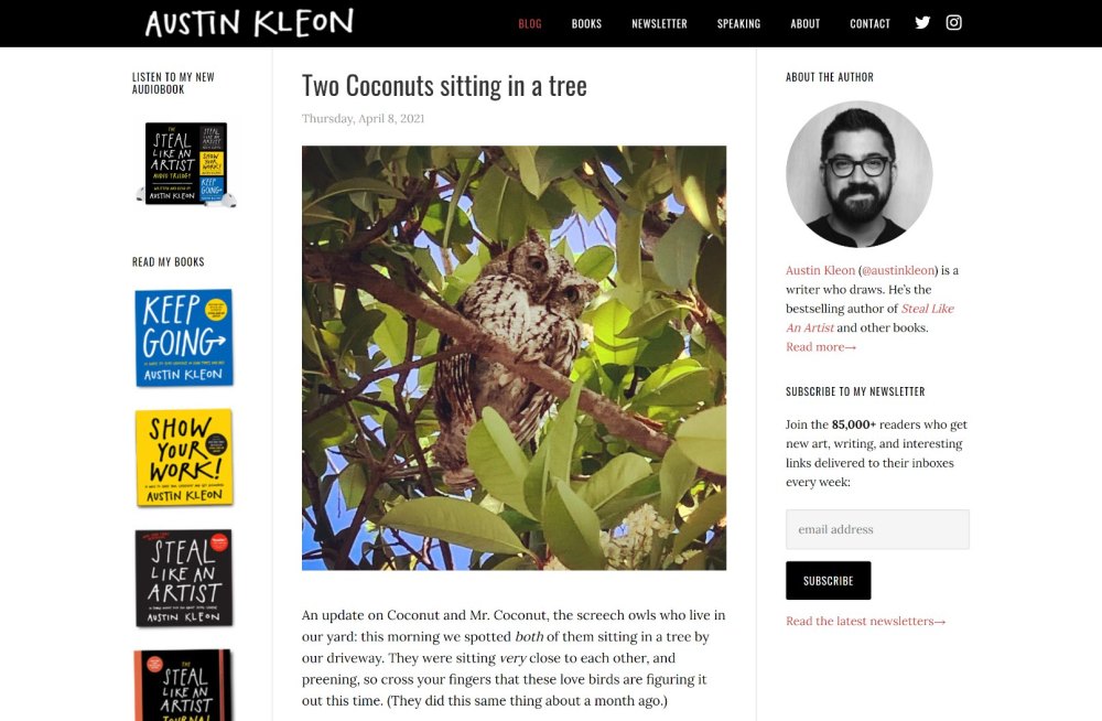
Once an author’s website is made, it should be maintained. In other words, it should be kept updated. Do you think this is a challenging task? Well, it is, at least from time perspective! But all you have to do is learn from Austin Kleon, who does a great job of keeping his website updated. You can be easily inspired!
It is common for your website to remain static (inactive) for a long period unless you can smartly write and release quality books on fixed intervals. Yet, when your fans visit it, you simply do not want them to have that old feel. You want to make them find something new and interesting.
This is what the website of the author, Austin Kleon, does by publishing blog posts regularly. Simple, the visitor knows that the author is still writing something new. So, this website design is for those authors who want to give a reason to the viewers or fans to come back.
David Sedaris
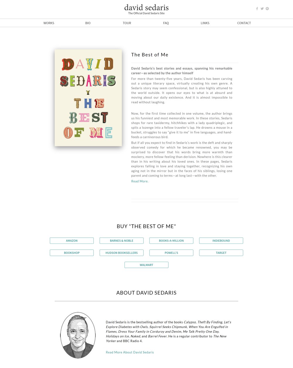
If you as an author believe that your fans or viewers visit an author’s website just to know who you are, it is time to change it! This is because for them, your books and other writing works matter much more than who you are. This is exactly what you will find on the website of David Sedaris.
Upon launching it, you will first see its upcoming or featured book. David is letting its viewers know the start product at present. So, you also can do the same for your current best seller or new release. They are here to know about your book, not to wait for a page to launch.
Further, David’s website is minimalist in terms of design. Thus, it is next to impossible to skip the main news, the new book. Additionally, it helps to load a website faster, which means your visitors will not get frustrated with more load time.
Even more appealing, to those who intend to buy, are the set of buttons that reveal the sources of buying, right from Amazon to Walmart. This is essential to build a lucrative author website. After all, once your book is available, you need to ensure that viewers know from where to purchase it.
Megan McDonald
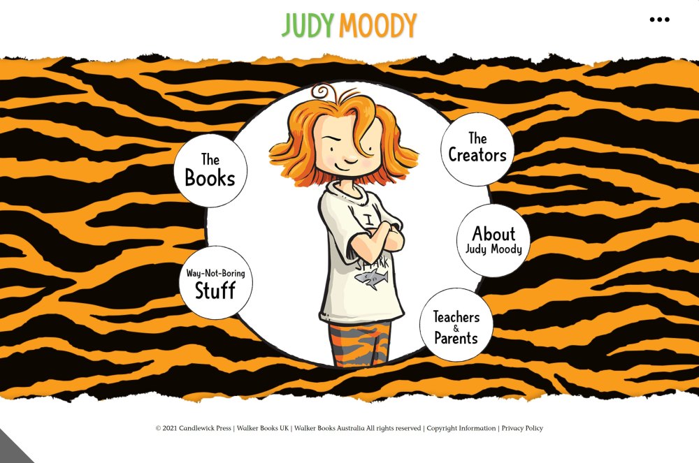
Again, this is another unique author website, as its style is illustrative that can only be done with the help of a web developer. It illustrates the brand to get it straight into the mind of the viewers without any delay. It also shows the author’s specialty area of writing, which is fun children’s books. After all, the best author websites are the wings of the author’s brand.
This design is ideal for branding a series or yourself as an author. If you too are a writer of books for kids, you can consider using the same style, with your unique mascot in the middle and useful links surrounding it, such as books, creators, about me, teachers, and parents.
Conclusion
These are some of the best author websites in terms of presentation and organization of content, which can easily inspire the making of your website. Having a stunning website as author is a must in marketing mix.
You can make an author’s website based on these themes but do not copy them as they are; you need to be distinct in your presentation and organization of your content. So, which one did you like?
