The term “texture” is a catchall term for adding either abstract images, detailed photos, or patterns of different surfaces. Surfaces like metal, cracked paint, sand, etc. are used as an overlay on your image.
This is a type of “compositing” combining multiple images into one finished work. Adding textures to your images can change the mood, create special effects, strengthen the composition or help better tell a story. These five concepts will help you add textures more easily, realistically and quickly in Adobe Photoshop.
Finding textures
While there are tons of free sites out there to get textures from, use these sites with caution. First, if you are creating a finished work that you plan to make money from, you have to have licenses for all elements you used for which you don’t own the copyright.
Many free sites list, in small print and legalese, that the images are not for commercial use, or that attribution must be given in the finished work to the original artist. This can pose a problem for your finished piece unless you want someone else’s copyright statement typed across it. Some free sites also contain stolen images. They use web bots to scrape the internet and copy images to their servers, without the permission of the original artist. Using these images constitutes a copyright violation on your part. If there’s not an explicit grant of rights for you to use an image for your intended purpose by the original artist, DON’T USE THE IMAGE!
Many of these sites also don’t have high-resolution images available for use. While they are fine for lower resolution displays, they are limited for anything that will be produced in print or at a larger resolution.
Careful what you find and use
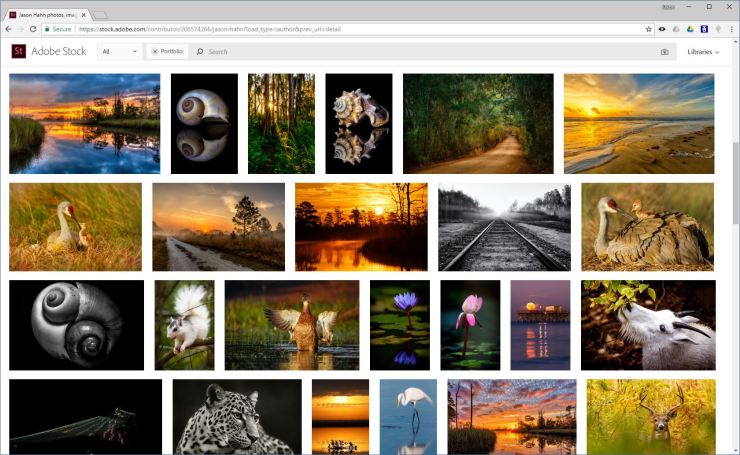
Although the lure of “free stuff” may be tempting, save yourself time and headaches and go through legitimate stock sites. Because it’s integrated fully with Photoshop, I use Adobe Stock. For about two bucks I downloaded two extremely high-resolution files of smoke and fire textures that are licensed for commercial use and fit my project perfectly. If I had to hunt down the same type of images and their owners on free sites, I would have wasted much more time. Something all photographers typically have in short supply!
Wrap to the shape
If using the texture as an overlay, for example wrapping it over someone’s skin in Photoshop, make sure you are using the Transform and Liquify tools to wrap it around their body. While we are working in two dimensions, we are trying to portray something three-dimensional, with sides, curves, and volume. A straight line that doesn’t follow the curves of a body causes an instant disconnect for the viewer, making your work look fake or sloppy. The Liquify tool can be used to gently or dramatically nudge parts of the texture into place so it looks natural. Another tool I frequently use is free transform (Edit → Transform … → Free Transform) to wrap textures into irregular shapes, then use the Liquify tool to refine the wrap.
It’s all about the light!
I know I have said this in many articles on many topics, but it holds just as true here. “It’s all about the light.” When adding textures, make sure that you have identified the characteristics of the existing light sources. This includes color, intensity, and direction. Using a combination of layer blending modes, curves layers, and dodging and burning will help even out the lighting on your textures to make them blend seamlessly with your photo.
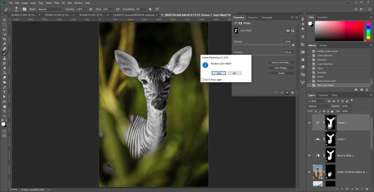
Combining the above two concepts, I present to you the zebra deer, or zeer or … debra?
.mgl-tiles { display: none; } #mgl-gallery-634eba8c6f599 { margin: -5px; width: calc(100% + 10px); } #mgl-gallery-634eba8c6f599 .mgl-box { padding: 5px; } @media screen and (max-width: 768px) { #mgl-gallery-634eba8c6f599 { margin: -5px; width: calc(100% + 10px); } #mgl-gallery-634eba8c6f599 .mgl-box { padding: 5px; } } @media screen and (max-width: 460px) { #mgl-gallery-634eba8c6f599 { margin: -5px; width: calc(100% + 10px); } #mgl-gallery-634eba8c6f599 .mgl-box { padding: 5px; } }
Searching Adobe Stock for a suitable image.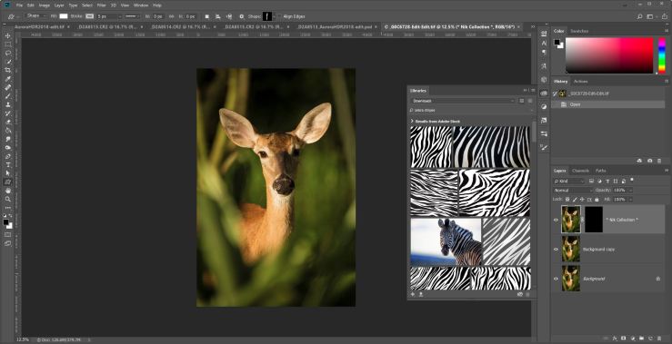
You don’t always have to use a pattern, using an actual photo can provide better results. In the case of the zebra, the strips are so intricate, using an actual zebra’s head makes it all work much better.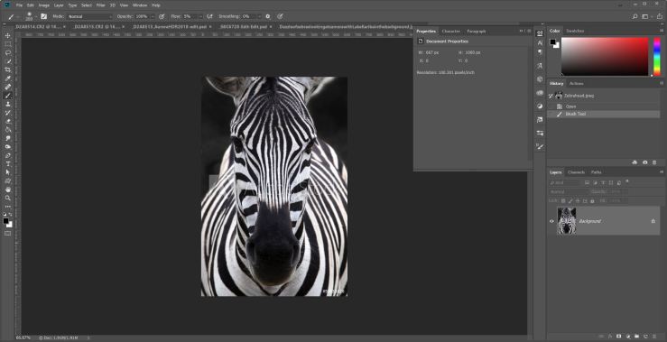
Drag and Drop a preview onto your image to try it out.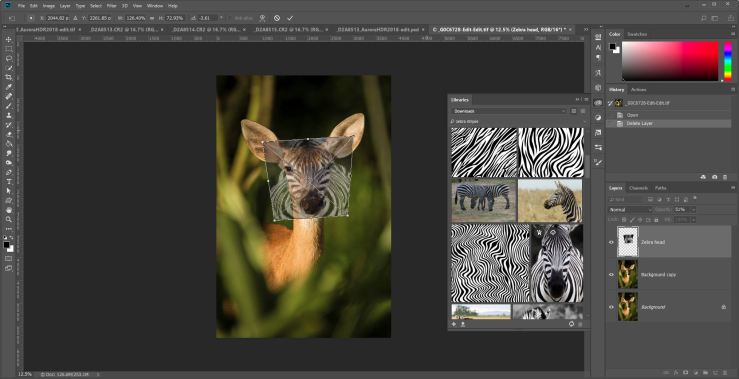
Working with masks, opacity, and transforms, shape the texture image to your subject.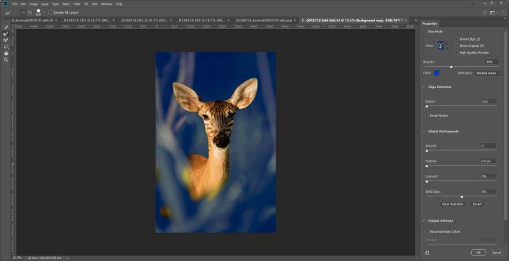
Breaking your subject into parts can be a big help. You don’t have to use just one image to add texture, use several and texture and blend each major part. 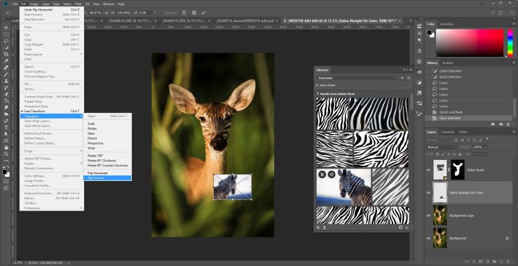
If you are using a photo as a texture, find something that matches your subjects’ general body geometry and pose.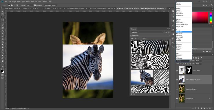
Not doing so will create a lot more work, and not as good of a result. 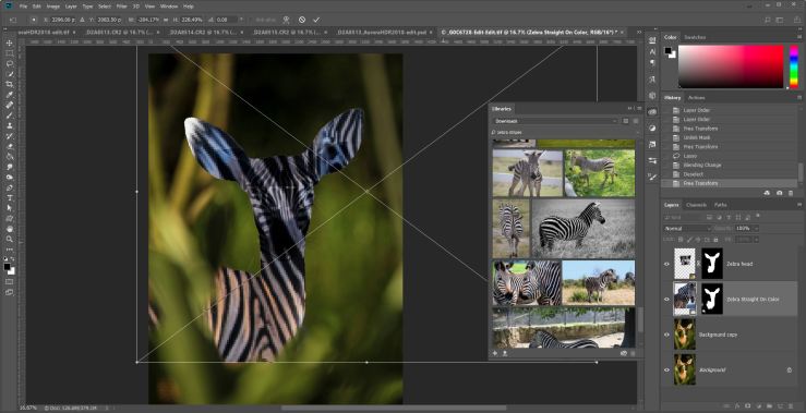
Here the lines cross the whole neck at a diagonal. Studying an actual zebra, this is not right, there should be a break in the middle of the neck.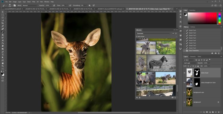
Using the right image isn’t always enough, you will still have to tailor it.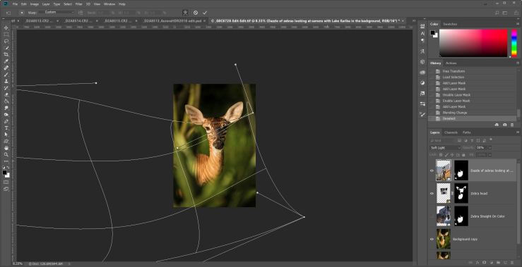
Using the warp tool (Edit –> Transform –> Warp…) is a great way to get the dimensions accurate, by allowing you to more accurately wrap the texture to the shape of the subject.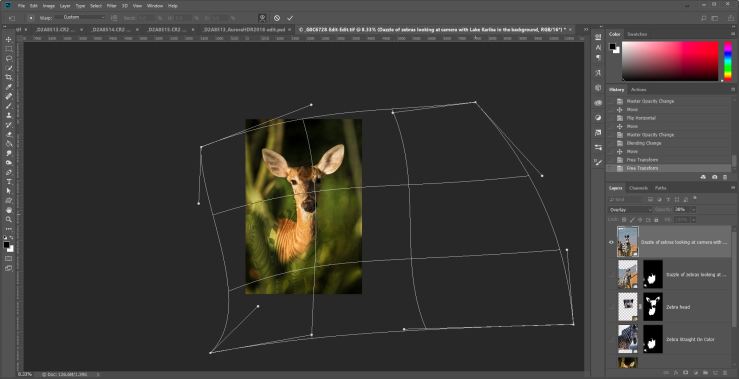
Like this.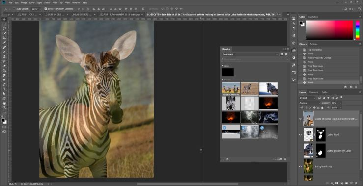
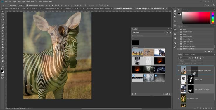
One of the big advantages of using Adobe Stock is you can use previews until you find the right image for your project before you purchase “the one”.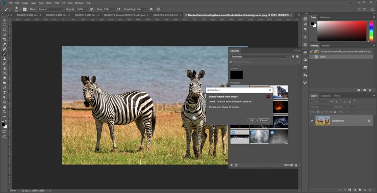
Know when to say when
Like many techniques in the Digital Darkroom, it’s easy and tempting to overdo it with textures. Have a clear idea of why you are adding a texture. Does it create more impact, transform the mood of the image, or improve the composition? Don’t be afraid to experiment and try something new. But, don’t fall into the trap of adding a texture just because you know how to.
Adding a smoke texture to a waterfall can create a misty, foggy look. Not that it necessarily needs it (personally, I think not!), but it could add a nice mood and depth to it if done correctly. Done wrong though, ick!
.mgl-tiles { display: none; } #mgl-gallery-634eba8c721bc { margin: -5px; width: calc(100% + 10px); } #mgl-gallery-634eba8c721bc .mgl-box { padding: 5px; } @media screen and (max-width: 768px) { #mgl-gallery-634eba8c721bc { margin: -5px; width: calc(100% + 10px); } #mgl-gallery-634eba8c721bc .mgl-box { padding: 5px; } } @media screen and (max-width: 460px) { #mgl-gallery-634eba8c721bc { margin: -5px; width: calc(100% + 10px); } #mgl-gallery-634eba8c721bc .mgl-box { padding: 5px; } }
Original image – no texture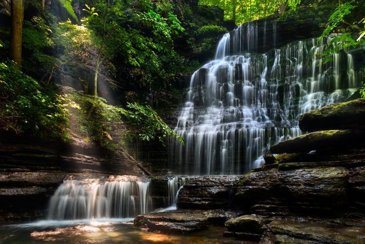
Some smoke texture
More smoke texture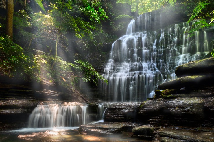
Um…no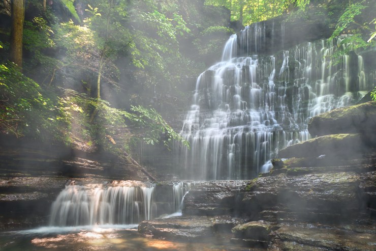
Take a break
After you have your image the way you like it, get up from your computer, walk away and take a break. It’s important to periodically take breaks and look at your image with fresh eyes. Or, have someone else take a peek. When we look at an image for too long we lose objectivity and adapt to things like color casts or composition issues. When you come back, what is your first reaction? If your first instinct is that it seems too artificial, flat, etc., it probably is. Make adjustments, take another break, and repeat until you are happy with the results.
Tell your story with the second annual Visual Storytelling Conference!
Experience four days of interactive, online training sessions featuring a range of educational content with experienced photographers and content creators. This free event kicks off with a series of technical boot camps to build essential skills, followed by live, online sessions on photography, video, business and social media. Join live from March 10-13, 2022!
