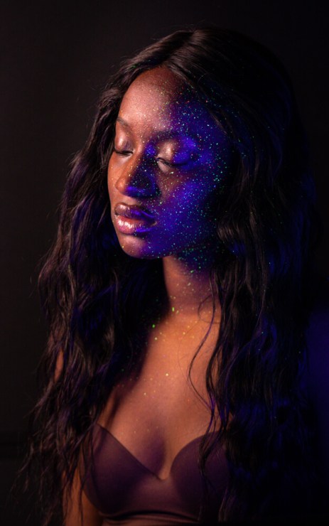
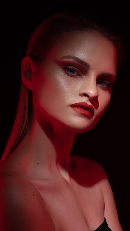
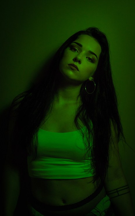
Adding additional color to an image that otherwise might not be there is one of the most powerful ways to be creative when it comes to photography. You can do this by using gels/cellophane, light painting, black light, a projector, or even a poster and tape.
Before we talk about how you can add it, let’s talk about color theory and how colors can influence our photos. Being aware of some of the science and techniques when it comes to color can help improve your overall photography.
The color wheel

I would first recommend studying the color wheel. This will help you understand the relationships and compositions between colors. Understanding these will help you to capture balanced color in your images. It will also help you to create images that may be unbalanced. Adobe has a great tool to help you learn these harmonies.
Monochromatic
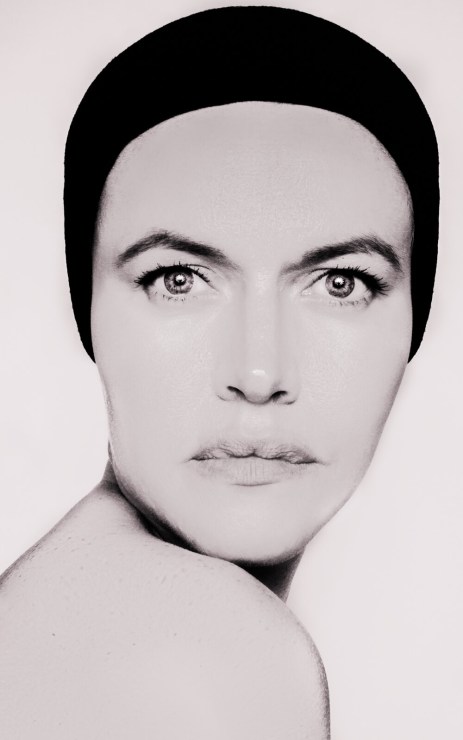
Monochromatic is various shades of the same color. For instance, a black and white photo is monochromatic. The entire image is differing amounts of light instead of different hues.
Complementary
Complementary are opposite on the color wheel. Select a color anywhere on the wheel. Then to find the complement, look at the color that sits directly opposite of it.
Analogous
Analogous are three colors that sit next to each other on the color wheel. This type of scheme is ideal to use in landscape and nature photography. Analogous colors feel like they belong together. They blend and create a sense of natural harmony.
Split complementary
Split complementary rather than the colors complementary, you use the two neighboring colors. This type of scheme is also known as a double complementary. Start by selecting the main color, then select two colors that are on either side of its complementary color.
Triadic
Triadic uses three colors evenly spaced around the color wheel. This scheme makes for vivid images because it uses three contrasting colors.
Tetradic
Tetradic uses a combination of four colors that consist of two sets of complementary colors. For example, purple and blue-green plus yellow-green and red. These form a rectangle on the color wheel creating a tetradic scheme.
Emotions

Don’t think of color in photography as being too scientific. Using it in photography can be really fun and exciting. Causing people to have certain emotions when looking at your image.
Using color to affect the mood of your image is a great way to add meaning to your photography. Below are some colors associated with the emotions they can convey.
- Red – excitement, strength, love
- Orange – creative, playfulness, warmth
- Yellow – cheerfulness, friendliness, creativity
- Green – natural, balance, growth
- Blue – cold, sadness, trust.
- Pink — sweet, compassion, softness
- Purple – royalty, spirituality, ambition
- Brown — rugged, dependable, trustworthy
- Black — dramatic, security, elegant
- White — clean, simple, innocence
Adding color

Below are a few ways you can instantly add color to your images.
Setting up and positioning your light source
While placing your light sources closer to your subject will help provide more saturated colors, the brighter your light source, the less color you’ll see in your final image. So bring that light close, but scale back on its power some.
Using gels
When using gels you can make your backdrop or seamless and appear more saturated than it really is. Simply gel your background lights with the same color as the backdrop.
Darker gels, such as deep reds or blues, block a portion of the light that the flash gives off. When working with these deeper shades, you may need to increase light power or place your lights closer to your subject.
And if you don’t have a full set of gels try experimenting with layering them. Place one on top of the other and create new colors. When doing so remember that doubling up will block more light and may require additional power or a closer placement.
Keep in mind, too, that colored cellophane will melt if it is placed too close to the modeling lamp. Which can in turn cause major damage to the lamp itself. To avoid this, turn off all modeling lamps after the power and positions are adjusted for the shoot. Secure your gel around the front of the light when securing it.
Other things to consider
- Change your white balance in the camera. If you are shooting outside use the incandescent setting.
- Different skin tones will give you varying results with your color.
- Lightroom, Photoshop and Luminar are your friends. Pull your images into a program to edit and tweak the hue, saturation and luminance sliders until you get your desired look.
Creating your own looks and being creative with color

Color is a great way to make your images really stand out. Whether in camera or in post-processing, it can change the mood and atmosphere of the image. So, play around. Experiment. Try something creative.
Tell your story with the second annual Visual Storytelling Conference!
Experience four days of interactive, online training sessions featuring a range of educational content with experienced photographers and content creators. This free event kicks off with a series of technical boot camps to build essential skills, followed by live, online sessions on photography, video, business and social media. Join live from March 10-13, 2022!
