I’ve been frequently asked to help take pictures (with a cellphone) simply because I’m a photographer and therefore MUST make better pictures than those coming from an average joe. Probably not always true, but I feel that there are some elements to know that could help everyone take better pictures even with a phone.
As a disclaimer, I shall say that this is NOT A RECIPE. When I shoot for myself, I shoot out of love. I choose and design my images based on feeling what is evoked when I come across an image and how it jumps out to me personally. These are some elements that work for me. Hopefully, you’ll be able to see several elements combined in the pictures scattered along here.
Using design elements to create your images
How you choose to compose/design your images is up to you and your approach as a creative artist. Hopefully, these elements can help you build confidence in what you create and capture. If you’re shooting for someone else hopefully they have a soul and have come to you because your vision speaks to them too.
With all visual art, there are design and compositional elements that can help you create powerful imagery. Through my short-lived formal education in graphic design, I’ve learned these elements and have adapted and merged them into my photography. From everyday snapshots to formal edits in portraiture, these elements have benefited me when I have needed a starting point for a shoot or when I have needed additional ideas.
Please note — there may be terms that you might not understand.
Feel free to comment and ask what I mean!
Lines
There are many different types of lines, but photography tends to really focus on vertical, horizontal and diagonal lines rather than contour, implied and other lines. All three of the main lines can be used to convey different moods. Vertical lines help show majesty and greatness in height, horizontal help show stability and calmness, and diagonal lines help show movement and direction.
Look for lines that lead to your subject. In most cases, you can use walls, corners, fences and/or stairs as lines to lead across the frame and toward your point of focus. The lines don’t always have to be straight; contoured curves from roads or pathways can also help shape the image’s flow and create something dynamically interesting. Sometimes a slant is all that’s needed to make a boring picture feel edgier. Feel it out.
It’s also important to pay attention to lines to avoid a composition that has an awkward flow or feels boxy. For instance, try not to have a bunch of lines leading through someone’s head, unless you intend to/can’t avoid including it or are just going to edit it out. Be aware of some unwanted lines like power lines.

Contrast design elements
When I think about contrast, my mind automatically goes to black and white portraits. I feel that B&W photos rely heavily on the principle of contrast to create a shape. If you study some old black and white film photographers, you’ll find some great examples of contrast as a design element.
Contrast is the total difference between light and dark areas. The greater the difference, the more your eyes are attracted to the area! Think about your whites and your blacks, how they’re balanced and where they’re placed. Plan out where you want shadows to fall in relation to the light that is hitting your subject.
Lighting can be of great help to add contrast and to create/accentuate shape in a portrait so study lighting patterns! When I shoot portraits, the Rembrandt lighting pattern is one that I often try first just because the way the shadows fall defines the shape of the face and creates drama.
Now go a step further and think about color and the values that you can use to create light and dark areas. A wardrobe can be another huge help in adding contrast, so plan your shoots well! Try bright yellows on some dark blues or purples get creative!
If you’ve checked out my work, you’ll see that I’m a big fan of blondes in black and white totally my fave, and I really enjoy shooting with chiaroscuro in mind to display contrast.

Color
This can be a whole separate topic, and if it’s requested, I can probably dive deep into it. Color can be powerful. Color can enforce a meaning and a mood and is something that can be combined with other elements to really make something impactful. Think about some warm, vibrant photos taken during the Golden Hour in California or happy photos. Now think about edgy-dramatic-killer-cool-photos or um, depressing photos. (It’s really funny, try searching depressed photography. You’ll see.)
You can change the feeling of the photo by a simple change in color temperature in Adobe Camera RAW. You can also draw attention by the placement of certain colors, or subjects wearing colors that pop against other colors in the background. To improve your theory in this area, look up color harmonies and study the color wheel! If you’re feeling more advanced, try using multiple lights with different colored gels on them.
Oh, besides wardrobe and what colors you want people to wear, think about makeup colors because that can add some color in an interesting way as well.

Space
I love space. Not the kind of space that I’ve heard girls tell their boyfriends they need, but the white space or negative space that is left empty in a captured frame widely known application of space. But the element of space is much more than just negative space. It involves the capture or creation of depth, framing and many other elements of composition which I also love.
Space can be achieved and displayed in numerous ways the easiest being through framing and the hardest through the depth of field. For framing, try backing up and making your subject rather small on a big blank wall. With the depth of field, let’s say you’ve found a detailed hallway; you could experiment with different aperture settings to show or not show the details of the hallway. You could also try shooting wide so you can crop in afterward and experiment with how much space you would allow around your subject. Also, the Rule of Thirds can be a useful quick hand to guide your use of space.
The only practical advice I want to give is this (which is specific to all of you new business/corporate portrait photographers, so listen up): leave some headroom. I only mention that because I’ve personally received a really horrid crop of formal corporate pictures. I’d say at least a good 13% enjoy seeing their hair along with their foreheads. That may or may not be a made-up statistic, but my point still stands.
Tension design elements
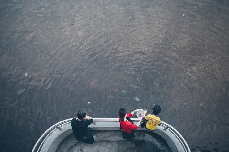
Someone once explained tension in the graphic design world as a conversation between the different compositional elements or subjects, including the viewer. The conversation can be loud and crazy or whisper quiet. They can be close together or really far from each other. A subject could even have a conversation with the edge of the frame!
The viewer can feel tension if the imagery and/or subjects provoke feelings or expectations, or display personal points of view or even past experiences. Quite the twist on things wouldn’t you say?
I’m a pretty big fan of using this for my more artsy pictures and street portraits. My main use of tension is typically seen in the imbalance and asymmetry caused by the placement of the subject or subjects to each other or an edge. This kind of tension is typically increased depending on how asymmetrical everything is.

The TL:DR version
- Lines — Lead toward your focus point. Watch out for power lines.
- Shape/Contrast — Make use of bright areas and dark areas.
- Color — Spin the Color Wheel and study it while it spins. Make good wardrobe/color choices.
- Space — Don’t cut off heads. Show depth — or don’t show depth.
- Tension — Create imbalance. Create feeling.
One of my former teachers told me that good design incorporates at least 3 elements (from this list and many more out there). I couldn’t name all the elements that the teacher helped me learn, but I do know that the elements listed above have stuck with me because they really do mesh and work well together.
The more compositional elements you’re able to give thought to, the more powerful, rewarding and attractive your work will become. You will become more expressive as a photographer and you will grow much more in your skills. Plus, your cool factor will go up when you can actually explain your process and why you took a shot the way you did.
Oh yeah, if you’re bored, try using each element as an exercise for creativity especially when you’re in a rut.
.mgl-tiles { display: none; } #mgl-gallery-634ebfd5360db { margin: -5px; width: calc(100% + 10px); } #mgl-gallery-634ebfd5360db .mgl-box { padding: 5px; } @media screen and (max-width: 768px) { #mgl-gallery-634ebfd5360db { margin: -5px; width: calc(100% + 10px); } #mgl-gallery-634ebfd5360db .mgl-box { padding: 5px; } } @media screen and (max-width: 460px) { #mgl-gallery-634ebfd5360db { margin: -5px; width: calc(100% + 10px); } #mgl-gallery-634ebfd5360db .mgl-box { padding: 5px; } }
What is it that draws your eye around the image?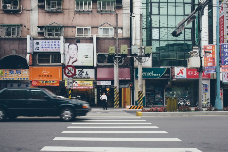
The color and space of this brings this together forme.
Contrast between the girl and the boy as well as her pose, shape and emotion create tension.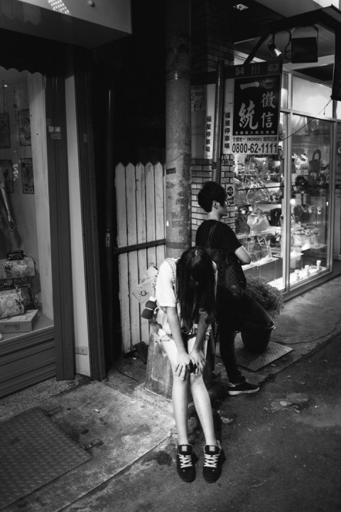
The stark contrast of the couple against the brighter brick combined with the leading S curve lines among other lines help create a leading movement.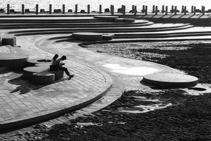
The patterns of light and line along with the contrast of this image help set the mood and guide the eyes to the person. I waiting till this lady’s waist matched up with the shadow.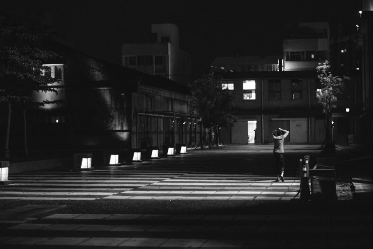
There is tension in this image on many levels. View the two bikes, the couple, the balance and positioning of both the bench and the bikes. The contrast of the right side of the frame compared to the left also creates tension. The positioning of the couple and their body language is more tension. 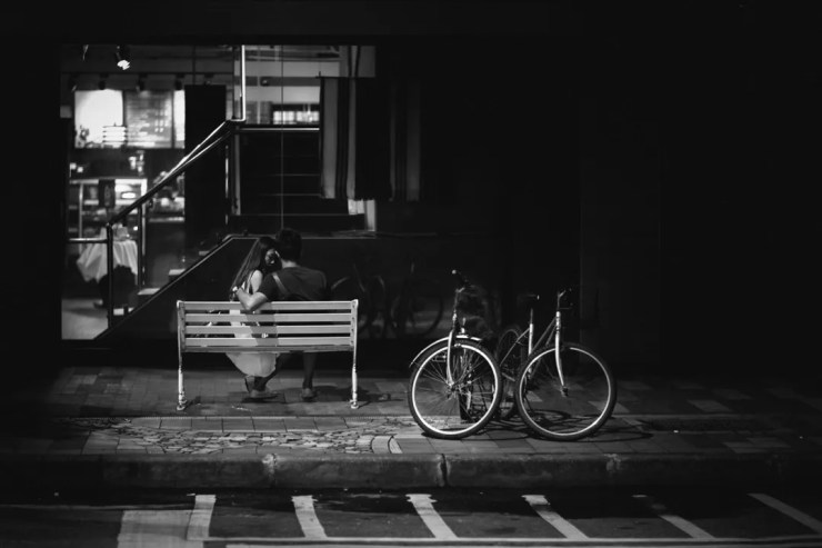
Horizontal lines create stability. This man isn’t going anywhere. That’s stable right?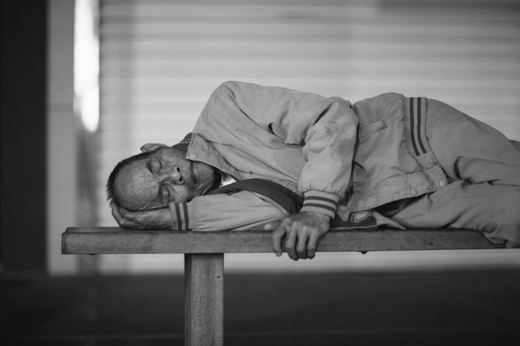
I really enjoyed the color of this as well as the space and relationship between the people.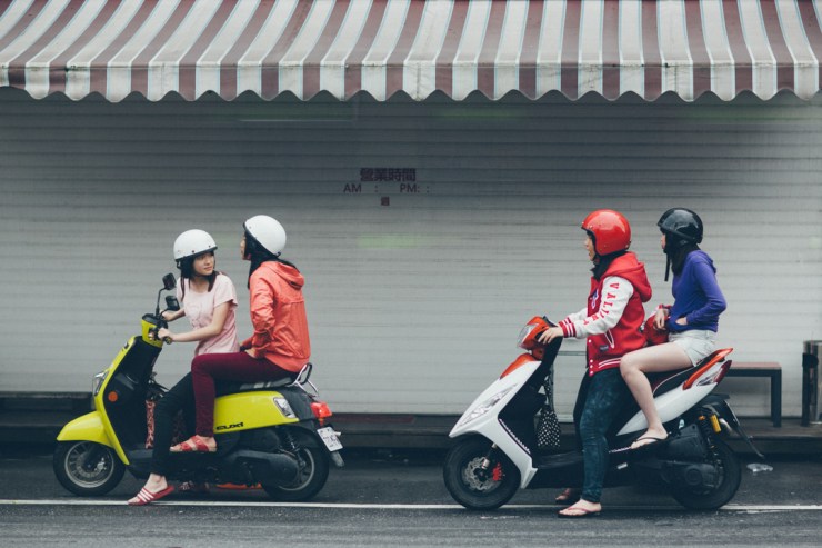
Contrast of the right side of the frame compared to the left combined with the color contrast of the dress and the blue stripe make this image attractive to me.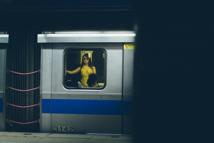
Tell your story with the second annual Visual Storytelling Conference!
Experience four days of interactive, online training sessions featuring a range of educational content with experienced photographers and content creators. This free event kicks off with a series of technical boot camps to build essential skills, followed by live, online sessions on photography, video, business and social media. Join live from March 10-13, 2022!
