Something to consider when styling and composing for a still life photoshoot is whether or not to use height — and I am not referring to standing on a ladder. If all of the items in your scene are fairly flat to the background, how will you place or angle your camera so that the viewer can see all of the items in your image? Let’s look at using varied heights to shoot with.
Using height for framing
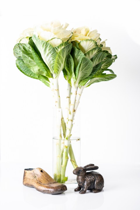
If you have some items that are different heights, shooting directly straight on cannot only frame your subject but give a sense of scale and height. For instance, if you had a multilayered chocolate cake and you shot from above only, you would not know how many layers it had, only that it was perhaps round and was frosted. But if you shot from straight on, you could see how many layers, especially if there was a slice removed and placed on the side.
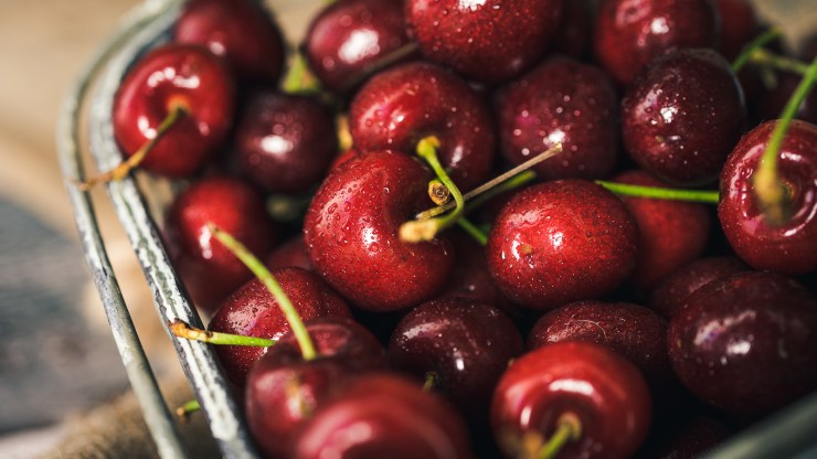
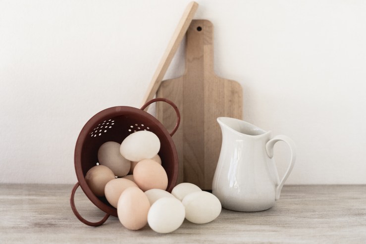
You can also use different heights within your scene to frame the subject, placing things of greater value on a different level from other objects in the scene. Perhaps a bowl of cherries or eggs and the focal point was the very one at the top. The photo does not necessarily need to be in portrait or landscape either, as both can work well.
.mgl-tiles { display: none; } #mgl-gallery-634ecd95e7840 { margin: -5px; width: calc(100% + 10px); } #mgl-gallery-634ecd95e7840 .mgl-box { padding: 5px; } @media screen and (max-width: 768px) { #mgl-gallery-634ecd95e7840 { margin: -5px; width: calc(100% + 10px); } #mgl-gallery-634ecd95e7840 .mgl-box { padding: 5px; } } @media screen and (max-width: 460px) { #mgl-gallery-634ecd95e7840 { margin: -5px; width: calc(100% + 10px); } #mgl-gallery-634ecd95e7840 .mgl-box { padding: 5px; } }
Photographing at an angle for the appearance of height
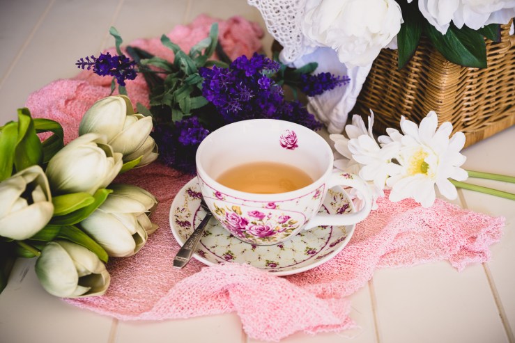
Sometimes you would like to convey a sense of height, but the actual height is not quite as important as other items in the scene can be. Perhaps a vase of flowers or crate gives you height, but just out of focus would like to place a cup of tea and a book to help tell more of a story. They do not need as much focus as the flowers, but they still need to be in the shot.
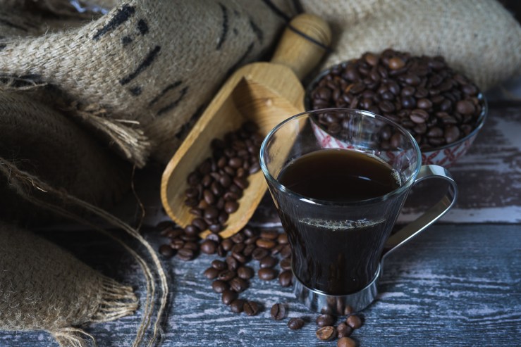
This is where shooting on an angle can give a sense of depth to an image. Try 25, 45 or 75-degree angles, which are generally common settings, but there is no written rule as to what you must use. Experiment and play; each image can call for something different. In the coffee story photo, all of the elements are visible due to the angle I have shot at, as well as the glass coffee mug intentionally used to see through.
.mgl-tiles { display: none; } #mgl-gallery-634ecd95e88e0 { margin: -5px; width: calc(100% + 10px); } #mgl-gallery-634ecd95e88e0 .mgl-box { padding: 5px; } @media screen and (max-width: 768px) { #mgl-gallery-634ecd95e88e0 { margin: -5px; width: calc(100% + 10px); } #mgl-gallery-634ecd95e88e0 .mgl-box { padding: 5px; } } @media screen and (max-width: 460px) { #mgl-gallery-634ecd95e88e0 { margin: -5px; width: calc(100% + 10px); } #mgl-gallery-634ecd95e88e0 .mgl-box { padding: 5px; } }
Flat Lay
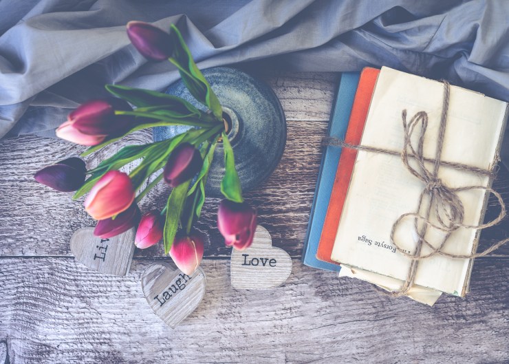
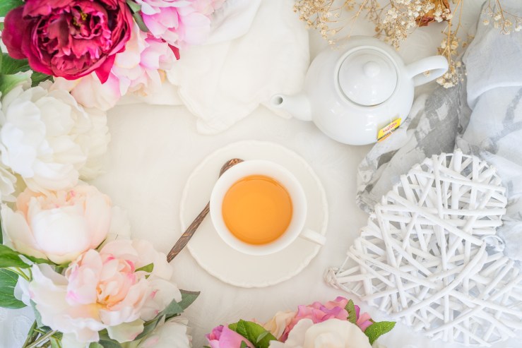
Introducing a top-down Flat Lay can solve this issue if everything is fairly flat in your scene. Getting the camera directly over your scene can often be tricky. If it is on a table, you may need to stand on a chair or ladder and that can be quite dangerous. I recommend having flat boards that can resemble a tabletop and placing them on the floor or lower table to make it easier (and safer) to hold your camera over.
Using a tripod with an extension arm that places your camera directly over your subject is wonderful as well. Just make sure they are securely weighted down with a sandbag or similar to prevent the tripod from tipping over, which could cause damage to yourself and your camera gear.
.mgl-tiles { display: none; } #mgl-gallery-634ecd95e9189 { margin: -5px; width: calc(100% + 10px); } #mgl-gallery-634ecd95e9189 .mgl-box { padding: 5px; } @media screen and (max-width: 768px) { #mgl-gallery-634ecd95e9189 { margin: -5px; width: calc(100% + 10px); } #mgl-gallery-634ecd95e9189 .mgl-box { padding: 5px; } } @media screen and (max-width: 460px) { #mgl-gallery-634ecd95e9189 { margin: -5px; width: calc(100% + 10px); } #mgl-gallery-634ecd95e9189 .mgl-box { padding: 5px; } }
Negative space
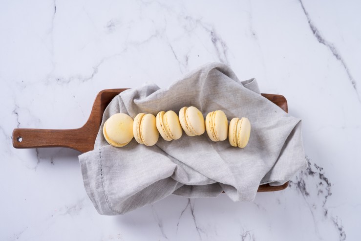
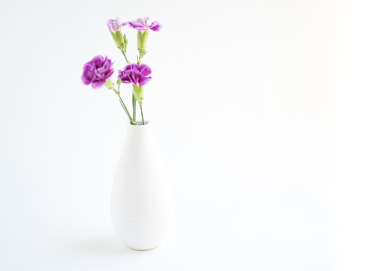
Sometimes it is nice to give the viewer some room to breathe (i.e. don’t zoom in all the way) and let there be some negative space in the picture. It’s soothing on the eyes and mind, especially if you are doing a more editorial-style shoot with multiple images. Sure, you can shoot up close and highlight the fine details. But also be sure to pull back and show more of the overall concept, including any height in the image.
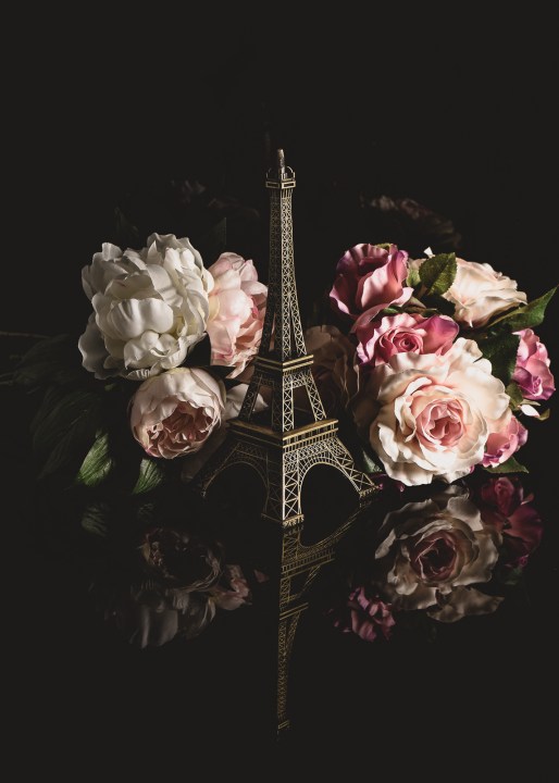
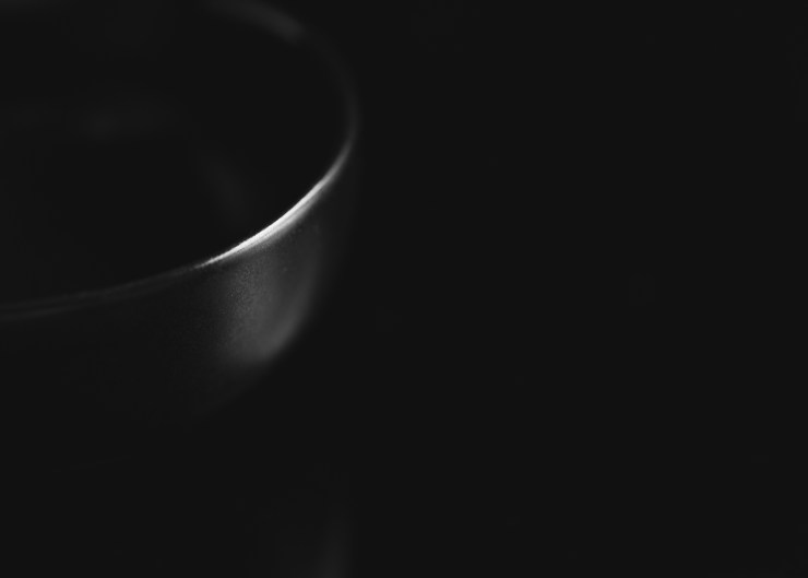
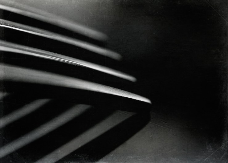
Do not be afraid of having lots of black or white space in your image (or any other color, really). Especially in the case of white on white or neutral on neutral. Using silhouettes on black can add a sense of drama and intrigue, as well as being minimalistic and engaging.
.mgl-tiles { display: none; } #mgl-gallery-634ecd95e9b74 { margin: -5px; width: calc(100% + 10px); } #mgl-gallery-634ecd95e9b74 .mgl-box { padding: 5px; } @media screen and (max-width: 768px) { #mgl-gallery-634ecd95e9b74 { margin: -5px; width: calc(100% + 10px); } #mgl-gallery-634ecd95e9b74 .mgl-box { padding: 5px; } } @media screen and (max-width: 460px) { #mgl-gallery-634ecd95e9b74 { margin: -5px; width: calc(100% + 10px); } #mgl-gallery-634ecd95e9b74 .mgl-box { padding: 5px; } }
Tell your story with the second annual Visual Storytelling Conference!
Experience four days of interactive, online training sessions featuring a range of educational content with experienced photographers and content creators. This free event kicks off with a series of technical boot camps to build essential skills, followed by live, online sessions on photography, video, business and social media. Join live from March 10-13, 2022!
