Environmental portraits show people in their place and their habitat. The environment sets the mood and the place of the story, and a single look at the photograph can tell you what the story is about. Let me show you three things I think about as I light the background to make an environment worth photographing.
1. Make it believable
Lighting and posing a person so he looks his best is my primary concern. (Here are two other articles about lighting and posing to help people look great.) After that’s under control, I’ve got to figure out what the background will be, and how bright to make it. Most of the time, it’s got to look believable, and I like it to look like a good picture, not a well-lit picture. I don’t want someone to say, “Oh, this guy has a nice light from a flash on his face”.
For instance, I needed to photograph this high school teacher in the cafeteria, but the sun was not shining in the windows, and the room was quite dark. I made this first picture and you can see that the teacher is well lit, but the rest of the room is so dark that it’s apparent there’s a light shining on him.
.mgl-tiles { display: none; } #mgl-gallery-634ecde2aae96 { margin: -5px; width: calc(100% + 10px); } #mgl-gallery-634ecde2aae96 .mgl-box { padding: 5px; } @media screen and (max-width: 768px) { #mgl-gallery-634ecde2aae96 { margin: -5px; width: calc(100% + 10px); } #mgl-gallery-634ecde2aae96 .mgl-box { padding: 5px; } } @media screen and (max-width: 460px) { #mgl-gallery-634ecde2aae96 { margin: -5px; width: calc(100% + 10px); } #mgl-gallery-634ecde2aae96 .mgl-box { padding: 5px; } }
Panasonic Lumix GH4, Leica Nocticron 42.5mm f/1.2 lens, f/1.2, 1/320s, ISO 100.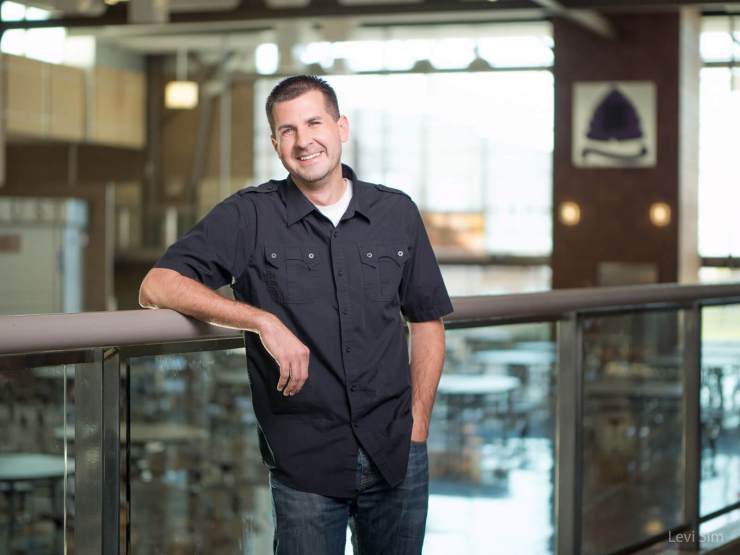
Panasonic Lumix GH4, Leica Nocticron 42.5mm f/1.2 lens, f/1.2, 1/320s, ISO 100.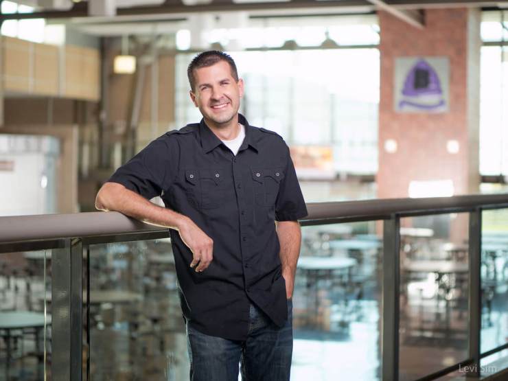
In the second portrait, my assistant set up a strobe to add lighten up the background. The light on the teacher is from a white, 86″ Paul C. Buff PLM brought in as close as possible without being in the frame; the background light is a bare-bulb strobe pointing generally toward the brick wall. With all this light in the room, it’s more believable that there could be light shining on the teacher, too. Plus, the background light illuminates the school’s logo, and that adds relevance to a portrait of a teacher.
2. Make environmental portraits relevant
It’s important to tell a story that makes sense. Photograph a doctor in a clinic, and photograph a landscape architect in front of a property. If you photograph a doctor outdoors, it doesn’t really make sense, and even less so to photograph an architect in a doctor’s office.

We found a nice looking home with well-tended landscaping to photograph this architect, and styled her with some sketchbooks and plot maps so she looks real–she’s holding the tools of her trade. A person working in her place is relevant.
As far as the background goes, I knew I’d need a polarizer to show the colors of the plants vibrantly and to reduce the glare on the windows and rocks. (Here’re two articles about polarizing portraits for better color and less retouching) I also lucked out: there was a solar eclipse going on, so the sky was clear, but not as bright as with full sun–it was like an ND filter on the sun! With full sun, I would have a harder time shooting at f/1.8 and staying within my flash sync speed.
I made several frames without my flash firing until I had the settings just right to make the background look great, then I added the flash on the architect. This is the simplest way to balance your flash with available/ambient light: begin with the flash powered off. Again, I used the white 86″ Paul C. Buff PLM on a c-stand and my assistant held on to it tightly so it wouldn’t blow over.
These doctors practice integrative medicine, so showing their tools makes the picture relevant and tells a lot about them at a glance. The coats and stethoscopes represent traditional Western medicine, while the herbal medicines and treatments in the background represent the other tools they use.
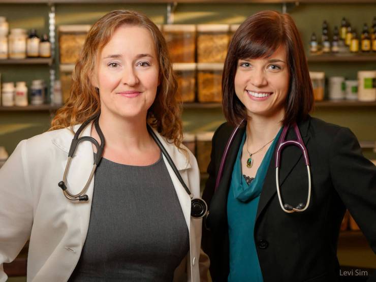
The light on the doctors upfront is from a single speedlight in a Westcott Rapid Box, which provides a soft light for their faces. The background is tricky, though. It’s a very small room, with fluorescent lights overhead, and a window on the right that had no light shining through it. I figured anywhere I put a light inside the room would look like a room with a flash shining in it. So, I put an orange (CTO) gel on a second speedlight, placed it high on a stand outside the window, zoomed the flash head as tight as possible, and positioned the louvers on the blinds so they would cast shadows.
The idea was to mimic warm sunlight shining through the window, and I think it turned out pretty good. The light illuminates the product to give a sense of place, and it makes it clear that there’s a window in the room, which also helps the clinic to appear warm and open–not like an interior medical office that feels sterile. I think it helps with my third consideration for background lighting, as well: it’s gotta be interesting.
3. Make it interesting
When you make an editorial or environmental portrait, the environment has to be interesting, or it might as well be a studio shot. Not everyone has an office full of depth and character, or there might be other privacy concerns that limit the places you can photograph. My next subject worked in a government building, and we couldn’t shoot in her office because they couldn’t risk sensitive information being visible. The only place we could shoot was the conference room.
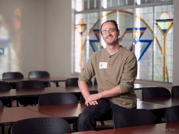
This room had one interesting feature: a huge stained glass window. My assistant, Jesse, sat in for a test shot, but it was a rainy day, and there wasn’t enough light coming in to make the window really interesting.
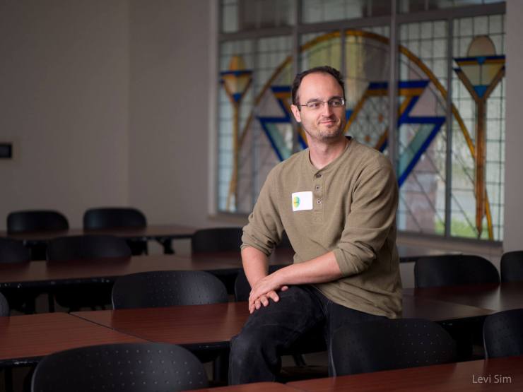
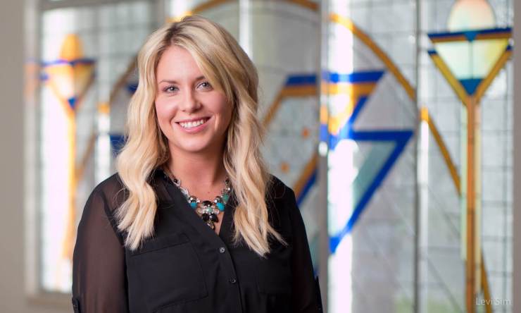
Jesse helped me position a light outside the building shining in through the window to illuminate the colors and hopefully cast some interesting colors on the blank wall, too. It took a few tries, and due to the depth of the window sills we couldn’t get the colors on the wall in the right spot, but the result was pretty good.
With the background glowing so nicely and lots of apparent ambient light, it was more believable to have such great light on my subject’s face. Was it relevant to her social work job? Nope. But it was pretty interesting, and two out of three ain’t bad!
A few final thoughts on environmental portraits
Environmental portraiture is really fun–it’s got plenty of challenges and that keeps me engaged and stimulates my creativity. The background is essential for placing the subject in the world, and your viewers can extract volumes of the story from your single image. I’d encourage you to make the background believable, relevant, and interesting and your pictures will be all the richer for it.
One more thing…
I recommend working with an assistant when creating environmental portraits. This is often a friend of mine and we’re working together to make some pictures, taking turns helping one another, as I have done with Jesse Walker for years. On a job, it’s also a relief to bounce ideas off one another and have a sounding board when things need to get creative in a hurry. To me, a good assistant is someone who works as hard as I do, and who is hopefully at least as good a photographer as I am. Besides, it’s fun to work with others.
Tell your story with the second annual Visual Storytelling Conference!
Experience four days of interactive, online training sessions featuring a range of educational content with experienced photographers and content creators. This free event kicks off with a series of technical boot camps to build essential skills, followed by live, online sessions on photography, video, business and social media. Join live from March 10-13, 2022!
