I don’t know about you, but most of the time my subjects are not models trained in posing for the camera, but I still need to help them look good. Did you know that most people look their best with their left side facing the camera? It’s true — I heard it on NPR (plus several studies I’ve read reports on, and my own experience substantiates it, too).
As many as 80% of people look best facing to the left hand side of your frame. I love it when there’s a clear, simple rule about making a better picture.
However, I need 100% of my subjects to look their best. So what do I do?
1. Take the bet: Short light on the left
80% is really good odds, so when I shoot I usually plan to have my lights on the left side of the frame. Why do my lights go there? I’ve talked before about short light, and it’s another surefire step toward setting up a good portrait.
Lighting the short side of the face gives depth and dimension to the portrait, and, while certain lighting patterns are flattering to some people, everyone is likely to look pretty good in short light.
What is short light?
We say, “short light,” but we really mean, “light the short side of the face.” The short side of the face is the side of the face away from the camera — the side of the face less visible, the left or the right. So, to light the short side of the face means there will be shadows on the side toward the camera, but I recommend having some light fall on the side toward the camera. You’ll know you’ve got the short side lit if the ear you can see is not lit.
We’ll talk about loop lighting, Rembrandt lighting, Paramount and the rest in another post. Basically, shine the light primarily on one side of the face, with a bit of shadow on one side of the nose, and you’ll be on the right track. Have a look at this picture. The light is from the left, he’s facing camera left, and the ear nearest the camera is in the dark, but he’s got a little light on his left cheek.
This setup will work well with 80% of people, so take that bet and be ready to use it.
However, it didn’t work well with my friend Jonathan at the top of this post. So, why not? And what did we change?
2. Facial features point the way
I hadn’t met Jonathan before our session for his new business portraits, so I had my lights set up ready to light him from camera left. I took a quick look at his face and thought it would probably work well. After a few frames, however, I realized we needed to switch. So, I placed the lights on the other side and made a few more pictures, and the difference is drastic. In fact, Jonathan remarked that his face was markedly ‘thicker’ when he was facing my left.
.mgl-tiles { display: none; } #mgl-gallery-634ee89f417f9 { margin: -5px; width: calc(100% + 10px); } #mgl-gallery-634ee89f417f9 .mgl-box { padding: 5px; } @media screen and (max-width: 768px) { #mgl-gallery-634ee89f417f9 { margin: -5px; width: calc(100% + 10px); } #mgl-gallery-634ee89f417f9 .mgl-box { padding: 5px; } } @media screen and (max-width: 460px) { #mgl-gallery-634ee89f417f9 { margin: -5px; width: calc(100% + 10px); } #mgl-gallery-634ee89f417f9 .mgl-box { padding: 5px; } }
Panasonic GH4, Olympus 75mm f/1.8 lens, f/6.3, 1/200s, ISO 200.
Panasonic GH4, Olympus 75mm f/1.8 lens, f/6.3, 1/200s, ISO 200.
Follow the nose
Jonathan’s nose is slightly crooked, and this is the main thing that indicates which side to light and which side of his face should be toward the camera. Have a look at these two:
.mgl-tiles { display: none; } #mgl-gallery-634ee89f42053 { margin: -5px; width: calc(100% + 10px); } #mgl-gallery-634ee89f42053 .mgl-box { padding: 5px; } @media screen and (max-width: 768px) { #mgl-gallery-634ee89f42053 { margin: -5px; width: calc(100% + 10px); } #mgl-gallery-634ee89f42053 .mgl-box { padding: 5px; } } @media screen and (max-width: 460px) { #mgl-gallery-634ee89f42053 { margin: -5px; width: calc(100% + 10px); } #mgl-gallery-634ee89f42053 .mgl-box { padding: 5px; } }
Panasonic GH4, Olympus 75mm f/1.8 lens, f/6.3, 1/200s, ISO 200.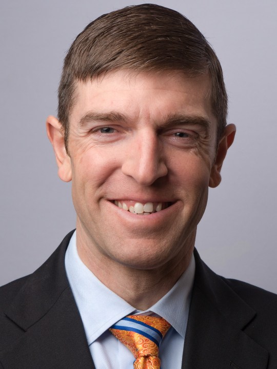
Panasonic GH4, Olympus 75mm f/1.8 lens, f/6.3, 1/200s, ISO 200.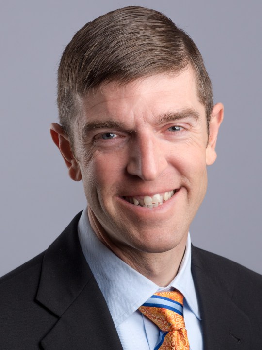
To me, these barely look like the same person. In the left image, you can see the crook of the nose, but in the right-hand image, it’s virtually invisible. The only changes are the way he’s facing and the light placement. Here I’ve emphasized the crook. Look again to see it clearly.
.mgl-tiles { display: none; } #mgl-gallery-634ee89f426f7 { margin: -5px; width: calc(100% + 10px); } #mgl-gallery-634ee89f426f7 .mgl-box { padding: 5px; } @media screen and (max-width: 768px) { #mgl-gallery-634ee89f426f7 { margin: -5px; width: calc(100% + 10px); } #mgl-gallery-634ee89f426f7 .mgl-box { padding: 5px; } } @media screen and (max-width: 460px) { #mgl-gallery-634ee89f426f7 { margin: -5px; width: calc(100% + 10px); } #mgl-gallery-634ee89f426f7 .mgl-box { padding: 5px; } }
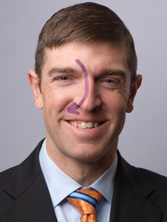
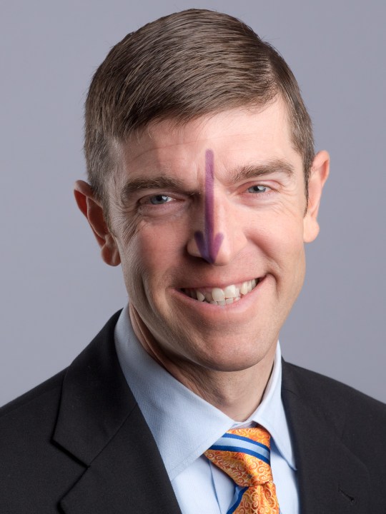
Many people have a slight (or significant) crook to their nose. In my experience, this is the most important facial feature to consider. Point the crook toward the camera, and light the other side of the face.
There is one other facial feature to consider for the best presentation, and that’s the eyes.
Light the tight one
Lots of people also have an eye that squints a little in pictures. This is really common — my right eyelid sits a little more tightly closed most of the time. Some people photoshop the eyes to be the same size, which may be appropriate in beauty and advertising pictures. For business portraits, it’s important to represent a person’s real self, but good posing makes a big difference.
For eyes, simply place the lights on the same side as the squinty eye. It’s incredible how much affect this has on minimizing the difference between the eyes. Look closely and you’ll see that this fellow’s left eye is quite a bit smaller/tighter that his right. But facing it toward the light has made that difference unnoticeable.
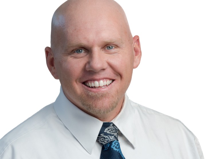
For the most part, you’ll find that your subjects can look their best facing the left side of your frame. People often have crook’d noses and squinty eyes, though, so point the crook toward the camera, and light the tight eye and you’ll end up with pictures that really look like the person you photographed.
Lighting and facing the right way are the first steps to making a great portrait, but it’s still up to you to help people emote and present their best selves in the portrait. I recommend you to Peter Hurley’s excellent videos on helping people look great.
I learned this stuff from people like Clay Blackmore and Tony Corbell at conferences like WPPI.
Portrait Tips come out each week, and you can see them all right here.
Tell your story with the second annual Visual Storytelling Conference!
Experience four days of interactive, online training sessions featuring a range of educational content with experienced photographers and content creators. This free event kicks off with a series of technical boot camps to build essential skills, followed by live, online sessions on photography, video, business and social media. Join live from March 10-13, 2022!
