
Printing to your inkjet printer can be such a joy — once you’ve figured it out. Here are a few tips for the technical and not-so-technical things that can cost you a heap-load of time, paper, ink and money.
Preparation is key
You need to figure out the steps to print your work of art and then lock in that information. Once it is done, it’s done. You just have to tell yourself, “Once I figure out what color profile and paper profile to use, I think I’m set. No, wait, I may need to understand the white point, black point, color balance, highlight-shadow detail, clipping, and metabolism are. OK, I’ve got all that down. Let’s press the PRINT button.”
I keep telling myself that I’ll be good to go once I’ve figured out the combination to the safe. I take a lot of notes to refer back to for how to do it and troubleshooting (now what did I do last time?). Use what you want, but I’ve found Evernote to be great for this task since it is accessible by all my devices, and I can update during downtime anywhere and on any device.
Take notes, lots of notes
Why have I chosen a paid app like Evernote instead of just typing my own and storing them somewhere? I’ve used all kinds of note-taking software and techniques over the years. Evernote has everything I could want in it; it’s stable, they haven’t gone out of business, and it’s always available on all my devices. A note-taking app is not something you want to jump from platform to platform with. Find something that works and won’t go away.
Then you hit a bump, only half the page prints. Or you’ve just run out of paper, or there are only one or two sheets left. Can you nail the perfect print in just one or two sheets? Truthfully, it’s possible, but as artists, we will always find something to improve. Or the ink levels, no wait, only one ink level is low. Even if it’s not the ink color you need in your print, your printer stops you and says, “Hey! Where do you think you’re going? I can’t print without ALL the inks!”
I don’t print that often, so I have found several strategies before hitting the PRINT button that saves enormous amounts of paper, time, money, ink, and waste.
Clean the print heads
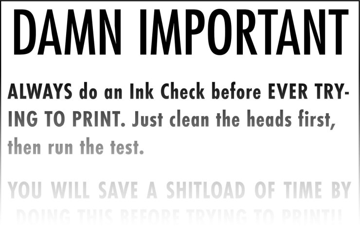
If you don’t print that often, always clean the heads first, and then print the test page. Cleaning the heads nearly always will guarantee a good print. In fact, put a sign on your printer, so you see it every time. Make sure you use strong language, so you pay attention to it. This isn’t a read me file you can skip — it’s more of a kick you in the backside type of action notice.
Small test prints
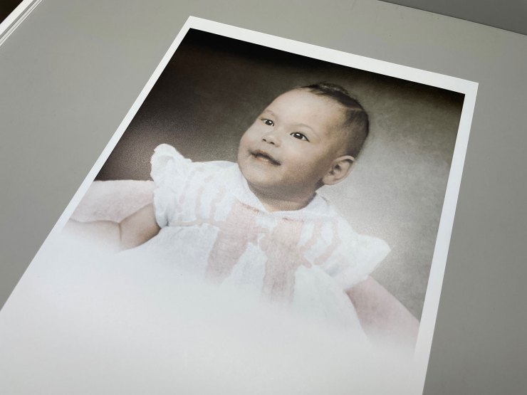
Stop making full-size test prints! If you use Lightroom, you can print small slivers of your image on the same size sheet or smaller repeatedly. Or better yet, reclaim some of the prints you thought were trash and use the areas that haven’t been printed on for test prints.
Then you can put the paper back into the printer and print another test in a blank area you didn’t print on (see video.) You will save soooooo much ink and paper this way. Watch the video below to learn how to make a Test Print template in Lightroom.
Image evaluation background

With all the technical goodies we have access to within our workflow, even if you get that correct, you can still have a problem in the final print with respect to brightness and contrast. In the Lightroom Classic Develop module, right-click on the background the image is presented on and change the background to white instead of using the standard gray or black background. Now compare the brights and whites to the white of the background before printing. The white in the background will show you instantly if your whites are bright enough.
If you know that something in your photo should be bright white (like white fabric, for example) or a specular highlight, having the white background to compare it to will give you a point of reference. You will see immediately if your image is too dark or not. A gray or black background is good for color balancing. But if you are going to send an image to print, having that white background will make a big difference. You can also imagine that white sort of like a matboard — though it would be nice if we could set that color to a specific color instead of grays. Maybe Adobe will add that feature someday.
Black and white points

One of the things printing your own work does is it forces you to understand what will print and what won’t. Suppose you have a bright white that has detail in it like a white shirt collar or the brightest part of a white blouse. The first printable density that a four-color press can print reads about 95.6% RGB in Lightroom Classic. That works out to about 3 C, 2 M, 2 Y, 0 K. Your inkjet printer uses cyan, magenta, yellow and black even though your image may be in RGB on your computer. Understand the differences.
To understand the RGB color space, stand up, and put your arms out at your side with your palms up. That represents what our eyes can see. Now take your hand and flip them so your fingers point upward (like telling someone how big the fish was you caught the other day), that is the RGB color space. Pull your hands in toward your head until they are twice the width of your head; that is how many colors are in the CMYK color space. This is the color space every book, magazine and inkjet print uses.
A white with detail should print; it should not be paper white; otherwise, what tone would you use to represent a specular highlight? You might be able to push this a small bit more with your inkjet, but it’s a good color build to target.
Editor’s Note: Mark Gilvey is a member of the Photofocus Community. He shared these tips and we wanted to share them with you. Mark is a commercial photographer based in Woodbridge, Virginia. He operates a 1,100 sq. ft. studio space and is an army of one most of the time. He photographs products, headshots, editorial, food, business services, is a photo-retoucher and also does photo restoration. Mark began working in Photoshop during version 2. Before that, he did what we do in Photoshop, on film. He worked on the same type of optical printer used to make the first “Star Wars” movie. Visit Mark’s creative or fine art websites.
Tell your story with the second annual Visual Storytelling Conference!
Experience four days of interactive, online training sessions featuring a range of educational content with experienced photographers and content creators. This free event kicks off with a series of technical boot camps to build essential skills, followed by live, online sessions on photography, video, business and social media. Join live from March 10-13, 2022!