Since the 20th Century, artists have used components like color and shapes to create a simple, minimalist pieces of work. As photographers, we can extend this idea to our own photographs, creating a unique view of an everyday subject with a minimalistic feel.
When preparing to shoot minimalist images, there are multiple things to consider. Background, depth of field, color and of course the subject you’re focusing on. But there’s one element that needs to be taken into consideration above all else — negative space.
What is negative space?
Negative space is the simple area around the primary object of your photo. In the above image, it’s the blue sky that complements the red of the sculpture. In the below image, the yellow table creates separation from the napkin and beer.

The color separation helps to create contrast for your subject, and also makes for a background that can help “complete” the photograph.
How do you utilize negative space?
Negative space should lead the viewer to see your subject better and clearer. There is no “right” or “wrong” amount of negative space, but seeing it flow around at least three sides of the subject helps focus attention.

In the above photo, the subtle texture on the table contrasts the birthday hats, but it doesn’t take away from the colorful lines on them.
Plainly put, the negative space should help to separate and create contrast from the subject.
In a similar practice, the below photo features a light background that complements the green color of the grocery cart. Imagine if the background of this was red. That wouldn’t complement the grocery cart at all — in fact, it’d be too distracting.

Play around with depth of field
By having a shallow depth of field, you can further separate your object from its background. In the below photo, the focus is on the bike wheel spokes. The road beneath it lends itself to both a background that coordinates with the subject, and one that gives separation for the spokes to shine.

Above all else, tell a story
The negative space in your photo should help tell a story, and should ultimately lead to some type of emotion from both the photographer and viewer.

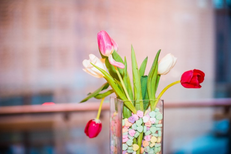
In the above photo, I shot a vase of roses and candy hearts. I noticed the tulip petals were starting to fall, and I wanted to focus on that element, as it captures a lot of emotion. I tried various different compositions here, but the most successful was putting the vase in the right lower third of the frame.
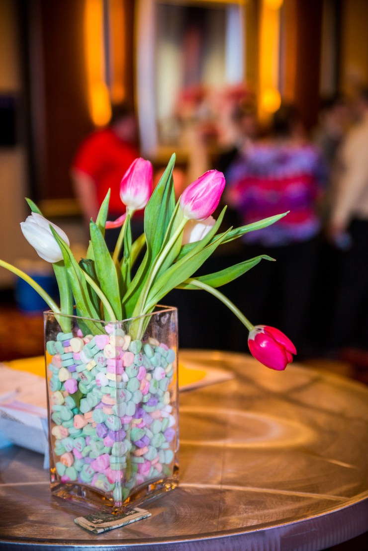
While this photo was taken at an event, I decided that it captured the essence of it quite well. I shot two frames of this — one as you see above, and the other below, which was shot vertically. Notice the difference in backgrounds. The above photo has a shallow depth of field and a background that complements the subject. The photo below, however is much busier, and doesn’t feel minimalistic.

It’s our job as photographers to create a story for every photograph we take. By emphasizing negative space in our photographs, we can further put an importance on the subject we’re shooting, and help to create a minimalistic sense of view for our audience.
Tell your story with the second annual Visual Storytelling Conference!
Experience four days of interactive, online training sessions featuring a range of educational content with experienced photographers and content creators. This free event kicks off with a series of technical boot camps to build essential skills, followed by live, online sessions on photography, video, business and social media. Join live from March 10-13, 2022!
