When I got this assignment to make a portrait of a comedian and performer, my mind immediately went wild with ideas. He’s known for a character who wears a fake mustache, so that helped me narrow down my plans. I had only a few days before the deadline, so I needed to put this together quickly.
Always maintain relationships
What is the best place to photograph a performer? In a performance place, of course. I called the opera house, which happens to be one of the best and most beautiful opera houses in the country. Years ago, I rented studio space in the building next to the opera house and I still have good relations with the management group. That made getting permission to use the stage a cinch.
You’ve got to maintain relationships over time. That’s actually the only good thing about social media: It makes keeping up with lots of people simple. As it happens, the same week I needed the theater, one of the directors at the theater needed an old photo from the university where I work. You better believe I worked hard to help her find the picture she needed.
To be clear, I would have worked hard for her even if I hadn’t needed her help, too. You may think that what goes around comes around, and if it helps you help people, that’s awesome. For me, it’s enough to do something good even if it doesn’t come back around.
Juxtaposition
That’s a fancy word thrown about in art critiquing circles. It means two things contrast with each other. In this case, I thought the goofy character who hoodwinked his way into the fancy opera house made an interesting picture.
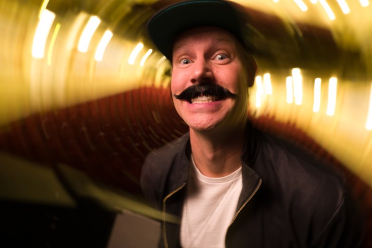
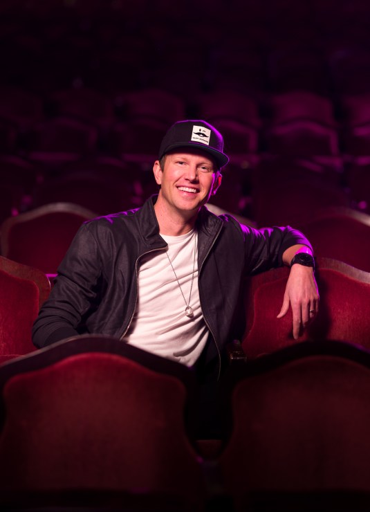
Also, contrasting colors of light make the photo more interesting. I used a warm gel on the front light to match the house lights. Then I added a purple gel on the side. The purple gives the impression of stage lighting and separates him from the background more distinctly. Incidentally, I use the MagMod gel system because it’s so easy and fast.
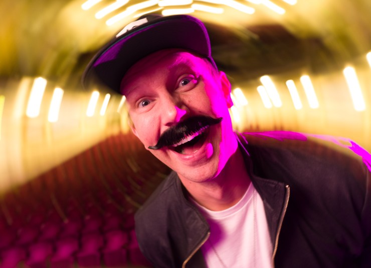
Choose the funky lens
I needed two things to make this picture work, and they both come from the same lens. Seeing the whole theater — the baroque plasterwork, the velvet seats — explains the fancy environment and so I needed a wide lens to get it all in. Plus, it’s well known to those who read the magazine so it sets the stage easily.
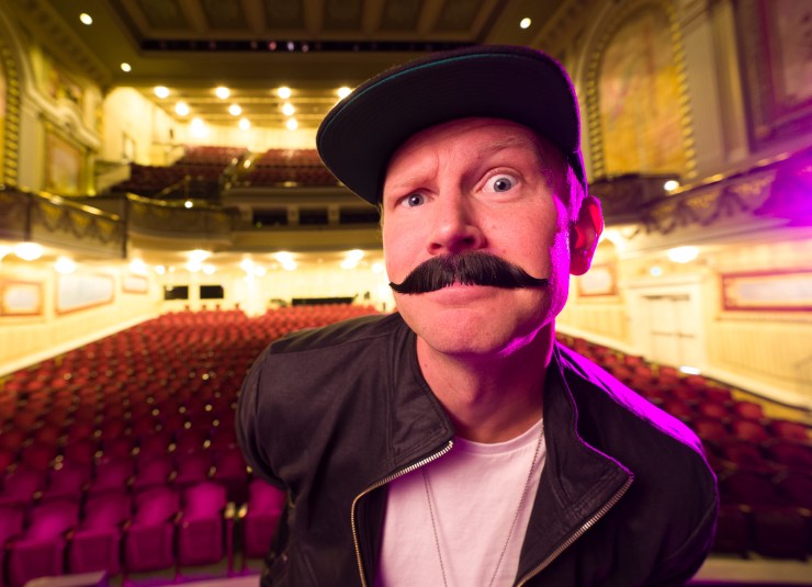
The wide lens is perfect for this caricature portrait, too, because wide lenses make foreshortening very apparent. Things close to the lens appear much larger than things a little farther away. The hat brim, the mustache and the eyebrows all appear very large and close, while his body tapers away, like a Looney Tunes character.
While you’re at it
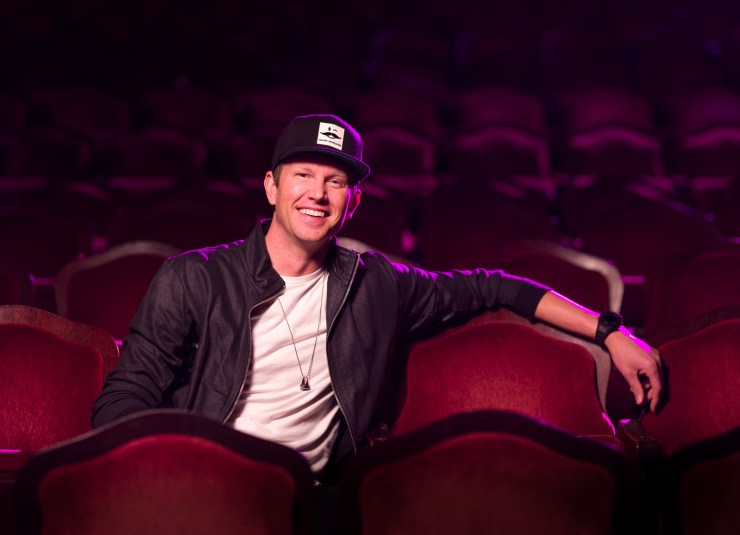
Since you’ve got the lights set up and the theater reserved and a character on hand — while you’re at it — use a normal lens, too. I swapped for the 85mm and set my subject in the seats. Same settings on the lights, same contrasting positions. The magazine ran both photos.
Tools I used
I’m shooting with a Lumix S1 with a Sigma 85mm f/1.4 lens and the Sigma 14-24mm f/2.8. For lights, I’ve got Godox strobes and MagMod modifiers. The front light is in the MagBox softbox and the backlight is bare with only the purple gel.
Make a vision
I had a plan for this picture, a picture in my mind. I was so pleased when it turned out exactly as I had imagined. There’s plenty of opportunity for on-the-spot ideas, too, but I love it when a plan comes together.
Make a plan for a picture, and go make it happen. I’d love to see your results. Share them in the Photofocus Community.
Tell your story with the second annual Visual Storytelling Conference!
Experience four days of interactive, online training sessions featuring a range of educational content with experienced photographers and content creators. This free event kicks off with a series of technical boot camps to build essential skills, followed by live, online sessions on photography, video, business and social media. Join live from March 10-13, 2022!
