Recently someone commented on one of my images: “I wish I had your eye for composition.” My reply: Composition can be learned.
Art classes in high school and college helped me learn the basics of composition, color, lines, shapes and the elements of design that go into creating good compositions. These apply to art, drawing, painting and yes, photography. There are plenty of online resources about art and learning basic composition.
Normally my process is to get it as right as possible when I shoot it. Sometimes, though, I know what I want in my head but can’t always get it in-camera at the moment the shutter is clicked. I thought I’d share a couple of before and after images that can help you start seeing the shot whether it’s at that moment or after you get home and upload your images.
Crop and color
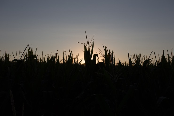
For this image, I knew I couldn’t get quite what I wanted, had in my head, or what I was feeling at that moment. I was shooting into the sun to create the silhouette but I wanted to show that it was sunrise and it was brighter and warmer than this. I took a few three-shot exposures at +/- 1 and at f/10, ISO 100 and used only one frame for this one.

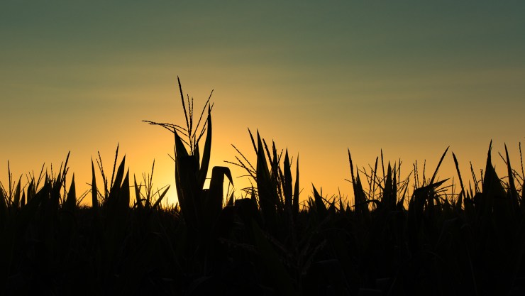
It’s an OK image, but a bit boring in the color department and flat. The centered stalk and centered horizon line don’t create any interest here. This is more of what I had in mind:

To create this, I used Lightroom Classic and started by cropping the image. There was too much black in the lower third of the image. Then I shifted the image left and right to find the composition that was most appealing.
From there, I removed sensor spots and/or bugs, just to make sure the sky was clean.
A preset was used to bring back some of the golden color of the sky. I love presets for seeing what can be done and for creating a jumping off point.
Then I added a graduated filter on the top half of the image using dehaze which brought back a bit of the blue in the sky. Finally, the temperature was pushed up to add a bit more warmth to the sky.
Crop for Distractions
Here’s another image to illustrate small changes that can be made to help your composition.

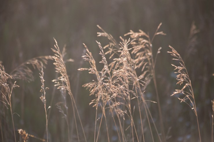
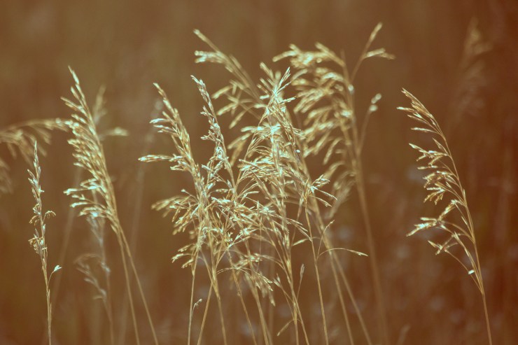
The morning light on tall grass in the ditch along a dirt road was almost perfect. Again, the image is OK but in my mind, the light on the grass was just a bit more sparkly and more golden. There are also pieces of grass that are distracting along the edges taking the focus away from the main clump in the center of the image.

Using Lightroom Classic, this was cropped a few times to remove those pieces of grass that weren’t quite in the frame on the right, left and bottom. The subject is the light on the grass. Anything that doesn’t contribute to your subject should be removed if possible or de-emphasized. In this case, one preset was all it took to get the look I wanted. Quick and easy.
Questions to guide your shoot and composition
Watch the edges of your frame when you are shooting. Are there things sticking out of the corners or edges? If you eliminate distractions before you press the shutter you’ll save yourself post-processing time.
Be aware of the foreground and background, what is in front of or behind your subject. Is it distracting?
Take a look around the area. What do you see, what is it that is drawing you in to shoot it in the first place? How does it look in your mind?
Here’s another article with more tips for composition and learning to see a little more and a little differently.
Tell your story with the second annual Visual Storytelling Conference!
Experience four days of interactive, online training sessions featuring a range of educational content with experienced photographers and content creators. This free event kicks off with a series of technical boot camps to build essential skills, followed by live, online sessions on photography, video, business and social media. Join live from March 10-13, 2022!
