Luminar Neo differs in workflow from LuminarAI. I’ll go through how you might use Luminar Neo to process a photo, occasionally discussing how the workflow has changed from LuminarAI.
One big change up top in Luminar Neo
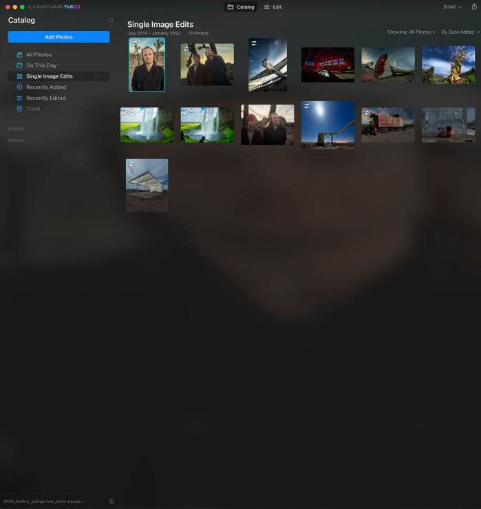
For example, there is no Template Menu at the top. We still have Edit, though. Pressing “Edit” immediately opens up a rather long list of Tools. We will take a brief look at some of the features there. Unlike LuminarAI, you can now also import by dragging photos into the main Catalog window.
CropAI
.mgl-masonry { display: none; } #mgl-gallery-634ed753226b5 { column-count: 2; margin: -5px; } #mgl-gallery-634ed753226b5 .mgl-item { padding: 5px; } #mgl-gallery-634ed753226b5 figcaption { padding: 5px; } @media screen and (max-width: 800px) { #mgl-gallery-634ed753226b5 { column-count: 2; } } @media screen and (max-width: 600px) { #mgl-gallery-634ed753226b5 { column-count: 1; } }
Luminar Neo Crop AI, before “suggesting” a crop.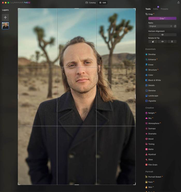
Luminar Neo Crop AI, after cropping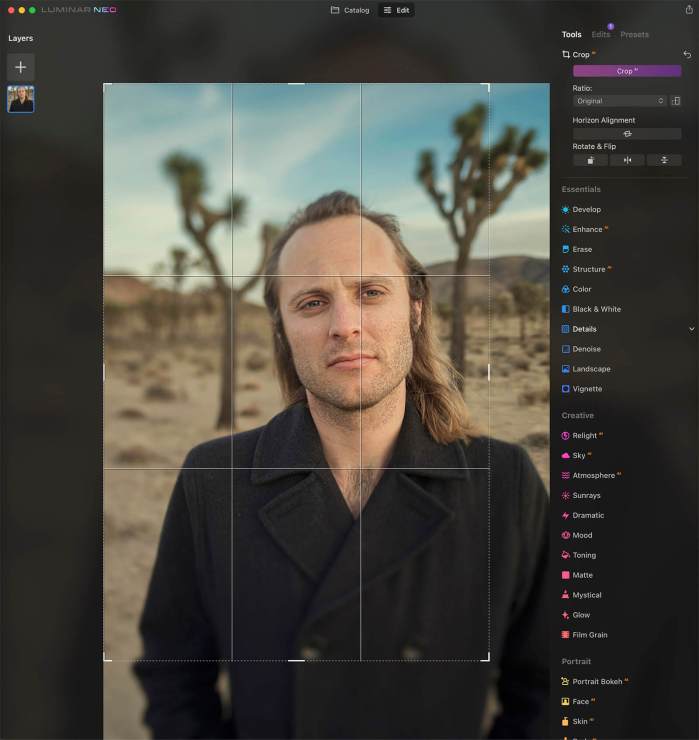
Right out of the gate, Luminar Neo has CropAI on top. Given the workflow, I suppose this makes sense. You might want to crop the photo and see where you are. Or you could come back to it. Sometimes, if I adjust perspective or optics, for example, I might save the cropping for later to give more room for the optics or perspective adjustments to “maneuver.”
You may allow Luminar Neo to “offer” a suggestion by pressing the CropAI button. Or you may choose from a variety of templates, including Facebook sizes, or custom sizes, or edit freely.
Interestingly, Neo does not currently have CropAI if used as a plug-in in Photoshop. It’s currently only offered in the stand-alone version.
Essentials
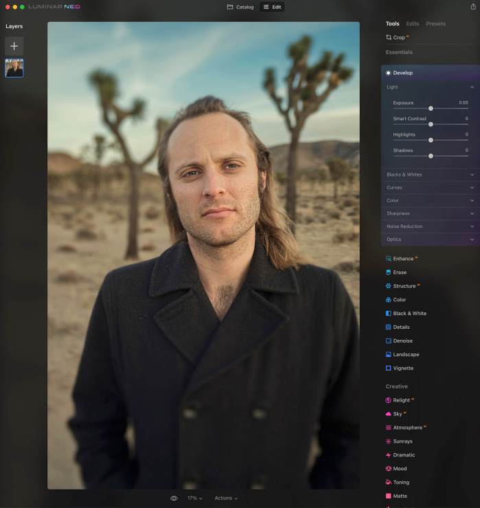
Speaking of Optics, that shows up soon. This has been moved to the Develop Panel. So has Light as well as Blacks & Whites, Curves, Color, Sharpness, and Noise Reduction.
Many of the features in Essentials will be familiar to those who use LuminarAI or Luminar 4. There’s EnhanceAI, Details (which I love), Denoise, Landscape, Vignette, Black & White, StructureAI, and Color, for instance. But some of them have changed. Both have Erase. However, Erase has an Objects Removal section with two buttons: Remove Powerlines and Remove Dust Spots.
Most photographers like to make corrections and global adjustments first. In that sense, the Essentials section lives up to its name. It allows you to adjust color and get rid of elements you don’t want, such as power lines, sensor spots, or other distracting elements. I would love to see a Graffiti Removal tool. One can dream, right?
Creative editing in Luminar Neo
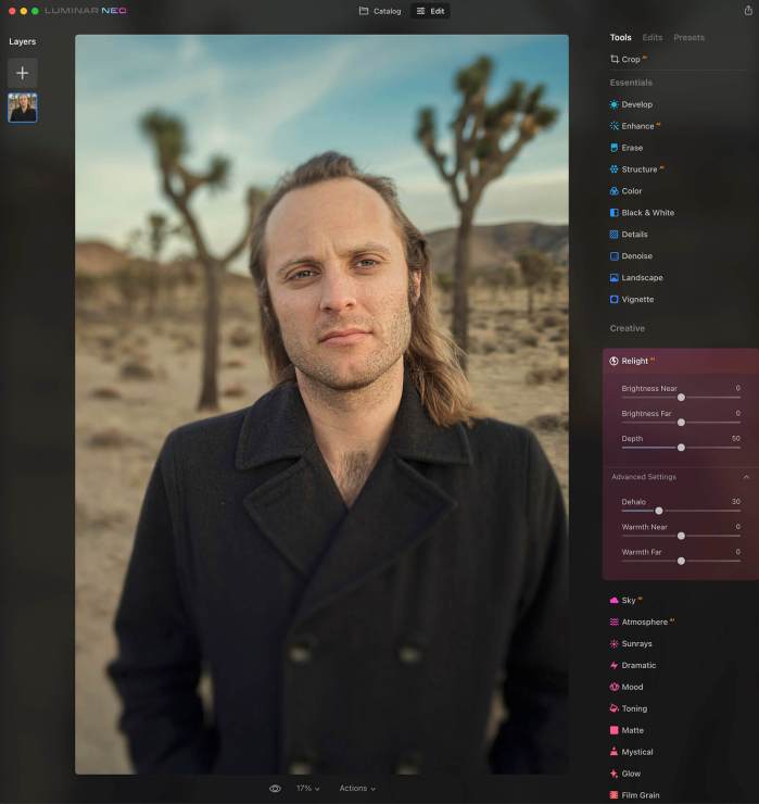
The first tool under the Creative heading is RelightAI. This is a rather powerful tool by itself. But of course, when used with other tools (adjustments), it can be quite flexible. Many of the examples show Luminar Neo relighting portraits. But it also can swiftly edit landscape photos. This uses three sliders — Brightness Near, Brightness Far, and Depth — for adjustments. Advanced settings can address halos and the general warmth of the relighting.
SkyAI is one of Luminar’s better-known features. This allows you to replace the sky, making refinements and even reflections easily. Well, it’s here as well.
And so is AtmosphereAI, which can add mist, haze, or fog. If used appropriately, it can add a lot of mood to your photo.
Many of the other familiar Tools are here as well, including Sunrays, adding rays of light where little or none existed before. Other familiar Tools such as Dramatic, Mood, toning, Matte, Mystical, Glow, and Film Grain complete the Creative section.
This Creative section would seem to be a logical next step after addressing the Tools in the Essentials section.
Portrait
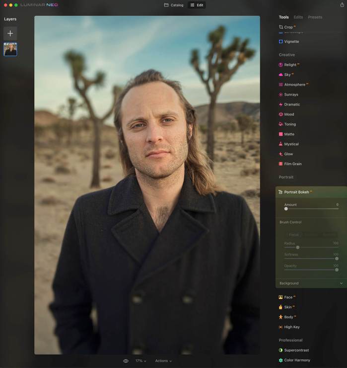
This next section is the anticipated Portrait BokehAI. If Luminar Neo does not detect a face, this will be “ghosted,” and none of the functions will work. However, this may possibly change later as algorithms detect other subjects. For now, Portrait BokehAI does, well, exactly what you think it does: it controls the quality and amount of bokeh. And it generally does it well, controlling the focus or lack thereof, radius, software, and opacity. Furthermore, you can open the Background panel. This reveals controls for Brightness, Highlights Glow, Warmth, Depth Correction, and Edges Correction.
FaceAI, SkinAI, and BodyAI make their return, first having appeared in LuminarAI. This still includes the Skin Defects RemovalAI as a checked box. I would be curious to know whether this will have more controls in the feature, allowing you to determine or refine what is considered a defect and what is not.
High Key rounds out this section, looking the same as previous incarnations.
Professional
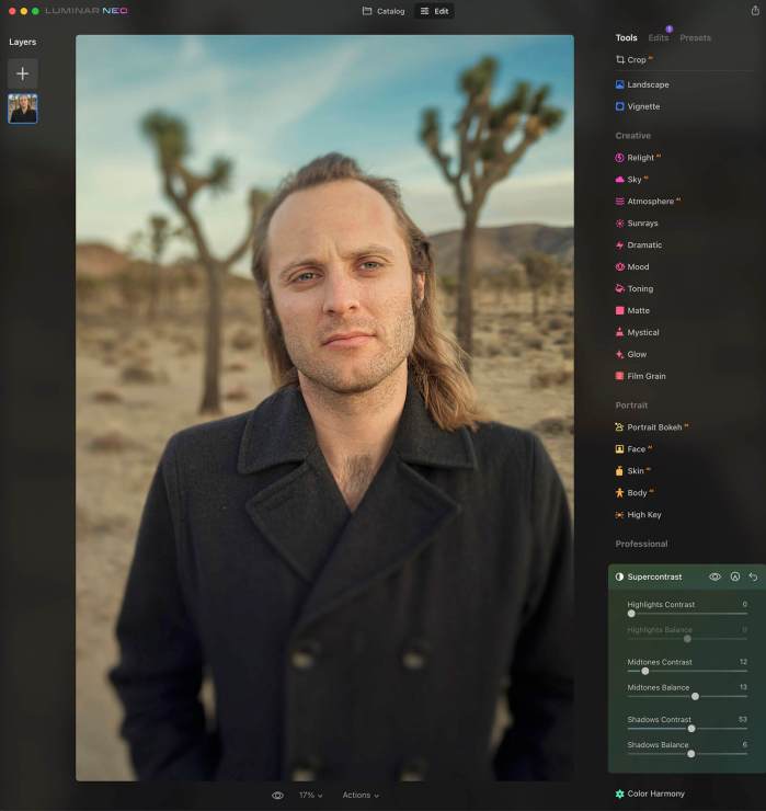
The LuminarAI section began with Optics. However, as mentioned, that’s been moved to the Develop Panel in the Essentials section up top.
Therefore, Supercontrast kicks off the Professional section. This has the same controls as LuminarAI. This contrast gives you a surprising amount of control over brightening, darkening and generally controlling the contrast over the image.
The Color Harmony section has identical controls to LuminarAI. This includes Brilliance and Warmth. Below that, you can open three subsections: Color Contrast, Split Color Warmth, and Color Balance.
Edits
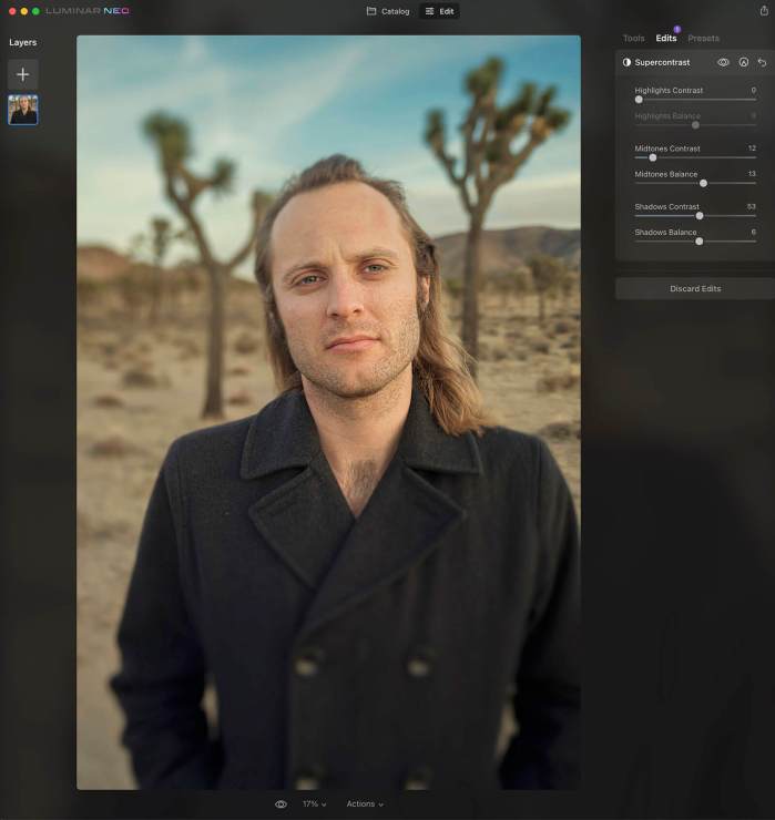
On the top right-hand side of Luminar Neo, to the right of Tools, is Edits. This did not exist in this manner with LuminarAI. However, I think I could get used to this in a hurry.
Initially, if you make no adjustments in Tools, Edits remains ghosted. Click on it, and nothing happens.
But when you begin to make adjustments, and suddenly a blue circle with a number shows up. This represents the number of edits you’ve made. Click on Edits. This reveals all the menus with edits that you made. And of course, you can readjust the edits you’ve made here. I like this feature with one caveat, which I will discuss in the “Ruh-Roh (sort of)” section below.
Presets
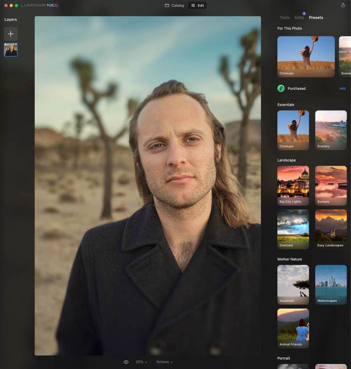
Luminar Neo has a Presets section. It’s essentially the same as LuminarAI’s Templates section. However, it isn’t front and center on the top menu and is positioned after Edits on the right-hand sidebar. This works in the same manner, making adjustments by percentage as you could have done with Templates.
That’s where the similarities end, however. When you adjust a Preset, it shows up in Neo’s Edit Menu. However, you cannot edit individual parameters. Within the Edit Menu, you can still only make adjustments by percentage.
Ruh roh (sort of)!!
If you change a slider or control and decide you don’t like it, there does not appear to be any “undo” or “redo” function in the menu. If there is, I haven’t found it yet. It’s not under the topmost menu under “Edit.” Also, there’s no Ctrl+Z or Command+Z for “undo” or Ctrl+Y or Command+Z for “redo.”
Further, if you mistakenly hit the “Discard Edits” button, there is also no “undo.” There is no dialogue box that pops up that says, “Hey, you don’t really want to undo this, do you?”
You can, however, get the edits back. Fortunately, the sections you have edited don’t actually go away. Click on each one to open it again and your previous edit roars back to life. If you have many edits, you would have to click on every menu to open it again. But at least that’s an undo of sorts.
As I mentioned above, I like how the Edits section is configured. But I also would love to have the traditional “undo” and “redo” as well.
Luminar Neo Workflow
If you follow the Tools from top to bottom, I believe you would generally find that this suggested workflow seems to work logically.
The workflow differs somewhat from LuminarAI, which was largely driven by Templates, after which you could tweak them. Sure, with LuminarAI, if you pressed Edit on top, it also revealed the Tools menu. And it too had a logical workflow if you followed it from top to bottom. And the larger headings of Essentials, Creative, Portrait, and Professional are in the same order, if not some of the subsections.
I am confident that one could do some great editing with Luminar Neo. I intend on incorporating it into my workflow.
Tell your story with the second annual Visual Storytelling Conference!
Experience four days of interactive, online training sessions featuring a range of educational content with experienced photographers and content creators. This free event kicks off with a series of technical boot camps to build essential skills, followed by live, online sessions on photography, video, business and social media. Join live from March 10-13, 2022!
