Do you ever look at a photo and think to yourself, “what makes this photo good?” There’s more to photography than just pointing and shooting. Composition is key when it comes to taking photos that are both aesthetically pleasing and meaningful. Here are 7 photography composition rules to know for better photos.
If you’re more of a visual learner, be sure to check out the video I made regarding composition in photography:
7 Photography composition rules
Rule of thirds
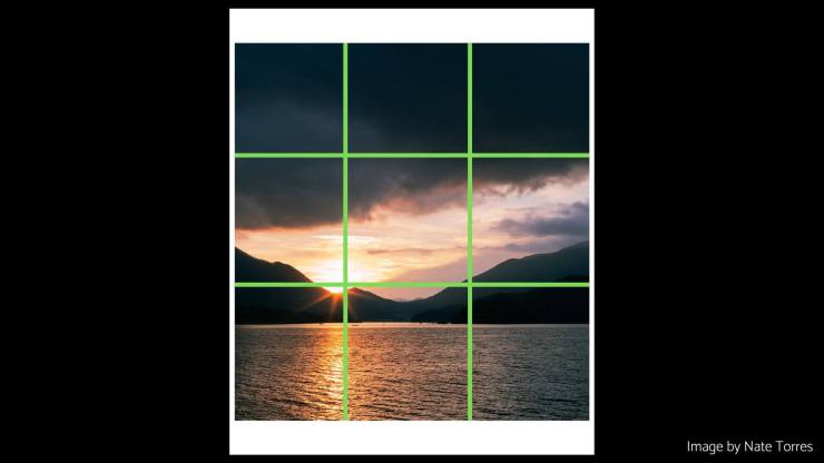
The rule of thirds is one of the most basic composition rules in photography. It states that when composing an image, you should divide it into nine equal parts by drawing two vertical and two horizontal lines. Place the main elements at the intersections of these lines or along their path to create a balanced scene.
This is my favorite photography composition rule because it gives you a simple guideline for creating aesthetically pleasing photos.
For example, in this image I took in Japan, I wanted the main focal point to be the setting sun so I aligned it to be on the bottom-left intersection:
Frame within a frame
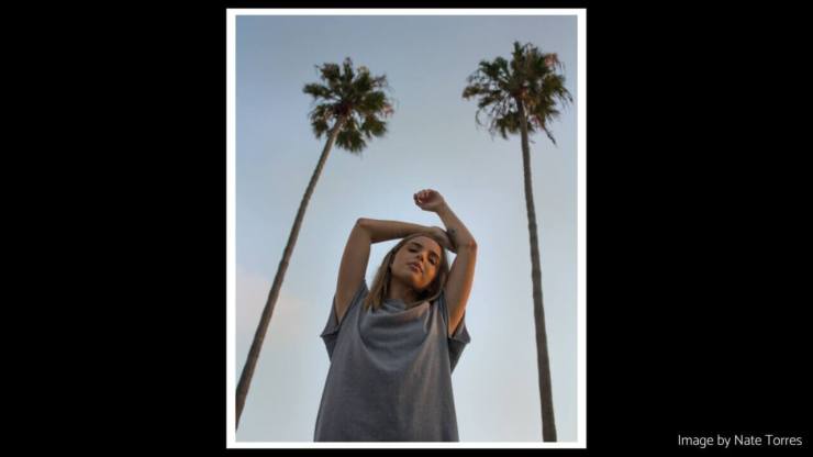
Creating a frame within your photo can help create depth and draw the eye to the subject and is also another favorite photography composition technique of mine. This can be done by using natural elements like trees or rocks, or even man-made objects like windows and doorways.
It’s called a frame within a frame because you’re using the frame to draw attention to your subject. This technique helps create a sense of depth in your photos and makes them more visually interesting.
For example in this image, I framed my subject using two palm trees to add visual interest:
Leading lines
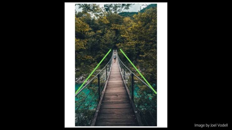
Leading lines are used to create a visual path for the viewer’s eyes. This can be done using natural elements like rivers, roads, and pathways. It can also be accomplished by using man-made elements such as fences, walls, or staircases.
Using leading lines helps guide the viewer’s eye to your subject.
For example in this image, the bridge ropes and bridge itself is used as leading lines to lead our eyes to the subject:
Symmetry
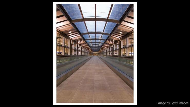
Symmetry is when two sides of an image are mirrored. This can be done naturally, by using elements in the environment that have a natural symmetry, or it can be done artificially by using lines and patterns to create a symmetrical composition.
Using symmetry in your photos helps create balance and harmony, making them more aesthetically pleasing.
Symmetry is best used in landscapes and architecture photography because it helps create a sense of order in an otherwise chaotic scene.
For example in this image you can see the left and right sides are mirrored images of each other:
Patterns
Patterns are repeating shapes, colors, or textures that can be used to create interesting compositions. Look for patterns in man-made elements like tiles and brick walls, or natural elements like sand dunes and rippling water.
Using patterns helps create texture and visual interest in your photos.
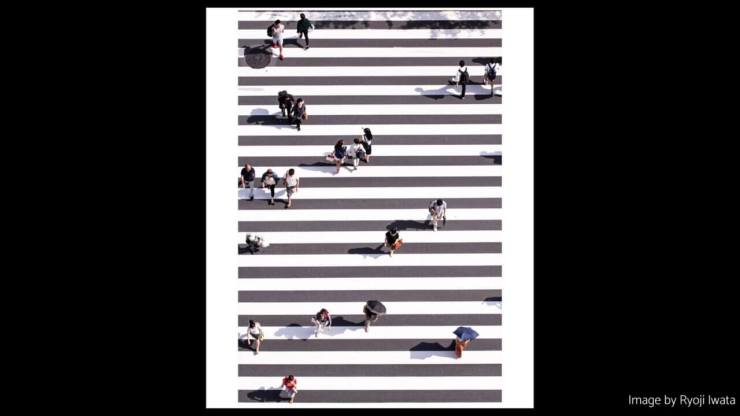
For example, in this image, you can see the crossing lines being used to create a pattern within the image:
Pattern-Breaking
Pattern-breaking is the opposite of patterns. It’s when you intentionally break up a pattern to draw attention to an element in your photo. This can be done using shapes, colors, or even people.
Using pattern-breaking helps create visual tension and makes your photos stand out from the crowd.
Pattern-breaking is best used in street photography, where you want to capture the uniqueness of a moment.
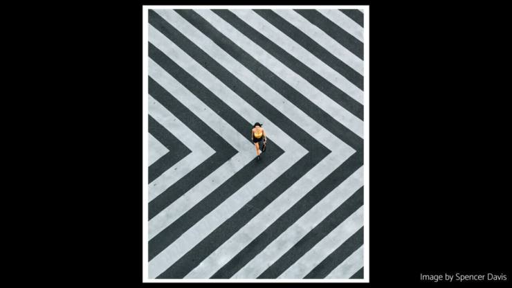
For example, using the example of our last image, the pattern of the road crossing lines is broken using color (yellow) to act as visual contrast:
Simplicity
Simplicity is the art of creating a composition with only essential elements. This means cutting out distracting elements in your photos and focusing on one main subject.
Using simplicity helps create clarity and focus in your photos, making them more impactful and meaningful.
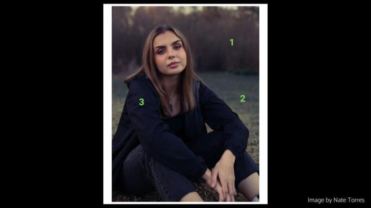
I always strive to have 3-5 focal points within the photo, I believe if you have more than this, then the image will become cluttered and unfocused.
Take this example of a portrait I took, the 3 focal points include the subject, trees, and the grass:
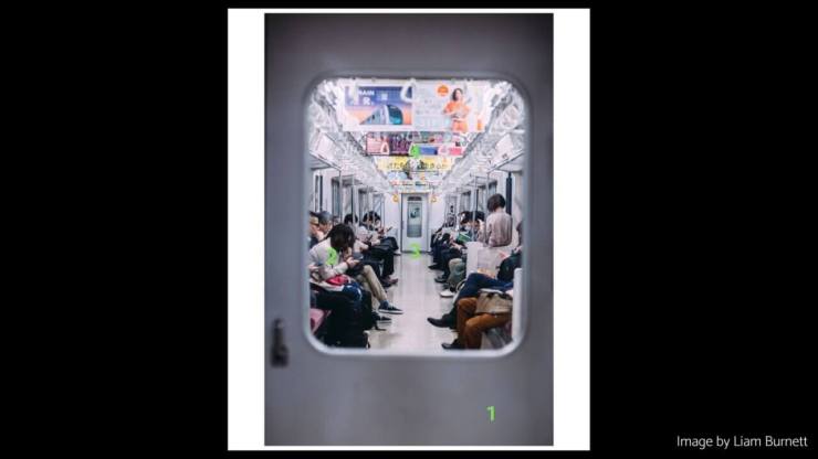
Don’t confuse focal points for actual subjects in the photo, because you can often combine subjects into one focal point based on how they create a unit. For example in this image, there are multiple people but they can be combined into one focal point. So the focal points in this image are the door, the door on the other side of the train, the people, and the ceiling banners:
Some of the most impactful photographs are also the simplest in terms of focal points.
Final remarks
These 7 photography composition rules are key when it comes to taking aesthetically pleasing and meaningful photos. You don’t need to follow all the rules, but having an understanding of them can help you create better photos.
I’ve also left out some such as Golden Triangle or the Golden Spiral because I believe if you follow the Rule of Thirds, then you will also be achieving these two composition rules.
Lastly, you can combine different composition rules to create unique and interesting photos. Experimenting with different techniques is the best way to understand photography composition, so don’t be afraid to get creative and have some fun!
If you liked this article, be sure to check out my photography newsletter.
Tell your story with the second annual Visual Storytelling Conference!
Experience four days of interactive, online training sessions featuring a range of educational content with experienced photographers and content creators. This free event kicks off with a series of technical boot camps to build essential skills, followed by live, online sessions on photography, video, business and social media. Join live from March 10-13, 2022!
