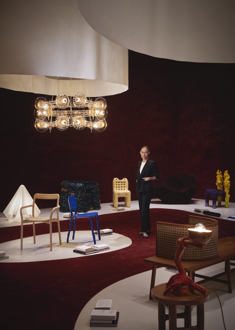
From Thomas Barger’s aptly named “Butter Chair 2” to Germane Barnes’ hair pick-inspired “Uneasy Lies the Head That Wears the Crown (4),” the 45 works now on view at SFMOMA’s new furniture show are – as the show’s title suggests – a sculptural equivalent of an opinion piece, chairs with something important to say. “Conversation Pieces: Contemporary Furniture in Dialogue” understands that furniture designers – and artists working with furniture – are offering us more than a place to sit, but cogent positions on wealth, race, gender, comfort, and discomfort.
Interior architect Alexandra Loew, founder of the Alexandra Loew Studio in Los Angeles, co-organized the exhibition with Jennifer Dunlop Fletcher, SFMOMA’s Helen Hilton Raiser Curator of Architecture and Design. She’s the star of this week’s Milkshake, talking to us from within the exhibition itself right before it opened to the public. Here, you’ll see a number of the pieces in the show, as well as the exhibition design, with its space-defining use of dramatic red carpet. “Conversation Pieces” marks Loew’s entry into the world of exhibition design. We asked her for her secrets, and she demurred: “I don’t have a lot of secrets, [since] this is my first exhibition design, but I think in general I’m a big fan of using color as a way to create things that are dynamic and compelling and alluring and attract attention,” she says. “You can see here that we used wall-to-wall carpeting on the floors and set a datum on these 18-foot ceilings to create a really sumptuous, deep, rich color. It also has a lovely acoustic quality, so it immediately makes the gallery less echo-y, more intimate.” They also used a plum color on the benches within the show to indicate seating areas. “I think color in this instance was a great way to create a unifying backdrop for these very eccentric, widely divergent groups of furniture.”

We also asked Loew where she’d like to head next within exhibition design – her ideal follow-up to Conversation Pieces. “An exploration of the relationship between interior design and mental health and general well-being,” she says. “Health and well-being is an ongoing process of transforming yourself and transforming experiences – transforming all kinds of symptoms into something else. That’s what healing really is, and I think that artists have done that so well – taking materials and transforming them, taking personal experiences and transforming them into something else.
I’m interested in exploring the ways that architects and interior designers have done that around the way we feel in space. I’m not sure where that’s going to go, but I think that’s part of the fun of design in general – doing research and mobilizing form and texture and line and color to communicate a message and tell a story.”
For more, tune in!
Diana Ostrom, who has written for Wallpaper, Interior Design, ID, The Wall Street Journal, and other outlets, is also the author of Faraway Places, a newsletter about travel.
Milkshake, DMTV (Design Milk TV)’s first regular series, shakes up the traditional interview format by asking designers, creatives, educators and industry professionals to select interview questions at random from their favorite bowl or vessel. During their candid discussions, you’ll not only gain a peek into their personal homeware collections, but also valuable insights into their work, life and passions.
